Uberfacil


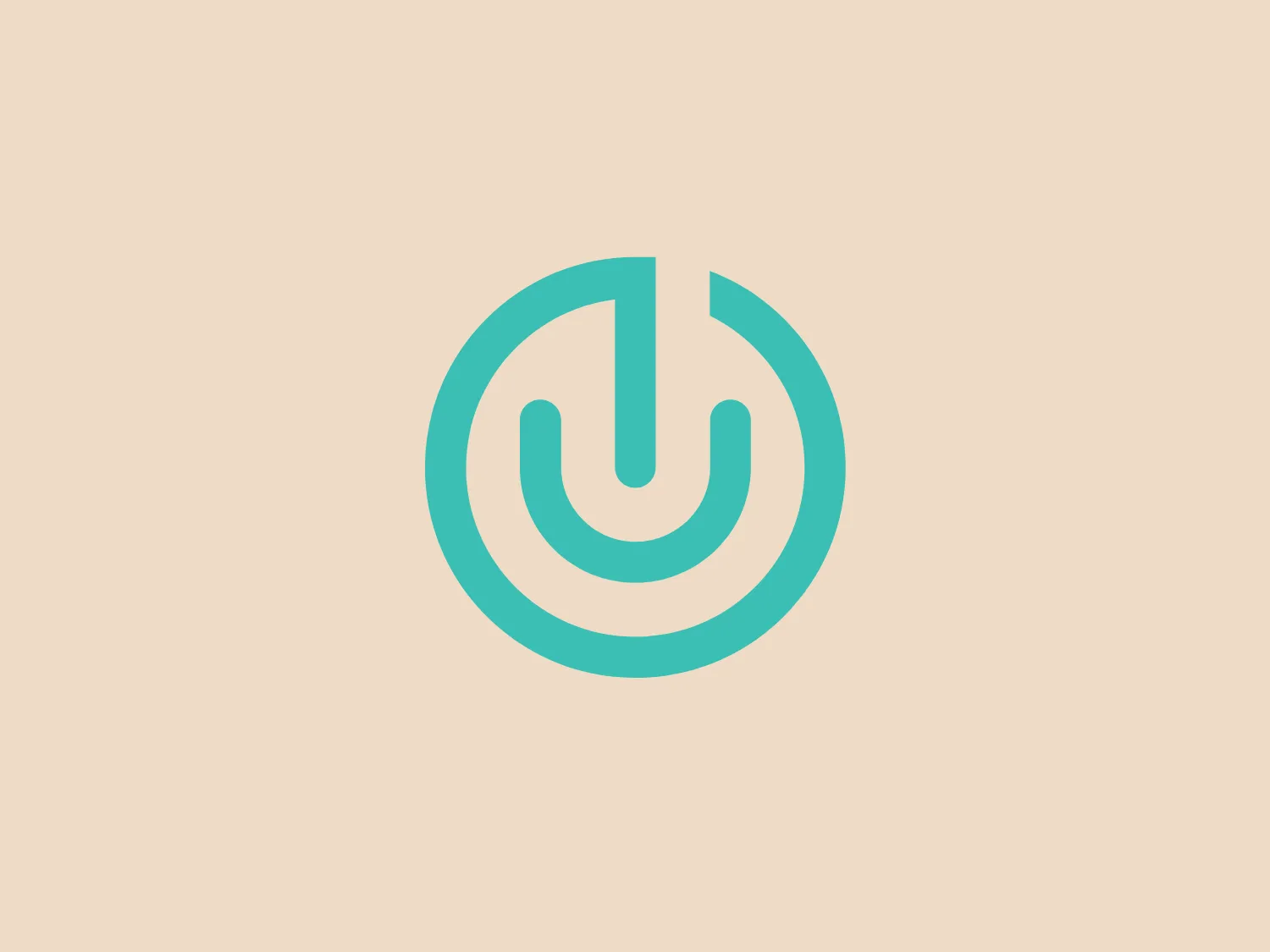
What catches our eye is the minimalist and modern stylized power button symbol in the Uberfácil logo, conveying simplicity, tech-savvy, and universal appeal.
Letter
Type
Color
Style
The logo for Uberfácil features a stylized power button symbol consisting of a vertical line that intersects a circle with a gap at the top, suggesting the universal icon for power or turning on. The design is minimalist and modern, with a sleek gradient of aqua to a lighter turquoise that adds depth and a tech-savvy feel. There are no additional embellishments, making it clean and easy to recognize. The circular shape conveys a sense of completeness and universality.
Uberfácil is the creator of Épico, a premium WordPress template renowned for its comprehensive features tailored for successful blogging.
Similar logos
NEW

The Ciklum logo features a stylized letter "C" created using curved lines or arcs that decrease in size towards the center, evoking a sense of inward motion or a ripple effect. The color gradient ranges from a deep, vivid blue to a bright turquoise, suggesting fluidity and dynamism. The overall design aesthetic is modern, clean, and would likely be associated with technology, communication, or water themes due to its fluid-like appearance. The different shades of blue impart a professional and soothing visual experience.
NEW

The Moises AI logo is a modern and minimalistic design featuring three wave-like curves that undulate symmetrically, forming a pattern reminiscent of water waves or audio frequencies. Rendered in a vibrant turquoise color, the shapes are clean with rounded edges, conveying a sense of softness and approachability.
NEW

The Ramsauer logo features a stylized letter "R" contained within a circle. The design is minimalistic, with the right side of the "R" extending beyond its usual form to create a fluid, dynamic look that breaks the circular boundary on the right side, giving the appearance of motion or progress. The color is a rich, bold teal, which stands out with a modern and sleek vibe. The logo's simplicity suggests a contemporary brand identity with an affinity for elegance and innovation.
NEW

The DMarket logo features an abstract, stylized design resembling a forward-pointing arrow within a hexagon. A single, continuous ribbon twists to form the arrow and hexagon perimeter, conveying motion and direction. The gradient color creates a 3D effect, ranging from deep turquoise to lighter teal. This modern, sleek aesthetic suggests dynamism and innovation, with a subtle shadow adding to the sense of movement.
NEW

The Technomex logo showcases an abstract, looped design reminiscent of an intertwining figure-eight or infinity symbol. The modern and sleek appearance, defined by smooth curves and clean lines, is complemented by gradients of green and turquoise, creating a dynamic and fresh look. The color transition from a deep teal-like hue to a soft green at the tip of each loop adds depth and movement to the design. The overall aesthetic is minimalistic yet distinctive, with a color scheme suggestive of growth, sustainability, or technological innovation.
NEW

The BBC Radio 5 logo features a large, bold number '5' centered within a circle. The '5' is displayed in a clean, weighty sans-serif font, evoking reliability. The vibrant turquoise color grants a fresh, modern feel, while the circular background promotes unity. The minimalistic design, lacking additional embellishments, supports a contemporary aesthetic. The contrast between the white numeral and the colored background ensures the logo is legible and eye-catching.
NEW

The Homedics logo depicts a modern and clean stylized letter 'H' in bold teal or turquoise color. This H features a minimalist sans-serif font with clean lines and squared-off edges, exuding a contemporary and professional look. The letter is structured with two vertical pillars connected by a horizontal bar, adorned with slightly detached horizontal lines for contrast and depth, while maintaining a monochromatic scheme.
NEW

The Relo logo consists of three solid-colored squares arranged in an abstract geometric design to form a stylized letter "L" or a right-angle shape. The squares are navy blue (#000080), turquoise (#40E0D0), and a medium shade of yellow (#FFD700), giving the logo a vibrant and modern aesthetic. The straight edges and corners denote stability and structure, while the varying colors can imply diversity or a multifaceted approach.
NEW

The logo presented for DFDG Architecture is a stylized letter "D" composed of geometric shapes in a tessellation pattern. The shapes that form the letter include a darker rectangle and lighter, varied trapezoidal and triangular shapes that create a sense of three-dimensionality. The color palette is a gradient of teal and turquoise tones, evoking a modern and sleek design aesthetic. The geometric concept suggests precision and cutting-edge technology. For a background that complements this logo without overpowering it, a soft, neutral color would be ideal.
NEW

The Bluewindow logo features a continuous ribbon-like design creating a stylized letter "B." The design consists of smooth lines with gentle curves, enhancing its dynamic and modern aesthetic. It utilizes a bright and engaging shade of turquoise, which is eye-catching and conveys a sense of innovation and freshness. There are no additional embellishments, which contributes to the emblem's clean and minimalist style. This simplistic yet sophisticated graphic conveys movement and connectivity, embracing a contemporary and forward-thinking brand identity.