MIDI Association

15
We like the bold, symmetrical "M" shape in the MIDI Association logo; it's versatile, modern, and visually strong.

MIDI Association Logo

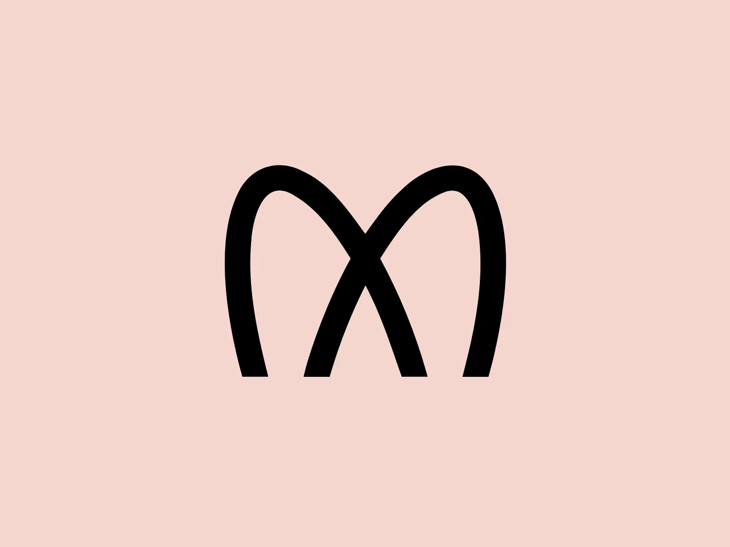
The MIDI Association logo features a bold and stylized design with two arches that converge to form an abstract "M" shape. The symmetrical arches create a sense of balance and stability, resulting in a simplistic and modern design with clean lines and no additional embellishments. The black logo stands out well against lighter backgrounds and has a strong visual presence due to its thick lines and distinct negative space that forms the "M." The minimalistic aesthetic ensures broad versatility for various applications.

About MIDI Association

The MIDI Association aims to foster a global community of individuals who utilize MIDI to create music and art. Serving as a comprehensive resource, the MIDI.org website functions as the central hub for information on various aspects of MIDI technology.

Similar logos

The Bardee logo is a stylized design consisting of two interlocked shapes that appear to be an abstract representation of the infinity symbol. Its contours are smooth and continuous, creating a sense of fluidity and connection. The design is black, simple, and bold against a white background, conveying elegance and modernity. The shapes are reminiscent of loops or ties, suggesting a theme of interconnectivity or eternity. The logo exudes sleekness and simplicity, making it versatile for various applications.
The Framer logo consists of a bold, abstract geometric design that features two black shapes on a white background. These shapes resemble stylized arrowheads or triangular segments arranged back-to-back with a right angle between them, creating a dynamic and forward-moving impression. The overall design aesthetic is minimalist, modern, and hints at movement or transition. The logo's sharp angles and contrasting colors give it a striking appearance.
The logo for École des Musiques Actuelles portrays a sleek, abstract design featuring a single continuous, wavy line. This line forms a rhythmic and dynamic visual effect with delicate curves at the beginning and end, extending into two sharp peaks resembling the letter "M," a stylized heartbeat, or sound waves. Rendered in bold black, the monochromatic logo stands out sharply against a light background, exuding a modern, minimalistic, and versatile aesthetic suggestive of movement and vitality, suitable for diverse branding applications.
The Gearbest logo features a bold, black, stylized smile at its center, with the ends of the smile tapering to points. This simplistic and cheerful smile is prominently positioned against a vibrant yellow square background with rounded corners. The overall design aesthetic is modern and minimalistic, suggesting friendliness and positivity. The design's high contrast and simplicity would stand out well against a variety of backgrounds but would be particularly striking on a light, muted color to maintain its vibrancy without overwhelming its simplicity.
The Alanod logo features a stylized, abstract design composed of black concentric shapes that form a circular motif resembling the letter 'D' or a spiral in silhouette. At the center, the shapes taper into fine lines, creating a sense of movement and depth. The design is modern and clean, utilizing negative space effectively to distinguish the forms. This logo conveys a sense of innovation and dynamism.
The BlueDot logo is a stylized lowercase letter 'b', combining geometric forms. The main form is a bold, black loop that encircles a smaller, solid blue circle. The design is simple, modern, and clearly contrasts the deep black against the bright blue, giving it a striking and easily recognizable appearance. Due to the minimalistic design and clean lines, the logo conveys a contemporary and sleek aesthetic.
The Buckle logo is a modern and striking representation of the letter "B." It is composed of a bold, black rectangle with rounded corners, creating the main body of the letter, and a smaller, similarly shaped rectangular cutout that defines the letter’s vertical spine. The design emphasizes geometric shapes and minimalism, and its stark contrast would enhance its boldness and visibility on a lighter background.
The PadRabbit logo features a stylized, abstract design of a rabbit cleverly incorporated into the negative space of a bold, black letter "R." The black and white color scheme is striking and minimalist, highlighting the clever use of space within the letter to suggest the form of the rabbit, complete with a suggestion of an eye, ears, and head. The overall design aesthetic is modern, clean, and would be highly recognizable even from a distance. The design effectively captures attention through its simplicity and the surprise element of the hidden animal figure.
The logo for Recruitment Architects is a minimalist and contemporary design featuring a stylized letter 'R' created with bold, continuous black lines. The 'R' incorporates a perfect circle for its counter, positioned centrally and slightly towards the top. The leg of the 'R' curves inward, aligning seamlessly with the outer curve to create a harmonious and modern appearance. The overall aesthetic is devoid of additional embellishments. Given the simplicity of the design, a soft and neutral background would complement the clean lines best.
The Chatham Steel logo showcases a minimalistic design with a stylized circular shape and a two-tone color scheme. The left half features a vibrant red, while the right side displays a progression of black to gray segments, evoking a pie chart or a shutter in motion. The central white portion provides a focal point and ties the two sides together, conveying a sense of balance and dynamism. This design may symbolize growth, progress, or the integration of different elements, and could be enhanced by a soft, light background.