Voila Leather


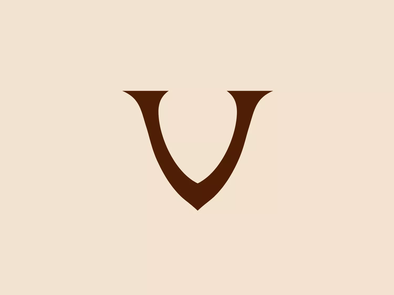
What catches our eye is the minimalist design of the Voila Leather logo, particularly the stylized, dark brown letter 'V' that exudes sophistication and modernity.
Letter
Type
Color
Style
The Voila Leather logo is a minimalist design featuring a stylized, dark brown letter ‘V’. This ‘V’ is formed by two bold, diagonal strokes that converge at a sharp point at the bottom and open at the top, creating symmetry and balance. The rich, deep shade of the ‘V’ stands out against a light background, giving a modern and clean aesthetic that suggests sophistication and a contemporary brand identity.
Tas Voila is dedicated to creating handcrafted products using authentic, high-quality materials infused with care and dedication. The company stands behind its commitment to excellence with a lifetime guarantee, underscoring the enduring quality of each Tas Voila creation.
Similar logos
NEW

The Motorola logo features a stylized letter 'M' in bright white, set against a circular vibrant blue backdrop. The 'M' has a modern geometric design with pointed vertices at the top and a wave-like link between the two legs of the letter at the bottom, resembling mountain peaks. The contrast and simplicity of the design give it a clean, crisp, and easily recognizable aesthetic. A light, neutral shade such as pale pinkish-tan is a suitable background color that complements its vibrant tone while ensuring the white 'M' stands out.
NEW

The Prince Hotels logo is a stylized monogram with an elegant script typeface that combines the letters "L" and "P". Its sweeping curves and fine lines create a sense of fluidity and sophistication. The aesthetic is classic and refined, suggesting a brand that values tradition and fine craftsmanship. The color of the logo is a deep, rich brown, which gives it a warm and inviting appearance. Given the logo's luxurious and classic style, a light and subtle background that does not compete with the design would be complementary.
NEW

The business logo for Asgrow features two distinct shapes overlaid on one another with a sleek, modern design. The primary shape is a green right-angled triangle with a slightly curved hypotenuse, giving it a dynamic and forward-moving appearance. The secondary shape is a brown, flattened oval that intersects the triangle, peaking from its bottom right corner. The combination creates the impression of motion and interconnectivity. The colors are bold and earthy, suggesting a theme of growth, nature, or sustainability merged with innovation.
NEW

The Sincol logo features an abstract, three-dimensional geometric figure that resembles a stylized, incomplete cube constructed from separate parallelogram shapes. The design has a modern and minimalistic aesthetic with only three colors: a rich brown, a vibrant red, and a clean white background that highlights the figure. The shapes are arranged in a way that creates a sense of depth and motion, as if the parts of the cube are either assembling or disassembling. The outer square boundary, in a subtle red, frames the design neatly. Given the current color scheme of the Sincol logo, a light but slightly contrasting background would complement it well.
NEW

The logo presented is a simple, stylish design consisting of two mirrored shapes that resemble the letter "M". The design is abstract and minimalistic, with no additional embellishments or text. Its color is a solid, warm shade of brown, giving it a modern and professional look. The overall aesthetic is clean and sophisticated, likely to appeal to contemporary businesses seeking an elegant visual identity.
NEW

The Polish Translators Association logo features an abstract design that seamlessly integrates the letter "T" with a book-like structure. The solid, dark brown color scheme exudes professionalism and scholarly sophistication. The top part of the "T" extends horizontally on both sides, creating an open book cover effect, while also clearly representing the letter "T". The logo's clean and modern lines, characterized by right angles and no extraneous elements, contribute to its robust and streamlined aesthetic.
NEW

The EMT Packing logo is a stylized, geometric depiction of a three-dimensional cube or hexahedron-like shape. It utilizes a palette of brown and beige colors, with contrasting dark brown edges and lighter faces to create depth. The logo features thick outlines and a clean, modern aesthetic. It is minimalistic yet conveys solidity and structure, likely representing stability or reliability in the associated brand. Given the design and colors, a light and neutral background would complement it well.
NEW

The Bazar Posnanski logo showcases a bold, capitalized letter 'B' in a serif font, set within a circular border. The border has two concentric circles with a gap, creating depth. Four evenly spaced horizontal lines create a dynamic burst effect, drawing attention to the central letter. The logo's rich, dark brown color exudes tradition and reliability, while the overall design exudes classic sophistication with a touch of vintage charm.
NEW

The Orfeu logo is a stylized, abstract representation of a nature-inspired theme. It features two symmetrical halves arranged vertically, with three curved, horizontal stripes on each side suggesting movement or organic growth. The design is simple and modern, using a single warm brown color, denoting natural origins and earthiness. The smooth, rounded shape of the logo gives it a friendly and approachable look.
NEW

The Urbane Coffee logo showcases a stylized cup or mug viewed from the top, with the letter 'U' seamlessly integrated into its design. The main shape resembles a 'U' or a horseshoe, drawn with smooth, symmetrical curves. The color palette includes dark brown, mint green, and a lighter shade of green, creating a modern and clean aesthetic. The bold dark outline contrasts with the soft green tones, accentuating the iconic shape and lending an organic, comforting feel. The logo strikes a balance between simplicity and a creative twist, embodying a contemporary look while remaining approachable.