Homedics


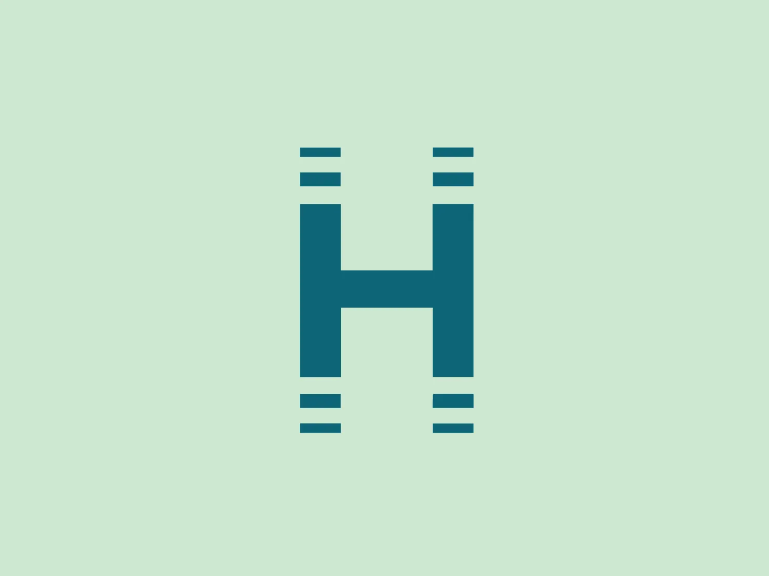
We like the modern and clean stylized letter 'H' in bold teal or turquoise color with a minimalist sans-serif font.
Letter
Type
Color
Style
The Homedics logo depicts a modern and clean stylized letter 'H' in bold teal or turquoise color. This H features a minimalist sans-serif font with clean lines and squared-off edges, exuding a contemporary and professional look. The letter is structured with two vertical pillars connected by a horizontal bar, adorned with slightly detached horizontal lines for contrast and depth, while maintaining a monochromatic scheme.
Homedics is a prominent global manufacturer of health and wellness products designed to promote relaxation, reduce stress, and enhance overall well-being.
Similar logos
NEW

The Waymo logo depicts a stylized letter "W" with a modern and dynamic design. It is composed of three overlapping, geometric shapes that are rounded at the ends, suggesting fluidity and movement. The color palette includes a gradient ranging from a bright teal to a deeper blue-green, creating a sense of depth and vibrancy. The overall design aesthetic is clean, contemporary, and would likely appeal to a tech-savvy or forward-thinking audience. The fluid form and gradient give the Waymo logo a sense of innovation and approachability.
NEW

The Ciklum logo features a stylized letter "C" created using curved lines or arcs that decrease in size towards the center, evoking a sense of inward motion or a ripple effect. The color gradient ranges from a deep, vivid blue to a bright turquoise, suggesting fluidity and dynamism. The overall design aesthetic is modern, clean, and would likely be associated with technology, communication, or water themes due to its fluid-like appearance. The different shades of blue impart a professional and soothing visual experience.
NEW

The Moises AI logo is a modern and minimalistic design featuring three wave-like curves that undulate symmetrically, forming a pattern reminiscent of water waves or audio frequencies. Rendered in a vibrant turquoise color, the shapes are clean with rounded edges, conveying a sense of softness and approachability.
NEW

The Ramsauer logo features a stylized letter "R" contained within a circle. The design is minimalistic, with the right side of the "R" extending beyond its usual form to create a fluid, dynamic look that breaks the circular boundary on the right side, giving the appearance of motion or progress. The color is a rich, bold teal, which stands out with a modern and sleek vibe. The logo's simplicity suggests a contemporary brand identity with an affinity for elegance and innovation.
NEW

The logo presented for Photopea is a simplistic and modern design consisting of a single white spiral shape set against a flat teal square background. The spiral starts from the border near the lower-left corner and curves inward towards the center of the square, resembling a stylized letter "P" or a nautilus shell. The white spiral on the teal creates a striking contrast, making the logo memorable and visually impactful. Overall, the design is clean with a balance between organic curves and geometric form.
NEW

The DMarket logo features an abstract, stylized design resembling a forward-pointing arrow within a hexagon. A single, continuous ribbon twists to form the arrow and hexagon perimeter, conveying motion and direction. The gradient color creates a 3D effect, ranging from deep turquoise to lighter teal. This modern, sleek aesthetic suggests dynamism and innovation, with a subtle shadow adding to the sense of movement.
NEW

The SABC 3 logo features a stylized number 3 at its center, depicted in a bold, sans-serif typeface with a slight italicization, giving it a dynamic feel. Surrounding the numeral is a series of concentric circles made up of slices that alternate in color. These slices transition smoothly through a spectrum of cool hues, ranging from deep purples, blues, and greens to teal, creating a visual effect similar to that of a camera aperture or the blades of a turbine. The design exudes modernity and technological sophistication, hinting at dynamism and innovation. The use of gradients in the slices adds a sense of depth and dimensionality to the overall design.
NEW

The logo for UKG is a stylized smiley face composed of a thick, U-shaped figure in dark teal, evoking a mouth, paired with two solid circles above it, suggesting eyes. The design is minimalistic, modern, and friendly, with a playful touch thanks to its simple, clean lines and rounded forms. The color scheme consists of a contrasting palette where the dark teal elements stand out against a white background, providing a strong visual impact.
NEW

The Scaledrone logo is an abstract, geometric design that resembles a stylized letter "S." It is composed of two symmetrical, interlocking shapes, creating a three-dimensional effect. The color scheme features two shades of green: a light seafoam green and a slightly darker, teal-like variant, giving the logo a fresh and modern vibe. The use of negative space enhances the dimensional illusion and adds a layer of sophistication to the overall design. This logo conveys a sense of innovation and dynamism.
NEW

The Binarium logo features a stylized letter "B" with integrated circuit-like lines that suggest digital or technological themes. It uses a monochromatic color scheme, with shades of teal to create a sleek and modern vibe. The graphic lines create a visual flow from top to bottom, mimicking the pathways on a circuit board, with solid dots at the ends of lines representing connection points or nodes. The softened corners of the "B" provide a friendly yet professional aesthetic, complementing the sharpness of the circuit lines.