Gourma

15
We like Gourma's circular, bold logo with a vibrant yellow fill that exudes energy and modernity.

Gourma Logo

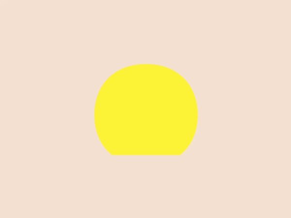
Gourma's logo is a circular design with a solid, bright yellow fill. It's a simple and bold design with a clear and unmistakable shape. The choice of a vivid yellow gives the logo a sense of energy and cheerfulness. The logo's uncomplicated form suggests ease and accessibility, a design that could be effectively used across various media and applications. Its minimalist aesthetic conveys modernity and efficiency.

About Gourma

Gourma, formerly known as Les Herbes Gourmandes (Gourmet Herbs) de St-Norbert, is a prominent greenhouse cultivation company based in Quebec. The company specializes in producing a wide variety of high-quality herbs. Gourma is a leader in the industry and has gained recognition for its commitment to sustainable and innovative farming practices.

Similar logos

The logo in the image displays a symmetrical design resembling an abstract butterfly or a pair of wings. It consists of multiple leaf-like shapes radiating from the center, creating a harmonious pattern. Vibrant colors such as pink, orange, yellow, green, light blue, and teal are used, outlined with a thin black border that enhances their individuality. The overall design aesthetic is lively and organic, suggesting a sense of growth or transformation. The black background makes the colors pop, giving the logo a bold and energetic appearance.
The Gearbest logo features a bold, black, stylized smile at its center, with the ends of the smile tapering to points. This simplistic and cheerful smile is prominently positioned against a vibrant yellow square background with rounded corners. The overall design aesthetic is modern and minimalistic, suggesting friendliness and positivity. The design's high contrast and simplicity would stand out well against a variety of backgrounds but would be particularly striking on a light, muted color to maintain its vibrancy without overwhelming its simplicity.
The Assurex Global logo features an abstract, geometric design composed of triangular formations in two shades of yellow—bright and gold— outlined with a thin, light grey border. The sharp angles and contrast give it a modern, dynamic, and professional look.
The Monday logo boasts a minimalist design with three simple geometric shapes, exuding a modern and playful aesthetic. It showcases two oblong shapes, one vibrant pink and the other bright yellow, slightly slanted and positioned in parallel, hinting at forward motion or connectivity. A small, solid green circle sits below them to the right, providing a visual anchor and adding a touch of contrast. The clean lines and bold, primary colors infuse the logo with a sense of approachability and energy.
The Miro logo comprises three bold, stylized, and slightly slanted lines enclosed within a rounded square border. These lines converge at the left, suggesting movement or direction, with the negative space between them indicating a path or choice. The deep navy blue lines create a strong visual contrast against a solid, warm yellow background, exuding a striking and energetic feel. Overall, the design is modern, dynamic, and conveys a sense of innovation and progression.
The logo presented is a stylized letter "W" formed by the interconnection of three overlapping triangles with rounded corners, conveying a sense of unity and dynamic interaction. The triangles are filled with flat, bold colors—yellow on the left, green in the center, and blue on the right—creating a harmonious yet vibrant palette that suggests creativity and energy. The design aesthetic is modern, minimalistic, and playful, with a friendly and approachable vibe. The lack of borders or outlines and the use of clean, geometric shapes provide a sleek and contemporary feel.
The Wiserr Travel logo is a contemporary, fluid design that incorporates a stylized, continuous line forming a lowercase "w". It showcases a gradient that seamlessly transitions from a deep violet to a magenta-pink, culminating in a vibrant golden-yellow, evoking dynamism and innovation. The consistent thickness of the line and its rounded ends lend a friendly and approachable feel to the logo. Additionally, the line's curvature forms a loop at the top center, adding a unique element to the design.
The Mohawk logo is a minimalistic and stylized representation of the letter 'M'. It consists of three overlapping peaks with rounded vertices, creating an effect resembling a simplified mountain range or a series of waves. The color palette includes gradients of vibrant hues, with the left peak transitioning from yellow to green, the central peak shifting from pink to purple, and the right peak fading from blue to a light teal. This gradient effect adds depth and gives the design a dynamic appearance. The overall aesthetic is modern, playful, and versatile, suitable for a variety of creative or technological applications.
The logo presented for Sovereign Sports is a stylized abstract design formed by a continuous, smooth looping line that creates a dynamic, circular motion suggestive of fluidity and forward momentum. It is monochromatic, featuring a bold and bright shade of yellow that offers a sense of energy and innovation. The design aesthetic is modern and minimalist, with the absence of additional elements allowing the unique shape to stand out as the focal point. An interesting feature is the illusion of a stylized letter 'S' created within the negative space, providing a layer of visual intrigue.
The eTactica logo showcases a simple and geometric design composed of four differently colored quarter-circle sectors arranged in a circular pattern, resembling a spinning wheel or pie chart. The transition from vibrant red to yellow, green, and blue creates a smooth and balanced look. The use of primary and secondary colors gives the logo an energetic and optimistic feel. The white negative space in the center subtly forms a 'C' shape, possibly representing the initial of the company or brand.