Varta

15
What catches our eye is the minimalist and modern design of the Varta logo, with its bold color contrast and universally recognized motif for mail and communication.

Varta Logo

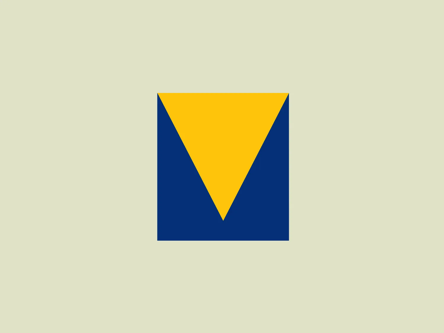
The Varta logo is a stylized representation of an envelope formed by simple geometric shapes. It features a large blue rectangle as the base of the envelope and an inverted yellow triangle as the flap. The design is minimalist with bold color contrast, using flat colors without gradient or shadow for a modern and clean aesthetic. The rectangular shape conveys stability and reliability, while the bright yellow triangle adds a dynamic element, suggesting movement or opening, in a universally recognized motif associated with mail and communication.

About Varta

Varta is a leading German company specializing in the manufacturing of batteries for the global automotive, industrial, and consumer markets. The company is widely recognized for its innovation and leadership in the microbattery sector, and it holds a prominent position as a market leader for hearing-aid microbatteries.

Similar logos

The Mobileye logo features a stylized letter 'n' with a distinct geometric design. It is comprised of bold, straight lines with sharp angles, creating a modern and minimalist aesthetic. The main component of the logo is a deep blue color, giving it a professional and trustworthy feel. The design is simple yet striking, with the use of negative space on the left side that could be interpreted as an abstract arrow or a partial square bracket, which adds an element of dynamism and forward-thinking to the overall design.
The image depicts the Akku Vertrieb logo with a bold, geometric design primarily using a bright blue color. The logo resembles an abstract depiction of an uppercase 'A' without the crossbar. It consists of three parallelogram shapes that form a stylized 'A' with white lines creating separation between them, adding a dynamic and layered effect. The design is sharp, modern, and conveys a sense of stability and professionalism. The simplicity and use of negative space give it a clean and versatile look, suitable for various applications.
The Unilever logo appears to consist of intricate and stylized illustrations forming a shield-like shape. The design features a collection of floral and organic patterns, ranging from leaves and flowers to abstract swirls, all densely packed to create a cohesive emblem. It is monochromatic, using a deep blue color which gives it a classic and professional appearance. The contrast between the negative space and the blue areas creates an engaging and dynamic visual effect, suggesting detail and craftsmanship. The logo has a symmetrical layout that adds to its balanced and harmonious look.
The Breitling logo depicts a stylized, fluid letter "B" with elongated, curved strokes, giving it an elegant and dynamic appearance. The design is minimalist, using a bold golden yellow color that suggests luxury, quality, and sophistication. The overall aesthetic is modern and sleek, with a sense of movement and possibly creativity, hinted by the smooth lines that evoke a sense of continuity. Given the vibrancy of the golden hue, a subtle and light background would complement it well without competing for attention.
The Basis London logo presents a modern and minimalist stylized combination of geometric shapes that form the letter 'B'. The design consists of intersecting straight lines and curves in a dark blue or navy color, creating an illusion of three-dimensional layering. The negative space within the circular element adds to the overall balance and visual interest of the design.
The Commodore logo features a large, bold, blue letter "C" that encircles a smaller red shape resembling a right-pointing arrow or a play button symbol. The stark contrast between the blue and red hues creates a striking and modern aesthetic. The absence of additional elements or embellishments underscores a commitment to clarity and efficiency in the design, striking a balance between visual impact and straightforward symbolism.
The Telstra logo features a stylized uppercase letter "T" in bold, sans-serif font, and an abstract oval-like shape underneath. The vivid blue of the "T" exudes professionalism and trust, while the warm coral red of the shape adds a dynamic and energetic feel. The modern, simplistic aesthetic is characterized by clean lines and curves suggesting movement or stability. The red shape resembles a swoosh or pathway, implying progress or a journey.
The United Healthcare logo is a modern, abstract image composed of five vertical, parallel bands forming a stylized shield shape. The bands are uniformly spaced, cascading downwards and gradually decreasing in width from left to right. They taper to suggest depth and movement, with the leftmost band being the broadest, symbolizing the backbone of the shield. The deep, rich blue color conveys professionalism and stability. This minimalist design is associated with a corporation or entity that values strength, protection, and forward momentum. For a background that complements the logo without overwhelming it, a subtle and light hue would be ideal.
The WildBrain logo features three stylized, abstract figures in various shades of blue, resembling a trio of birds or perhaps aquatic creatures, positioned side by side with their body shapes converging at the base. The figures have a minimalist look, with a smooth, rounded top edge that tapers down to a point. Each figure also contains a simple, circular black eye, adding a touch of character and life to the design. The shapes are devoid of intricate details, favoring a clean and modern aesthetic. Considering the cool blue tones, a soft, contrasting background color would complement the logo without overpowering it.
The Nationale Nederlanden logo exhibits a modern and dynamic design, featuring a stylized letter "N" enclosed within a circular shape. The minimalist "N" showcases sharp angles and a bold presence, with a gradient color scheme transitioning from vibrant orange to deep yellow, evoking energy and innovation. The circular background lends a sense of inclusivity or a global perspective, while the clean lines and digital feel make it suitable for a brand associated with technology, creativity, or communication.