Younium

15
The Younium logo features three stylized geometric shapes in coral red, mustard yellow, and teal, creating a modern, minimalist, and dynamic aesthetic with versatile appeal.

Younium Logo

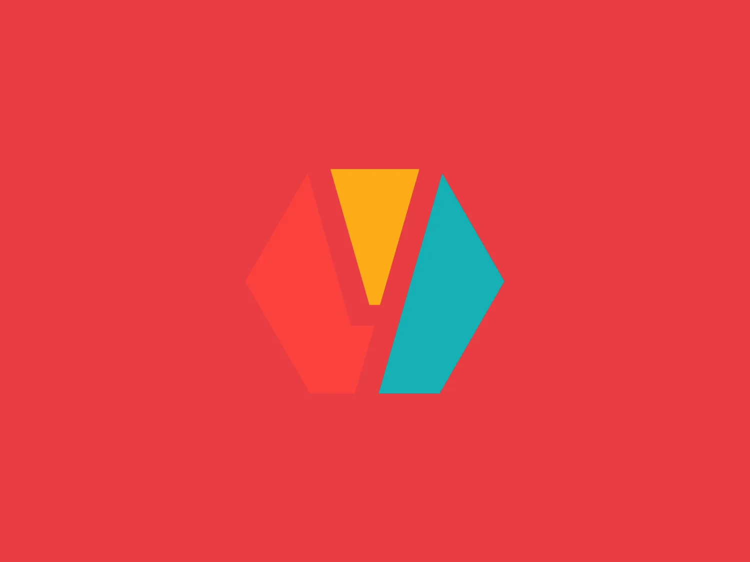
The Younium logo features three stylized geometric shapes resembling shards or crystals. The left icon is a bright coral red, the central one is a mustard yellow, and the right one is a teal. These shapes create a circular flow suggesting unity or a dynamic process. The overall aesthetic is modern and minimalistic, using flat colors and simple forms without gradients or shading, and all components have sharp angles and flat surfaces, giving the logo an edgy, contemporary feel. It is a versatile design that could represent a variety of modern, energetic, and forward-thinking brands. The hexcode for the coral red color is #F7DED6.

About Younium

Younium offers a comprehensive SaaS platform tailored to optimize B2B subscription management, invoicing, billing, financial reporting, and data insights. Through seamless integration with a company's existing systems, Younium aims to streamline these processes for improved efficiency and accuracy.

No items found.

Similar logos

The Angi logo showcases a sleek "A" in a vibrant coral red color. Its modern and minimalistic design includes a flowing curve that creates an engaging loop at the base, imparting a friendly and professional look. The bold typeface with smooth edges balances thick and thin strokes, exuding both weight and elegance. The logo's style and color suggest a preference for a complementary background that doesn't overshadow it.
The logo in the image displays a symmetrical design resembling an abstract butterfly or a pair of wings. It consists of multiple leaf-like shapes radiating from the center, creating a harmonious pattern. Vibrant colors such as pink, orange, yellow, green, light blue, and teal are used, outlined with a thin black border that enhances their individuality. The overall design aesthetic is lively and organic, suggesting a sense of growth or transformation. The black background makes the colors pop, giving the logo a bold and energetic appearance.
The Generale Bank logo is a minimalist design featuring a bold and modern 'G' created with sharp lines and curves. The solid, white letter sits centrally against a vibrant, flat, coral red square background. The 'G' has a geometric quality with its upper case form and is designed with a cutout that cleverly contributes to reading the letter correctly. The contrast between the bright white and the bold red makes the logo pop, indicative of a brand that aims to be seen as energetic and confident.
The Mycall logo features two overlapping geometric shapes resembling rounded hills or semi-circles. The one on the left is colored in a rich coral red, while the right shape is a bold magenta, creating a sense of vibrancy and energy. The portion where the shapes overlap appears in a blended hue due to the transparency effect, giving the design a modern, layered look. The silhouette's simplicity and the absence of text or additional elements contribute to a minimalist and contemporary aesthetic that could be versatile for various branding applications.
The Mohawk logo is a minimalistic and stylized representation of the letter 'M'. It consists of three overlapping peaks with rounded vertices, creating an effect resembling a simplified mountain range or a series of waves. The color palette includes gradients of vibrant hues, with the left peak transitioning from yellow to green, the central peak shifting from pink to purple, and the right peak fading from blue to a light teal. This gradient effect adds depth and gives the design a dynamic appearance. The overall aesthetic is modern, playful, and versatile, suitable for a variety of creative or technological applications.
The Motive logo features a sequence of three stylized shapes that resemble vertical waves or ribbons with a dynamic, flowing appearance. The color of the shapes is a bold teal/turquoise, which suggests a sense of innovation and freshness. The simplicity of the design, with its smooth curves and lack of additional ornamentation, gives it a modern and minimalist aesthetic. The shapes are evenly spaced and aligned in a way that creates a sense of motion and continuity. Considering the vibrant color of the logo, a muted and light background would complement it well.
The Road Media Group logo features a stylized letter 'R' with a modern and fluid design. The letterform has soft, rounded edges and a distinctive cut-out on its right leg, giving it a unique and contemporary appearance. Its color is a soothing, pastel teal with a slight gradient that adds depth to the flat design, making it look sleek and professional. The thickness of the line varies slightly throughout the design, which accentuates the letter's curves and edges, enhancing its dynamic feel.
The 8 Percent logo features a minimalistic design with a stylized number "8" that has a modern and fluid look. The smooth curves and circular forms intertwine to create a balanced and symmetrical figure. The vibrant teal-like shade stands out for its brightness and clarity while the simplicity of the design allows for versatility across various mediums.
The Pleco Ceramics logo features a stylized lowercase letter 'p' with a bold and fluid design. The main body of the 'p' resembles a loop, with a tail that flows downward and curls slightly to the right, ending in a rounded dot. The overall shape suggests movement and modernity. The color of the logo is a deep, teal-like green, which gives it a professional yet dynamic feel. The design aesthetic is minimalistic and contemporary, with the absence of any additional embellishment or text. Given the logo's color and style, a soft and neutral background that complements but doesn't overwhelm the logo would be ideal.
The WCS logo features a stylized 'W' shape comprised of three overlapping, rounded peaks, each with a distinct gradient. The left peak gradient flows from teal to a dark forest green, the middle transitions from the same forest green to a more moderate olive green, and the right peak morphs from olive green into a muted blue. The aesthetic is modern and minimalist, with clean lines and the use of gradient colors adding depth and movement to the design. The logo conveys a sense of dynamism and interconnectedness through its overlapping elements.