Motel One


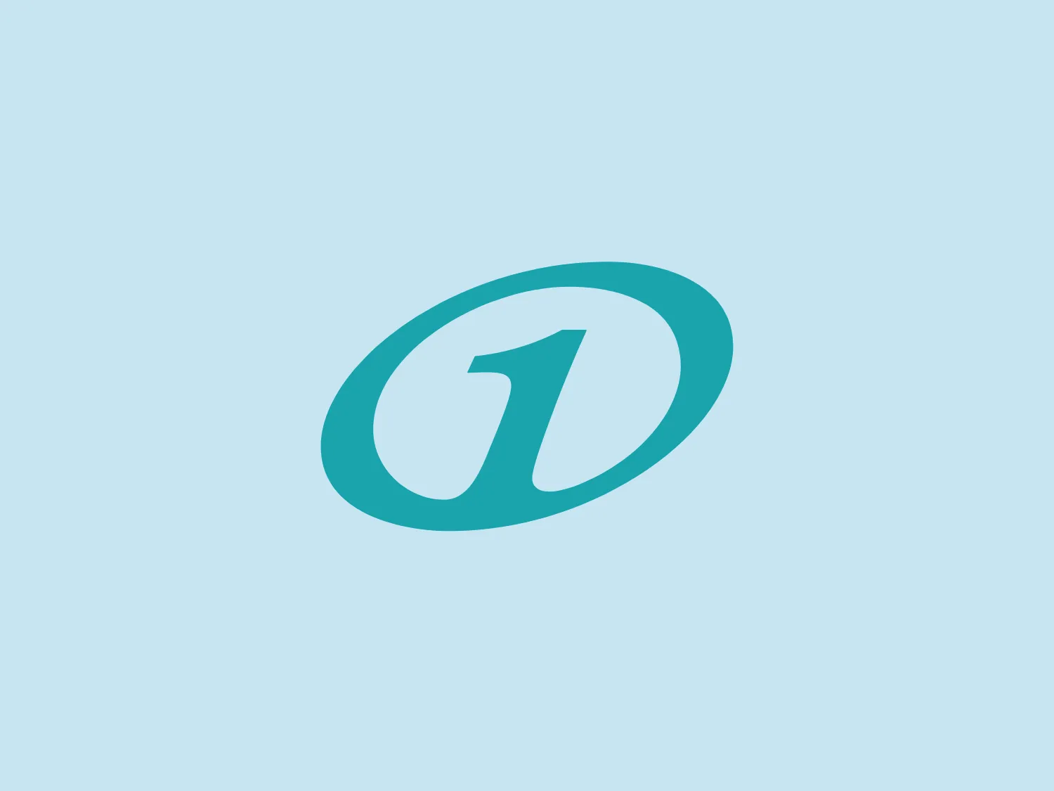
What catches our eye is the contemporary, flowing design of the Motel One logo, with its stylized lowercase 'd' and the gradient from cyan to teal, giving it a fresh and dynamic appearance.
Letter
Type
Color
Style
The Motel One logo showcases a contemporary, flowing design with a stylized lowercase letter 'd' enclosed within an elliptical ring. The gradient of cyan to teal lends a fresh and dynamic appearance, while the sleek curves of the 'd' imply motion and connectivity. The enclosing shape suggests inclusivity or protection, exuding a professional yet approachable vibe suitable for tech or communication brands. The gradient adds depth and dimensionality to make the logo stand out.
Motel One is a German budget hotel chain established in 2000 by Dieter Müller, a former manager at Accor. The company stands out for its well-crafted interiors, unique design, top-notch service, and central city locations, all offered at attractive rates.
Similar logos
NEW

The Waymo logo depicts a stylized letter "W" with a modern and dynamic design. It is composed of three overlapping, geometric shapes that are rounded at the ends, suggesting fluidity and movement. The color palette includes a gradient ranging from a bright teal to a deeper blue-green, creating a sense of depth and vibrancy. The overall design aesthetic is clean, contemporary, and would likely appeal to a tech-savvy or forward-thinking audience. The fluid form and gradient give the Waymo logo a sense of innovation and approachability.
NEW

The logo for Luma AI showcases a stylized, geometric design with two overlapping planes. The primary shape resembles a three-dimensional rhombus or skewed cube, creating depth and perspective. A vibrant cyan transitions smoothly to a rich, deep blue, suggesting movement and energy. The overall aesthetic is modern and dynamic, with clean lines and a minimalist approach, conveying a sleek, professional image.
NEW

The logo presented for Photopea is a simplistic and modern design consisting of a single white spiral shape set against a flat teal square background. The spiral starts from the border near the lower-left corner and curves inward towards the center of the square, resembling a stylized letter "P" or a nautilus shell. The white spiral on the teal creates a striking contrast, making the logo memorable and visually impactful. Overall, the design is clean with a balance between organic curves and geometric form.
NEW

The DMarket logo features an abstract, stylized design resembling a forward-pointing arrow within a hexagon. A single, continuous ribbon twists to form the arrow and hexagon perimeter, conveying motion and direction. The gradient color creates a 3D effect, ranging from deep turquoise to lighter teal. This modern, sleek aesthetic suggests dynamism and innovation, with a subtle shadow adding to the sense of movement.
NEW

The SABC 3 logo features a stylized number 3 at its center, depicted in a bold, sans-serif typeface with a slight italicization, giving it a dynamic feel. Surrounding the numeral is a series of concentric circles made up of slices that alternate in color. These slices transition smoothly through a spectrum of cool hues, ranging from deep purples, blues, and greens to teal, creating a visual effect similar to that of a camera aperture or the blades of a turbine. The design exudes modernity and technological sophistication, hinting at dynamism and innovation. The use of gradients in the slices adds a sense of depth and dimensionality to the overall design.
NEW

The logo for UKG is a stylized smiley face composed of a thick, U-shaped figure in dark teal, evoking a mouth, paired with two solid circles above it, suggesting eyes. The design is minimalistic, modern, and friendly, with a playful touch thanks to its simple, clean lines and rounded forms. The color scheme consists of a contrasting palette where the dark teal elements stand out against a white background, providing a strong visual impact.
NEW

The Scaledrone logo is an abstract, geometric design that resembles a stylized letter "S." It is composed of two symmetrical, interlocking shapes, creating a three-dimensional effect. The color scheme features two shades of green: a light seafoam green and a slightly darker, teal-like variant, giving the logo a fresh and modern vibe. The use of negative space enhances the dimensional illusion and adds a layer of sophistication to the overall design. This logo conveys a sense of innovation and dynamism.
NEW

The Binarium logo features a stylized letter "B" with integrated circuit-like lines that suggest digital or technological themes. It uses a monochromatic color scheme, with shades of teal to create a sleek and modern vibe. The graphic lines create a visual flow from top to bottom, mimicking the pathways on a circuit board, with solid dots at the ends of lines representing connection points or nodes. The softened corners of the "B" provide a friendly yet professional aesthetic, complementing the sharpness of the circuit lines.
NEW

The Katalon logo features two geometric shapes with a modern and minimalist design aesthetic. The primary shape is a large, solid black parallelogram, conveying stability and forward motion. Below and to the right, there's a smaller square in a bright teal color, adding vibrancy and suggesting innovation. The overlap of the two shapes conveys depth and interaction, while the stark color contrast creates a striking visual appeal. The simplicity of the design allows for versatility in various applications while maintaining a distinctive look.
NEW

The logo in the image is a modern and geometric design that consists of two parallelograms leaning against each other, creating a stylized letter 'N' for Intersystems. One of the parallelograms is a rich navy blue (#273B7A), while the other is a vibrant teal (#00A79D), suggesting a dynamic and contemporary vibe. The shapes are balanced and simple, yet they convey depth through the use of shading and the overlapping design. The contrast between the colors gives the logo an energetic feel. Due to the cooler tones of the logo, a subtle warm background color would complement it well. Hexcode: #F3DDEB.