Finnovex


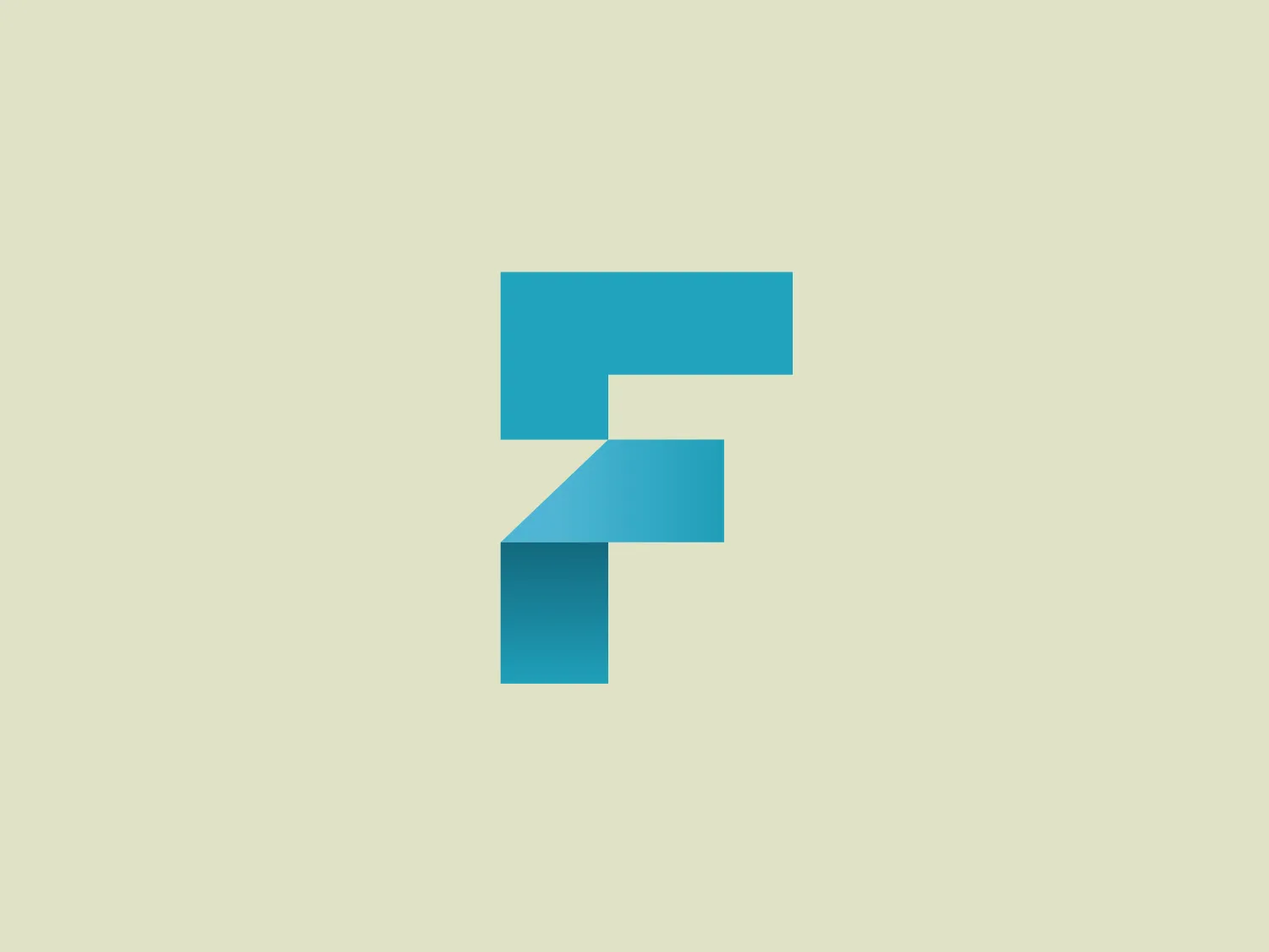
What catches our eye is the stylized letter 'F' in a bold turquoise color, exuding a modern and energetic feel, with a tech-oriented aesthetic.
Letter
Type
Color
Style
The Finnovex logo features a stylized, geometric letter 'F' constructed from two elongated, right-angled shapes with a parallel gap running through the middle. Rendered in a bold turquoise color, the design exudes a modern and energetic feel. Its minimalist and clean design, along with the use of negative space within the 'F', adds visual interest. This logo has a digital or tech-oriented aesthetic, making it a good fit for contemporary branding themes.
Finnovex is a series of summits focused on the future of financial services and how disruptive innovations are changing the way these services are structured, provided, and utilized.
Similar logos
NEW

The Ciklum logo features a stylized letter "C" created using curved lines or arcs that decrease in size towards the center, evoking a sense of inward motion or a ripple effect. The color gradient ranges from a deep, vivid blue to a bright turquoise, suggesting fluidity and dynamism. The overall design aesthetic is modern, clean, and would likely be associated with technology, communication, or water themes due to its fluid-like appearance. The different shades of blue impart a professional and soothing visual experience.
NEW

The Moises AI logo is a modern and minimalistic design featuring three wave-like curves that undulate symmetrically, forming a pattern reminiscent of water waves or audio frequencies. Rendered in a vibrant turquoise color, the shapes are clean with rounded edges, conveying a sense of softness and approachability.
NEW

The Ramsauer logo features a stylized letter "R" contained within a circle. The design is minimalistic, with the right side of the "R" extending beyond its usual form to create a fluid, dynamic look that breaks the circular boundary on the right side, giving the appearance of motion or progress. The color is a rich, bold teal, which stands out with a modern and sleek vibe. The logo's simplicity suggests a contemporary brand identity with an affinity for elegance and innovation.
NEW

The DMarket logo features an abstract, stylized design resembling a forward-pointing arrow within a hexagon. A single, continuous ribbon twists to form the arrow and hexagon perimeter, conveying motion and direction. The gradient color creates a 3D effect, ranging from deep turquoise to lighter teal. This modern, sleek aesthetic suggests dynamism and innovation, with a subtle shadow adding to the sense of movement.
NEW

The Technomex logo showcases an abstract, looped design reminiscent of an intertwining figure-eight or infinity symbol. The modern and sleek appearance, defined by smooth curves and clean lines, is complemented by gradients of green and turquoise, creating a dynamic and fresh look. The color transition from a deep teal-like hue to a soft green at the tip of each loop adds depth and movement to the design. The overall aesthetic is minimalistic yet distinctive, with a color scheme suggestive of growth, sustainability, or technological innovation.
NEW

The BBC Radio 5 logo features a large, bold number '5' centered within a circle. The '5' is displayed in a clean, weighty sans-serif font, evoking reliability. The vibrant turquoise color grants a fresh, modern feel, while the circular background promotes unity. The minimalistic design, lacking additional embellishments, supports a contemporary aesthetic. The contrast between the white numeral and the colored background ensures the logo is legible and eye-catching.
NEW

The Homedics logo depicts a modern and clean stylized letter 'H' in bold teal or turquoise color. This H features a minimalist sans-serif font with clean lines and squared-off edges, exuding a contemporary and professional look. The letter is structured with two vertical pillars connected by a horizontal bar, adorned with slightly detached horizontal lines for contrast and depth, while maintaining a monochromatic scheme.
NEW

The Relo logo consists of three solid-colored squares arranged in an abstract geometric design to form a stylized letter "L" or a right-angle shape. The squares are navy blue (#000080), turquoise (#40E0D0), and a medium shade of yellow (#FFD700), giving the logo a vibrant and modern aesthetic. The straight edges and corners denote stability and structure, while the varying colors can imply diversity or a multifaceted approach.
NEW

The logo presented for DFDG Architecture is a stylized letter "D" composed of geometric shapes in a tessellation pattern. The shapes that form the letter include a darker rectangle and lighter, varied trapezoidal and triangular shapes that create a sense of three-dimensionality. The color palette is a gradient of teal and turquoise tones, evoking a modern and sleek design aesthetic. The geometric concept suggests precision and cutting-edge technology. For a background that complements this logo without overpowering it, a soft, neutral color would be ideal.
NEW

The Bluewindow logo features a continuous ribbon-like design creating a stylized letter "B." The design consists of smooth lines with gentle curves, enhancing its dynamic and modern aesthetic. It utilizes a bright and engaging shade of turquoise, which is eye-catching and conveys a sense of innovation and freshness. There are no additional embellishments, which contributes to the emblem's clean and minimalist style. This simplistic yet sophisticated graphic conveys movement and connectivity, embracing a contemporary and forward-thinking brand identity.