TikTok

15
Something we like: The TikTok logo's combination of a stylized music note and the letters "d" and "j" creates a modern and dynamic aesthetic with vibrant colors.

Letter

Color

Teal
272
Pink
161

Style

TikTok Logo

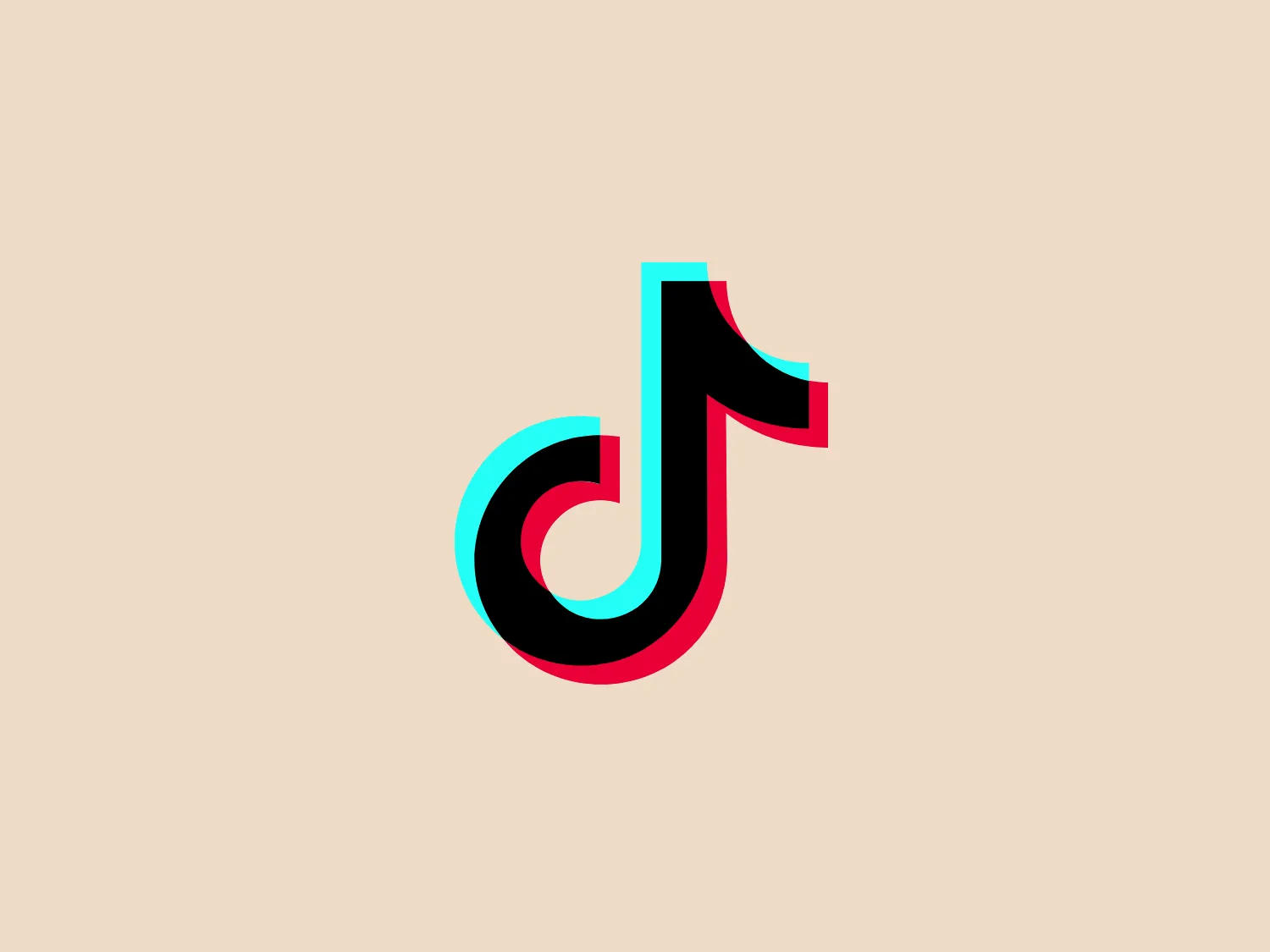
The TikTok logo depicts a stylized music note combining elements that resemble a "d" and a "j". It has a modern and dynamic aesthetic with a 3D effect, achieved through the use of shading and contrasting colors. The main body of the logo is a rich, vivid teal, outlined with a bright, neon-like pink that adds depth and a sense of motion. The overall design is clean and contemporary, with smooth curves that suggest musical flow and rhythm. Given the vibrant and saturated colors of the TikTok logo, a neutral background would complement it nicely.

About TikTok

TikTok, originally known as Douyin in China, is a popular short-video-sharing app and social network platform. The company aims to showcase global creativity, knowledge, and significant life moments, all directly from users' mobile devices.

Similar logos

The Lazada logo features a stylized three-dimensional shape reminiscent of a cube with a portion of its structure removed or invisible, creating an open corner perspective. It consists of two visible faces, with the left face in a vibrant orange and the right face in a hot pink, employing a gradient that combines the two colors seamlessly at the edge where they meet. The use of color and shading gives the logo a luminous, dynamic look, evoking a sense of innovation and modernity. There are subtle highlights and shadows on the faces that suggest depth and dimensionality. The overall design aesthetic is minimalist, bold, and contemporary, with a playful twist on geometric representation.
The DMarket logo features an abstract, stylized design resembling a forward-pointing arrow within a hexagon. A single, continuous ribbon twists to form the arrow and hexagon perimeter, conveying motion and direction. The gradient color creates a 3D effect, ranging from deep turquoise to lighter teal. This modern, sleek aesthetic suggests dynamism and innovation, with a subtle shadow adding to the sense of movement.
The Kelloggs logo is a stylized letter "K," rendered in a vibrant, solid pink/magenta color. Its design is fluid and modern, with smooth, flowing lines and tapered ends that suggest speed and dynamism. The "K" seems calligraphic, with characteristics reminiscent of a brush stroke or a signature. The design aesthetic is sleek and minimalist, appealing to contemporary sensibilities while maintaining a sense of individuality and flair. Given its color and design, a contrasting yet subtle background color would complement it well.
The Scaledrone logo is an abstract, geometric design that resembles a stylized letter "S." It is composed of two symmetrical, interlocking shapes, creating a three-dimensional effect. The color scheme features two shades of green: a light seafoam green and a slightly darker, teal-like variant, giving the logo a fresh and modern vibe. The use of negative space enhances the dimensional illusion and adds a layer of sophistication to the overall design. This logo conveys a sense of innovation and dynamism.
The logo for Winni consists of two shapes that form an overlapping heart, resembling pills or capsules. The left half is deep purple (#6A328D), and the right half is vivid pinkish-red (#EC008C). The design is modern and clean, with a clear emphasis on health or pharmaceutical themes suggested by the pill shapes. Gradients give the shapes dimension and a sense of motion or merging. The light background complements the logo without overwhelming the design. Hexcode: #F2E2D0
The Prosper Finance logo features a modern and geometric design comprising two quarter-circle shapes that form a stylized letter 'D'. The right quarter-circle is a deep and vivid red (#FF0000), while the left one features a lighter pinkish hue (#FFC0CB), against a crisp white background. The logo's clean lines and bold colors give it a dynamic and contemporary feel, suitable for a brand looking to convey innovation and energy. Hexcode: #F8DED9
The Katalon logo features two geometric shapes with a modern and minimalist design aesthetic. The primary shape is a large, solid black parallelogram, conveying stability and forward motion. Below and to the right, there's a smaller square in a bright teal color, adding vibrancy and suggesting innovation. The overlap of the two shapes conveys depth and interaction, while the stark color contrast creates a striking visual appeal. The simplicity of the design allows for versatility in various applications while maintaining a distinctive look.
The XRecruiter logo features a symmetrical, abstract design with a central cross shape composed of elongated ovals of varying sizes, overlaid in a dynamic, pinwheel arrangement. The color palette is vibrant and includes shades of purple, blue, green, and pink, with an orange dot situated below the cross, creating a sense of balance. The overall design aesthetic is modern and playful, with a sense of movement and connectivity implied by the interlocking shapes. The gradient within each shape adds depth and a digital, energetic vibe to the logo.
The logo in the image is a modern and geometric design that consists of two parallelograms leaning against each other, creating a stylized letter 'N' for Intersystems. One of the parallelograms is a rich navy blue (#273B7A), while the other is a vibrant teal (#00A79D), suggesting a dynamic and contemporary vibe. The shapes are balanced and simple, yet they convey depth through the use of shading and the overlapping design. The contrast between the colors gives the logo an energetic feel. Due to the cooler tones of the logo, a subtle warm background color would complement it well. Hexcode: #F3DDEB.
The logo presented for Photopea is a simplistic and modern design consisting of a single white spiral shape set against a flat teal square background. The spiral starts from the border near the lower-left corner and curves inward towards the center of the square, resembling a stylized letter "P" or a nautilus shell. The white spiral on the teal creates a striking contrast, making the logo memorable and visually impactful. Overall, the design is clean with a balance between organic curves and geometric form.