Hay Festival

15
What catches our eye is the modern and dynamic three-dimensional design of the Hay Festival logo, featuring stylized vertical bars in vibrant colors that convey depth and movement.

Letter

Color

Hay Festival Logo

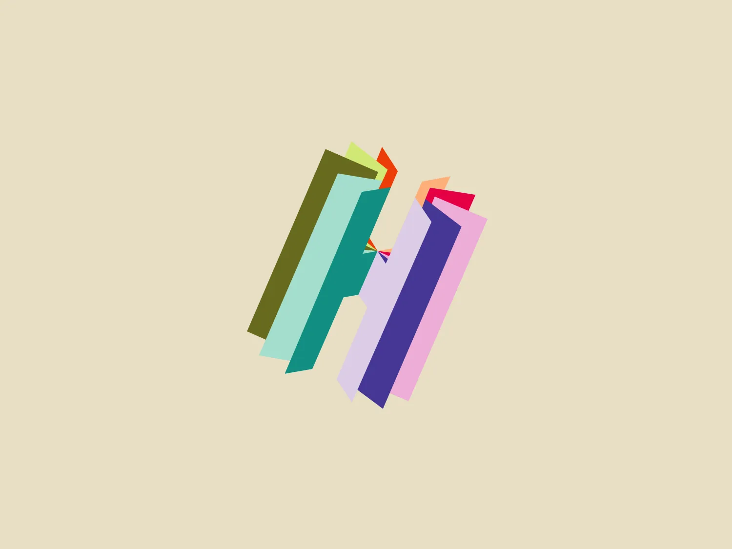
The Hay Festival logo is a modern and dynamic three-dimensional design. It features four stylized vertical bars in shades of teal, green, purple, and pink with subtle gradients and shadows, conveying depth and movement. The varying widths and heights of the bars create visual interest and a sense of progression or ascension. The overall aesthetic is vibrant, contemporary, and abstract, with a sleek and polished finish, making it well-suited for a brand looking to convey innovation or creativity.

About Hay Festival

Hay Festival is a charitable organization dedicated to fostering connections between readers and writers through sustainable events, including both live and online platforms. The organization hosts festivals globally, aiming to inspire, explore, and engage participants, while encouraging them to envision the world as it exists and its potential.

Similar logos

The Lazada logo features a stylized three-dimensional shape reminiscent of a cube with a portion of its structure removed or invisible, creating an open corner perspective. It consists of two visible faces, with the left face in a vibrant orange and the right face in a hot pink, employing a gradient that combines the two colors seamlessly at the edge where they meet. The use of color and shading gives the logo a luminous, dynamic look, evoking a sense of innovation and modernity. There are subtle highlights and shadows on the faces that suggest depth and dimensionality. The overall design aesthetic is minimalist, bold, and contemporary, with a playful twist on geometric representation.
The Matsuura logo features a stylized depiction of three overlapping, rounded shapes in a vibrant green color. The design exudes a modern and minimalist aesthetic with a nod to nature or growth themes, implying movement and connectivity. The shapes suggest leaves, pebbles, or abstract representations of increasing value/momentum.
The Kuda Bank logo features a stylized letter 'K' mirrored and joined in the middle to form a symmetrical design that resembles a chevron or arrow pointing to the left. The 'K' shapes are composed of four solid stripes with sharp angles, creating a dynamic and modern look. The color of the logo is a deep, rich purple, giving it a sense of sophistication and regality. There are no additional embellishments, allowing the clean and bold geometry of the letterforms to stand out.
The logo presents a stylized circular shape with a smaller circle connected to its upper right, resembling an abstract representation of a person or a molecule. The main circle has an even, hollow center, contributing to the minimalist design. The design is composed of a solid, deep purple color, giving it a professional and modern appearance. The logo for Fresco's simplicity makes it versatile and easily recognizable. The absence of additional elements ensures the focus remains on this unique, clean geometric form.
The BitX Capital logo showcases a stylized, abstract design with a dynamic feel. It comprises interlocking shapes resembling a three-dimensional impossible loop. The main elements consist of two intertwined ribbons with a gradation of green shades that provide a sense of depth and movement. The contrast between the lighter and darker greens enhances the interweaving effect. Overall, the logo presents a modern and clean appearance, suggesting innovation and connectivity.
The Holiday Inn logo features a stylized, abstract design that appears to be a pair of overlapping, slanted letter H's or a hash symbol (#) with a modern twist. It's composed of four bold, green lines with soft curves and slightly varied lengths, giving it a dynamic and contemporary feel. The use of negative space between the elements of the logo adds to its visual interest. The green color is vibrant and would stand well against a soft, pale background providing a contrast that is not too harsh.
The John Muir Health logo appears to be a stylized letter constructed from geometric shapes, featuring a combination of a darker and lighter shade of purple. The design is symmetric along a vertical axis, with the left side mirrored on the right. The logo consists of four distinct sections, each resembling an abstract petal or leaf shape rounded at the top and converging to a sharp point at the center bottom. The overall aesthetic is modern and minimalistic with a clean, crisp feel exuding professionalism and sophistication.
The Marberg logo features a stylized, geometric design made of three parallelograms arranged to create a sense of perspective and three-dimensionality. The shapes are aligned to give an impression of depth, with the largest at the front and the smallest at the back. It uses a solid, dark purplish color for the shapes, which adds to its modern and sophisticated aesthetic. The simplicity of the Marberg logo makes it versatile and easily recognizable.
The logo for Dashworks embodies a modern and minimalist aesthetic with a stylized arrow pointing right, adorned with a detached circle positioned to the upper left. Its deep purple color and geometric shapes create a bold and distinctive statement, signifying motion and advancement. The absence of gradients or additional ornamentation enhances its contemporary appeal.
The Kelloggs logo is a stylized letter "K," rendered in a vibrant, solid pink/magenta color. Its design is fluid and modern, with smooth, flowing lines and tapered ends that suggest speed and dynamism. The "K" seems calligraphic, with characteristics reminiscent of a brush stroke or a signature. The design aesthetic is sleek and minimalist, appealing to contemporary sensibilities while maintaining a sense of individuality and flair. Given its color and design, a contrasting yet subtle background color would complement it well.