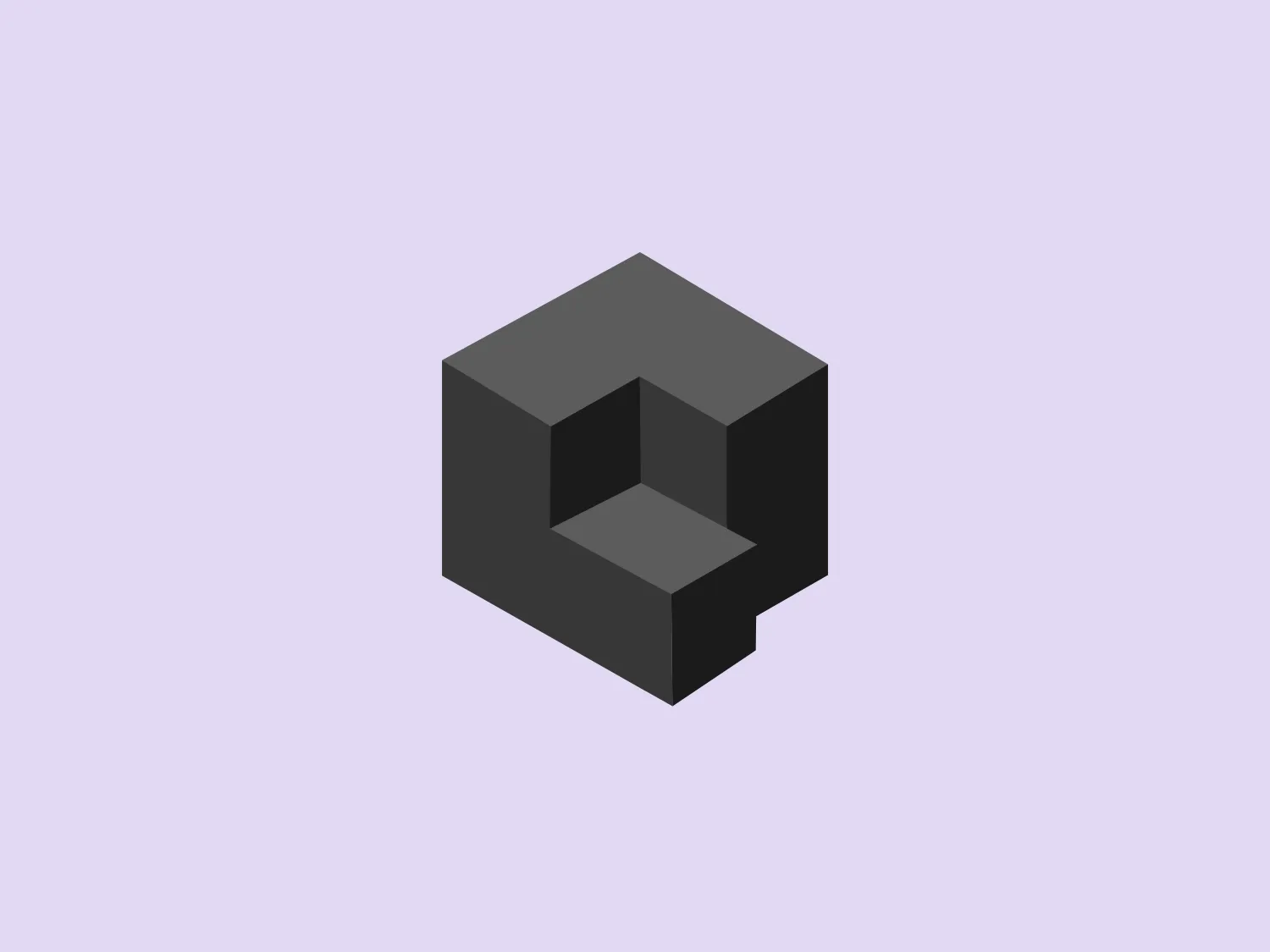
Qovery

15
Here's what we love: The Qovery logo's modern, minimalistic design exudes innovation with its clean, sharp look and dynamic 3D cube-like form.

Qovery Logo

The Qovery logo features a stylized, isometric letter or shape composed of interlocking geometric elements that create a three-dimensional cube-like form. It primarily uses two shades of purple, with the darker tone outlining and giving depth to the structure, while the lighter hue highlights the top and the left sides of the cube, simulating a light source from the upper left. The overall design aesthetic is modern and minimalistic, with a clean, sharp look that suggests innovation or technology. The use of gradients and shadow effects adds to the three-dimensional illusion.

About Qovery

Qovery Engine is a freely available abstraction layer library designed to simplify and streamline the deployment of applications on leading cloud service providers such as AWS, GCP, and Azure. With Qovery Engine, users can deploy their applications in a matter of minutes, enabling efficient and seamless cloud infrastructure management.

Similar logos

The Qmedics logo showcases a stylized letter Q in a 3D ribbon-like form with smooth, flowing curves. It incorporates warm red and pink tones transitioning to cooler purples and blues on the interior, creating a vibrant and energetic look. The modern, playful design uses gradients to convey depth and movement, evoking an aesthetic of creativity and dynamism.
The logo for Olelo showcases a stylized white speech bubble enclosed within a rounded purple rectangle. The speech bubble aligns to the right side and creates a seamless contour with the edge of the rectangle. This design choice has a clean and modern aesthetic and hints at communication, conversation, or messaging services. The color palette of white and purple offers a strong contrast that enhances visibility and brand recognition.
The logo featured for Mayo Performing Arts Center is a typographic representation consisting of two characters, possibly initials. The first character is a stylized lowercase ‘n’ with a right-angled vertex at the bottom, creating a sharp contrast to the otherwise curvaceous line that forms the letter. The second character resembles an uppercase ‘I’ with serifs at its base and top, but with unusually thick lines, giving it a bold presence. Both characters share a deep purple color, exuding luxury and professionalism. Embracing minimalism, the logo is distinguished by the simplicity and the balance between the roundness of the ‘n’ and the solidity of the ‘I,’ coming together to create a visually harmonious yet dynamic duality.
The logo for Realm showcases a modern and minimalist design, featuring a stylized, abstract depiction of a lowercase 'b'. The distinct letterform is formed by a semi-circle paired with a straight, vertical line, utilizing vibrant, solid purple color for a bold and energetic presence. The clean and contemporary aesthetic focuses attention on the brand identity, making it suitable for a light and understated background.
The Zula logo features two abstract shapes resembling speech or thought bubbles stacked with their points aligned. The upper, smaller shape is oriented horizontally, while the larger one below it has a vertical orientation. Both shapes have a modern, rounded design in a solid, deep purple color, providing a sense of unity and strength. The edges of the shapes curve inwards, creating an organic and dynamic appearance. This minimalistic design conveys communication, connectivity, and interaction.
The Nozbe logo showcases an abstract, geometric design with two intertwined shapes resembling stylized letter 'N's or arrows pointing in opposite directions. It incorporates a vibrant gradient transitioning from a purplish-pink hue to a lighter, soft pink, imparting a modern and dynamic feel. The design employs minimalist techniques, incorporating clean lines and flat surfaces to convey a sense of movement and interconnectivity. The overall aesthetic is sleek and contemporary, making it ideal for diverse branding and tech-oriented applications.
The logo in the image features an abstract, fluid shape that combines elements of both the letter 'B' and 'G'. It has a modern and dynamic aesthetic with smooth curves and a sense of motion. The design transitions from a rich blue at the top to a deep purple at the base using a gradient, giving Bridge LCS a vibrant and contemporary feel. The logo is clean, sans-serif, and suggests innovation and fluidity.
The Kuda Bank logo features a stylized letter 'K' mirrored and joined in the middle to form a symmetrical design that resembles a chevron or arrow pointing to the left. The 'K' shapes are composed of four solid stripes with sharp angles, creating a dynamic and modern look. The color of the logo is a deep, rich purple, giving it a sense of sophistication and regality. There are no additional embellishments, allowing the clean and bold geometry of the letterforms to stand out.
The Banana is Calling logo features a stylized letter combination that appears to merge an 'a' and 'b' in a dark brown color. It utilizes smooth curves and a flowing design where the vertical line of the 'b' doubles as the right side of the 'a', creating a seamless, continuous shape. The design is modern and minimalist, evoking a sense of simplicity and elegance. Given its simplicity and color, a lighter, complementary background would enhance its visibility and aesthetic appeal.
The Mohawk logo is a minimalistic and stylized representation of the letter 'M'. It consists of three overlapping peaks with rounded vertices, creating an effect resembling a simplified mountain range or a series of waves. The color palette includes gradients of vibrant hues, with the left peak transitioning from yellow to green, the central peak shifting from pink to purple, and the right peak fading from blue to a light teal. This gradient effect adds depth and gives the design a dynamic appearance. The overall aesthetic is modern, playful, and versatile, suitable for a variety of creative or technological applications.