Gong


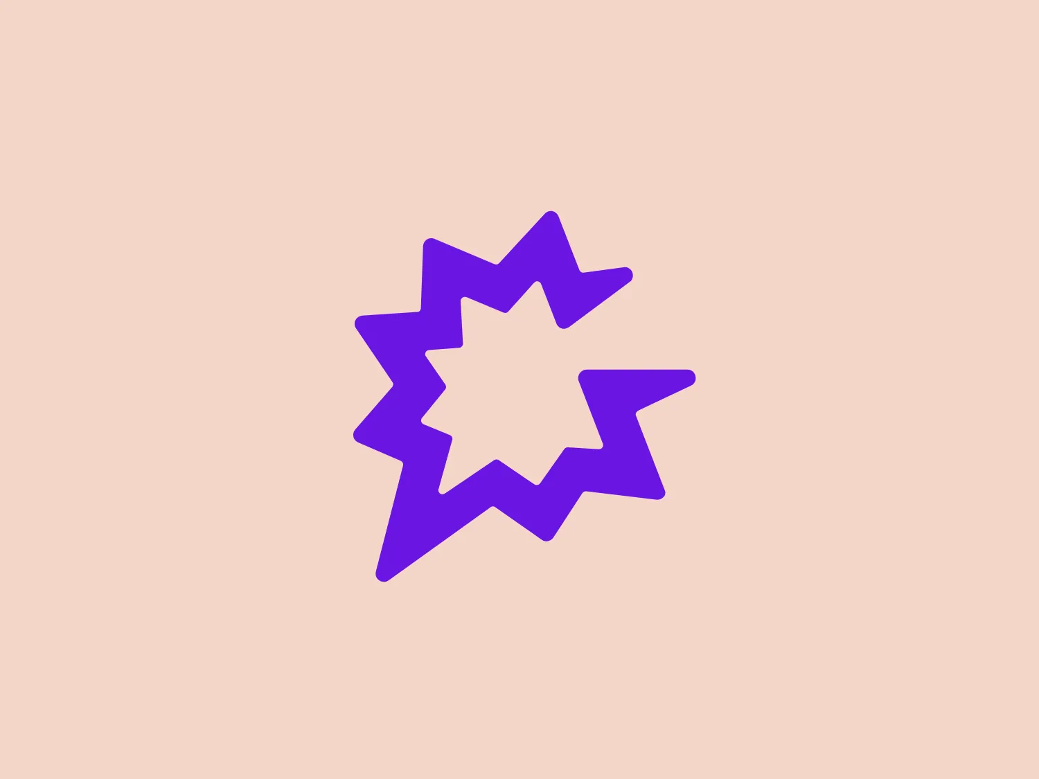
What we like about the Gong logo is its dynamic starburst design, bold purple color, and sense of energy and motion.
Letter
Type
Color
Style
The Gong logo features a dynamic starburst design with multiple layers. The central shape resembles a traditional star with points radiating outward, enclosed by a larger, jagged contour that adds a sense of energy and motion. The color is a bold and vivid shade of purple, giving the logo a modern and vibrant feel. This design offers a feeling of excitement and standout appeal, potentially conveying innovation or excellence. To complement this vibrant Gong logo, a neutral yet fresh background would be ideal.
Gong is a platform that records and analyzes customer interactions, providing actionable insights for informed decision-making. The tool enables teams to rely on data-driven insights rather than subjective opinions.
No items found.
Similar logos
NEW

The Kuda Bank logo features a stylized letter 'K' mirrored and joined in the middle to form a symmetrical design that resembles a chevron or arrow pointing to the left. The 'K' shapes are composed of four solid stripes with sharp angles, creating a dynamic and modern look. The color of the logo is a deep, rich purple, giving it a sense of sophistication and regality. There are no additional embellishments, allowing the clean and bold geometry of the letterforms to stand out.
NEW

The logo presents a stylized circular shape with a smaller circle connected to its upper right, resembling an abstract representation of a person or a molecule. The main circle has an even, hollow center, contributing to the minimalist design. The design is composed of a solid, deep purple color, giving it a professional and modern appearance. The logo for Fresco's simplicity makes it versatile and easily recognizable. The absence of additional elements ensures the focus remains on this unique, clean geometric form.
NEW

The Marberg logo features a stylized, geometric design made of three parallelograms arranged to create a sense of perspective and three-dimensionality. The shapes are aligned to give an impression of depth, with the largest at the front and the smallest at the back. It uses a solid, dark purplish color for the shapes, which adds to its modern and sophisticated aesthetic. The simplicity of the Marberg logo makes it versatile and easily recognizable.
NEW

The Resonator logo is a stylized letter 'R' crafted with bold, geometric shapes and a modern, minimalist aesthetic. It features a vibrant purple color, evoking creativity and uniqueness. The 'R' is constructed with seamless straight and curved lines, creating a sense of continuity and flow. The top part extends outward with a slight curve, while the leg is formed by a downward stroke that curls inward at the bottom, giving the logo a distinct and memorable look.
NEW

The logo presented for Proximus is a stylized, symmetric icon that resembles a combination of the letter "X" and an infinity symbol. It consists of smooth curves and loops, with the ends of the "X" shape thickening into rounded terminations, creating a sense of continuous movement or looping. The logo's color is a shade of deep purple, which adds a feel of sophistication and modernity. An interesting feature is the illusion of interweaving paths that could symbolize connection or interaction. The overall design aesthetic is minimalistic, clean, and would suit a contemporary brand or technology company.
NEW

The John Muir Health logo appears to be a stylized letter constructed from geometric shapes, featuring a combination of a darker and lighter shade of purple. The design is symmetric along a vertical axis, with the left side mirrored on the right. The logo consists of four distinct sections, each resembling an abstract petal or leaf shape rounded at the top and converging to a sharp point at the center bottom. The overall aesthetic is modern and minimalistic with a clean, crisp feel exuding professionalism and sophistication.
NEW

The logo for Dashworks embodies a modern and minimalist aesthetic with a stylized arrow pointing right, adorned with a detached circle positioned to the upper left. Its deep purple color and geometric shapes create a bold and distinctive statement, signifying motion and advancement. The absence of gradients or additional ornamentation enhances its contemporary appeal.
NEW

The logo features a stylized shield shape as the main element with a vivid purple color. On the shield, two mirrored abstract designs resembling a combination of the letter 'W' and flames or leaves in white create a dynamic and symmetrical effect. The overall design aesthetic is modern and clean, with a sense of strength and protection suggested by the shield motif. Sharp angles in the abstract design add to the assertive and energetic feel of the logo.
NEW

The logo for Planful comprises a modern and sleek design of a stylized lowercase letter 'p'. With a gradient flowing from deep royal blue to vibrant purple, the fluid and rounded shape of the 'p' seamlessly transitions from the hollowed-out circular part to the vertical stem. This contemporary and digital-friendly aesthetic suggests innovation and connectivity, enhanced by a subtle use of shadows and highlights, creating a three-dimensional effect.
NEW

The Marcha FM logo features a modern, abstract design with a flowing, ribbon-like shape. It combines two tones of color: a vibrant, deep magenta transitioning into a darker, purple shade, contributing to its dynamic and smooth appearance. The curves of the logo suggest motion and fluidity, while the tapering ends of the shape add a sense of finesse and precision. The minimalist style and the absence of any text or additional elements focus all attention on the wavelike form, making it versatile for various applications. Given its colorful nature, a neutral background would complement it well.