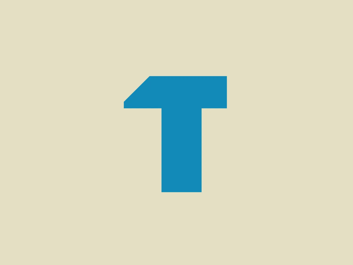
Tradify

15
What catches our eye is the modern, asymmetrical cut on Tradify's stylized "T" logo, adding movement and a minimalist feel with its clean lines and bright cyan color.

Tradify Logo

The logo displayed is a simple yet bold design, consisting of Tradify's stylized letter "T" in a bright, flat cyan color. The "T" features a unique cut on the top right corner, giving it a modern and slightly asymmetrical appearance. This geometric modification adds a sense of movement or evolution to the otherwise traditional letterform. The logo’s clean lines and lack of additional embellishments suggest a minimalist design approach, suitable for contemporary branding. The cyan color is vivid and would stand out effectively against a light pastel background.

About Tradify

Tradify offers job management software designed for trade and service businesses, enabling them to efficiently handle quoting, scheduling, job tracking, and invoicing while on the move.

Similar logos

The Brandcast logo features a stylized letter "B" composed of four distinct, quarter-circle sections that create a segmented modern look. The colors transition beautifully from a bold purple at the top left, to a deep blue at the top right, then to a bright cyan transitioning to a vibrant pink at the bottom. The design is clean and minimalist with a soft, rounded typeface. The color palette evokes creativity and innovation with a gradient that gives the illusion of a three-dimensional object. The merging of colors suggests connectivity and integration.
The Creative Folkestone logo features a series of six square shapes arranged in a 2x3 grid. Each square showcases a bold and vibrant color palette, including blue, green, pink, yellow, dark gray, and cyan. The modern and simplistic design adopts a flat color aesthetic with no gradients or shadows, giving it a contemporary and digital feel. The tightly packed squares convey a sense of cohesion and unity within the logo.
The Xspray logo features a minimalist and modern design, portraying a stylized, abstract figure combining a circular head with a cross-like body. The bright blue color with a softer cyan tone adds to its clean and friendly appearance. The logo exudes a sense of action and movement, emphasizing a minimalistic design approach without any additional embellishments or text.
The E-ridez logo showcases a circular shape with a stylized letter "Z" at the center. It consists of overlapping triangular and polygonal elements, with a gradient effect transitioning from deep violet to vibrant cyan. The design exudes a modern and dynamic aesthetic, representing movement and cutting-edge technology. The graphic elements, including sharp angles and whitespace within the "Z," contribute to the overall sense of energy and innovation in the design.
The Neos CMS logo features a stylized letter "N" with geometric facets suggesting a three-dimensional form. It employs different shades of blue, ranging from a dark navy to a brighter cyan, creating a sense of depth and dimensionality. The overall design aesthetic is modern and sleek with a tech-savvy feel. The angular segments and color gradients give the Neos CMS logo a dynamic and cutting-edge appearance.
The business logo for Global POS features a stylized geometric composition with vibrant cyan and deep purple. The design is simple yet modern, with clean lines and curves. It consists of two abstract shapes, one resembling a curved, cyan blue ribbon and the other a pair of purple elements cradling the lower part of the blue curve. The bold and unadorned elements convey a sleek and contemporary visual identity.
The Ugly Drinks logo is a stylized letter that resembles a combination of the letters "G" and "C" (or possibly a stylized "O"). It is composed of thick lines with a three-dimensional effect, featuring gradients of dark blue on the outer edges and a bright cyan blue on the inner curve, creating a sense of depth and movement. The overall design aesthetic is modern and sleek, with the use of gradients giving it a dynamic and contemporary feel. The logo is simple yet bold, ensuring easy recognition and scalability.
The logo for Mailbox features a minimalist geometric design resembling an abstract envelope or a downward-facing chevron inside a trapezoid shape. The primary color of the logo is a bright, flat cyan tone, invoking a sense of modernity and digital communication. There are no gradients or additional embellishments, emphasizing a clean and straightforward aesthetic that would suit a technology or correspondence-related brand. The sharp angles and the negative space in the center forming a 'V' or a peak add a dynamic quality to the design.
The Microsoft Edge logo features an abstract design reminiscent of a swirling wave or a dynamic circular motion, composed of two main elements that resemble a stylized letter "C". The right portion is painted in gradients of blue, cyan, and dark navy, suggesting depth and fluidity. On the left, the design transitions to a soft green, inferring energy and growth. The overall aesthetic is modern and sleek, characterized by the seamless gradient transition and the fluidity of the shapes. There's a sense of movement and connectivity in the design, perhaps symbolizing networking, communication, or environmental dynamics.
The Sentry logo is a modern and abstract design that resembles a stylized letter "S". It features a dynamic and fluid shape with a sweeping curve that forms two swirls. The logo's color gradient shifts smoothly from a deep navy blue on the left, representing professionalism and reliability, to a vibrant cyan on the right, symbolizing energy and innovation. This gradient creates a sense of motion and transformation, giving the logo a sleek, minimalistic, and contemporary appearance.