Bundle Bags

15
One thing we like about the Bundle Bags logo is the playful and modern touch created by the unique button design element within the lowercase 'b'.

Letter

Type

No items found.

Color

Bundle Bags Logo

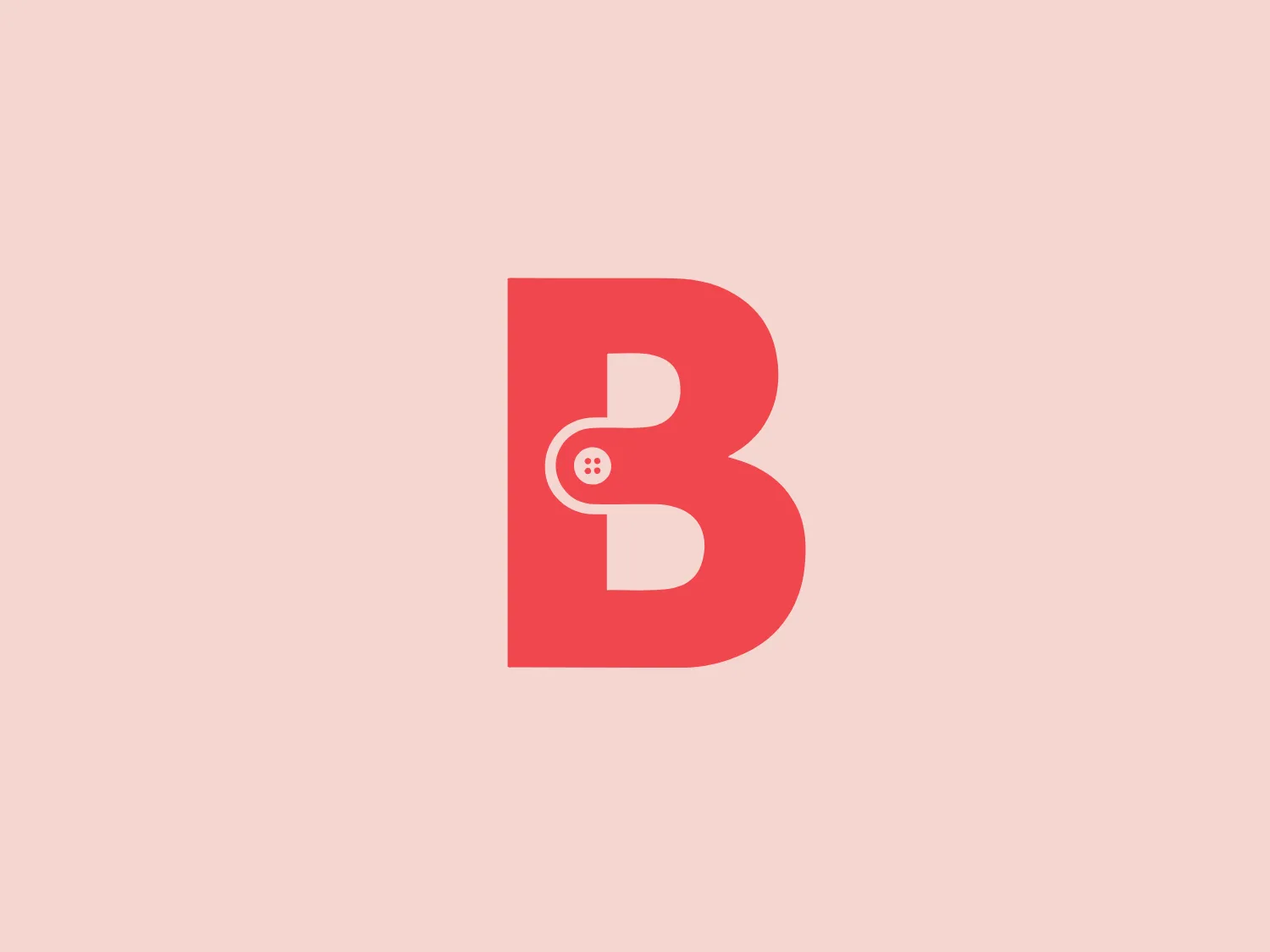
The logo for Bundle Bags features a lowercase 'b' in a solid coral red color, using a bold, sans-serif typeface. It includes a unique design element with a white circle and four smaller circles inside, resembling a button, placed within the curve of the 'b'. This adds a playful and modern touch to the logo, symbolizing connectivity or customization. The design's simplicity allows for versatility, while the button element provides a distinctive characteristic that sets it apart from a standard typographic logo.

About Bundle Bags

Bundle Bags offers carefully curated pre-packed product bundles designed for mothers' hospital stay and the arrival of their baby. These bundles prioritize high-quality, natural, and whenever feasible, organic products. Category: Maternity and Baby Care

Similar logos

The Angi logo showcases a sleek "A" in a vibrant coral red color. Its modern and minimalistic design includes a flowing curve that creates an engaging loop at the base, imparting a friendly and professional look. The bold typeface with smooth edges balances thick and thin strokes, exuding both weight and elegance. The logo's style and color suggest a preference for a complementary background that doesn't overshadow it.
The Framer logo consists of a bold, abstract geometric design that features two black shapes on a white background. These shapes resemble stylized arrowheads or triangular segments arranged back-to-back with a right angle between them, creating a dynamic and forward-moving impression. The overall design aesthetic is minimalist, modern, and hints at movement or transition. The logo's sharp angles and contrasting colors give it a striking appearance.
The Generale Bank logo is a minimalist design featuring a bold and modern 'G' created with sharp lines and curves. The solid, white letter sits centrally against a vibrant, flat, coral red square background. The 'G' has a geometric quality with its upper case form and is designed with a cutout that cleverly contributes to reading the letter correctly. The contrast between the bright white and the bold red makes the logo pop, indicative of a brand that aims to be seen as energetic and confident.
The Columbia SC logo features a vibrant, deep red rectangular background with rounded corners, creating a bold and attention-grabbing design. Centered on the background is a clean and modern white capital letter "H" with a contemporary aesthetic, featuring a slight gap between the vertical and horizontal strokes. The logo's balance of rounded edges and straight lines creates a dynamic and harmonious visual effect.
The Akon Hidrolik logo exhibits a bold and minimalist design with a black square background. Within the square, a white geometric shape forms a stylized letter "a" with a red circle at the base, evoking the imagery of a needle's eye or a focal point. The overall aesthetic is modern and contemporary, utilizing primary colors and strong contrast to enhance its visual impact. Its simplicity renders it highly recognizable and versatile.
The BETA Technologies logo features a bold, solid black letter "B" with a white lightning bolt cutting through its center, creating a modern and minimalist design. The stark contrast between the black and white elements emphasizes the strong visual impact of the logo. The lightning bolt infuses a sense of power and energy, suggesting dynamism and force. The classic, rounded attributes of the "B" combined with the edgy, contemporary feel of the lightning bolt create a striking visual identity for the business.
The logo for Olelo showcases a stylized white speech bubble enclosed within a rounded purple rectangle. The speech bubble aligns to the right side and creates a seamless contour with the edge of the rectangle. This design choice has a clean and modern aesthetic and hints at communication, conversation, or messaging services. The color palette of white and purple offers a strong contrast that enhances visibility and brand recognition.
The logo for Loja Kildare is a modern, clean design consisting of a bold and stylized letter "K." It features a striking red color with clear cutouts that create dynamic white spaces, giving the impression of forward motion or pivoting. The design is minimalist, utilizing sharp angles to convey a sense of precision and professionalism. The simplicity of the logo makes it versatile for various applications, and the contrast between the red and the white spaces adds visual interest.
The Newsela logo features a square composed of a bold, bright blue outline with a slightly darker blue fill. Inside the square, there are two white rectangular shapes that resemble an open book or a window, given the symmetry and the central divide. The design is minimalist and modern, employing simple geometric shapes and a limited color palette to convey clarity and openness. With its clean lines and uncluttered appearance, the logo exudes professionalism and a sense of transparency.
The Katerra logo comprises a stylized set of straight and angled lines organized in a manner reminiscent of an abstract or minimalist depiction of motion or speed. The monochromatic theme uses black lines on a white background, making it highly adaptable and versatile for various applications. The even weight of the lines contributes to a balanced and modern aesthetic that suggests dynamism and precision. Notably, the negative space formed by the angled lines could be interpreted as an arrow pointing to the right, which may symbolize forward movement or progress.