Miro


The Miro logo's bold, slanted lines and vibrant color scheme create a modern and dynamic feel, conveying innovation and energy.
Letter
Type
Color
Style
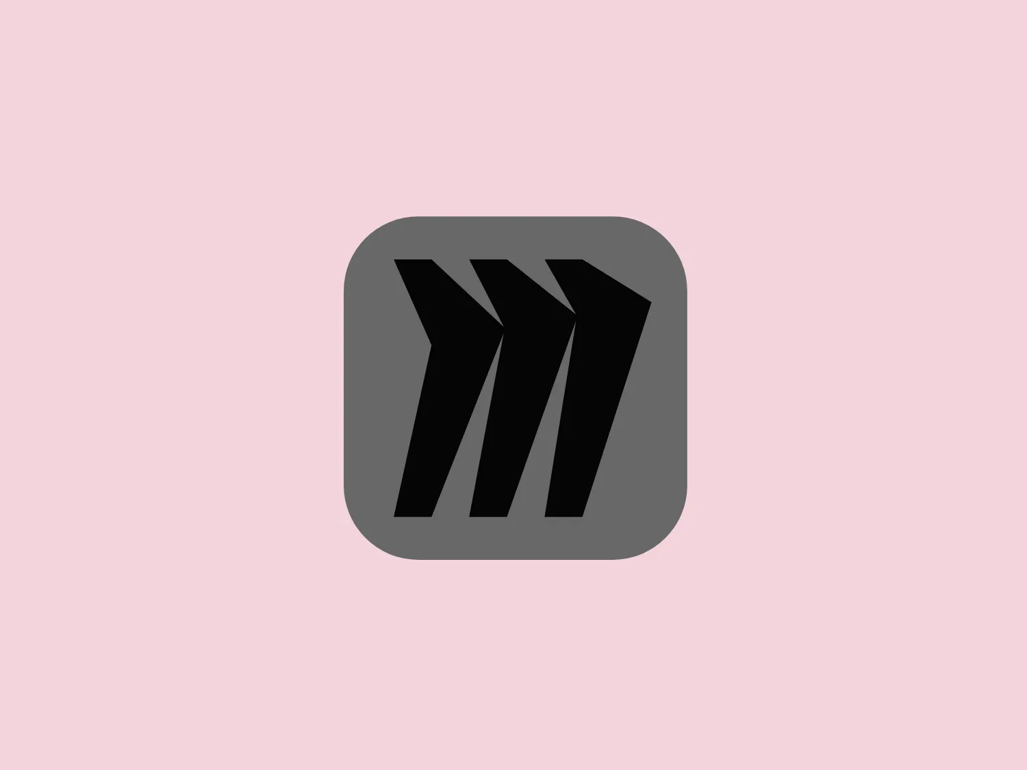
The Miro logo comprises three bold, stylized, and slightly slanted lines enclosed within a rounded square border. These lines converge at the left, suggesting movement or direction, with the negative space between them indicating a path or choice. The deep navy blue lines create a strong visual contrast against a solid, warm yellow background, exuding a striking and energetic feel. Overall, the design is modern, dynamic, and conveys a sense of innovation and progression.
Miro is a widely-used online collaborative whiteboard platform, with over 30 million users, including 99% of the Fortune 100 companies. The platform is designed to facilitate effective teamwork for distributed teams.
Similar logos
NEW

The Airbus Ventures logo features two overlapping geometric shapes forming an abstract mountain or a stylized letter "A." The deep navy blue color scheme exudes a professional and modern feel. The first shape is a right-angled triangle with its hypotenuse on the left and the smallest angle pointing downwards. The second shape follows the sloping right side of the triangle and curves inward to form a peak, creating an interlocking effect. This minimalistic design is bold and simple, making the logo versatile and easily recognizable.
NEW

The logo features a bold, uppercase letter 'T' centralized within an oval outline. The 'T' has a modern and sturdy design, presenting straight lines and squared edges that convey a sense of stability and strength. The color of both the 'T' and the oval border is a deep, navy blue, which adds to the professional and authoritative feel of the logo. The oval provides a sense of continuity and enclosure, framing the letter neatly and giving it prominence. There is an adequate amount of space between the 'T' and the oval border, highlighting the letter and making it the focal point. The simplicity of the design allows for versatility and clarity when displayed across various mediums.
NEW

The Breitling logo depicts a stylized, fluid letter "B" with elongated, curved strokes, giving it an elegant and dynamic appearance. The design is minimalist, using a bold golden yellow color that suggests luxury, quality, and sophistication. The overall aesthetic is modern and sleek, with a sense of movement and possibly creativity, hinted by the smooth lines that evoke a sense of continuity. Given the vibrancy of the golden hue, a subtle and light background would complement it well without competing for attention.
NEW

The Subway logo features two bold, interlocking arrows forming an 'S' shape, with the top arrow colored in a striking green and the bottom in a vibrant yellow. The design is clean and modern, with a dynamic sense of movement implied by the arrows pointing in opposite directions. This creates a sense of exchange, circulation, or progression, which might suggest a company involved in logistics, technology, or finance. The flat color treatment and lack of additional embellishments give it a contemporary and straightforward aesthetic.
NEW

The Nationale Nederlanden logo exhibits a modern and dynamic design, featuring a stylized letter "N" enclosed within a circular shape. The minimalist "N" showcases sharp angles and a bold presence, with a gradient color scheme transitioning from vibrant orange to deep yellow, evoking energy and innovation. The circular background lends a sense of inclusivity or a global perspective, while the clean lines and digital feel make it suitable for a brand associated with technology, creativity, or communication.
NEW

The logo presented for Eredivisie is a modern and minimalist design, comprising two interlocking shapes - a circle and a stylized letter "e." Crafted with smooth, clean lines, the logo suggests continuity and connection, with a deep, elegant navy blue as the primary color, providing a professional and trustworthy feel to the design. The negative space within the "e" creates a dynamic effect, making the letter stand out distinctly against the circular outline. Overall, the aesthetic mixes a corporate sensibility with a fresh, contemporary look.
NEW

The Champion logo features a modern and clean design of the letter 'C', composed of a dark navy segment and a bright red segment. The navy portion forms the main body of the 'C' while the red segment fills in the gap, creating a sense of closure and a subtle round negative space in the center that hints at an 'O'. The bold and geometric shapes, along with the custom-designed font, give the logo a friendly and contemporary appeal.
NEW

The Windesheim logo features a bold, modern design of a stylized letter "W" with sharp angles and a two-dimensional appearance. It is a vibrant, solid yellow color, creating a strong visual presence that is immediately eye-catching. The minimalist aesthetic and contemporary feel are accentuated by the use of a single bright color. The logo's angles convey a sense of movement and dynamism, resonating well with brands seeking to convey innovation or energy.
NEW

The National Leasing logo features a sleek and contemporary design consisting of a stylized letter "N" with a twist, giving the impression of infinity or a Möbius strip. It is composed of two intertwining parts, creating an elegant and dynamic loop. The color is a deep, strong shade of navy blue, which conveys a sense of professionalism and reliability. The design is minimalist yet impactful, with the use of negative space enhancing the visual effect of the intertwining forms.
NEW

The Shangri-La Group logo features a stylized, abstract design consisting of smooth, curvilinear shapes. It is composed of golden yellow lines that form a central symbol reminiscent of a bird in flight or a leaf, enclosed within a perfect circle. The lines are bold and flowing, creating a sense of movement and harmony. The overall aesthetic is modern, minimalistic, and organic, suggesting elegance, freedom, or growth. The simplicity of the design allows for versatile use across various media.