Eredivisie Logo
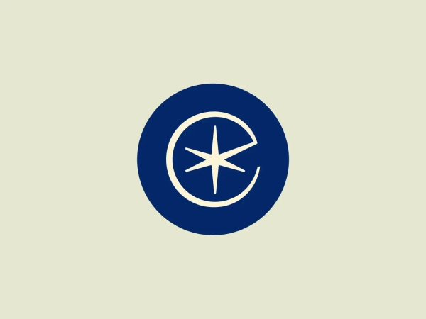
Navy Blue Letter E Circle Outline
What catches our eye is the clever use of negative space to form the letter "e" within the circular design, creating a modern and professional impression for Eredivisie.
- Industry
- Sports 107 Recreation 52
- Letter
- Letter E 230
- Location
-
 Netherlands 78
Use this logo
The Eredivisie logo is a trademark of its owner, shown here for design reference only. Request removal
About the Eredivisie logo
The logo presented for Eredivisie is a modern and minimalist design, comprising two interlocking shapes - a circle and a stylized letter "e." Crafted with smooth, clean lines, the logo suggests continuity and connection, with a deep, elegant navy blue as the primary color, providing a professional and trustworthy feel to the design. The negative space within the "e" creates a dynamic effect, making the letter stand out distinctly against the circular outline. Overall, the aesthetic mixes a corporate sensibility with a fresh, contemporary look.
About Eredivisie
The Eredivisie, established in 1956, is the premier professional football league in the Netherlands. Consisting of 18 clubs, it operates on a round-robin format. At the conclusion of each season, the bottom two clubs are relegated to the second division, while the top two from the second division are promoted. Additionally, the third-bottom team participates in playoffs for the chance to retain their position in the top league.