Pelasgaea

15
We like the stylized, abstract design of the Pelasgaea logo, with its clean, modern aesthetic and bold visual impact.

Letter

Color

Pelasgaea Logo

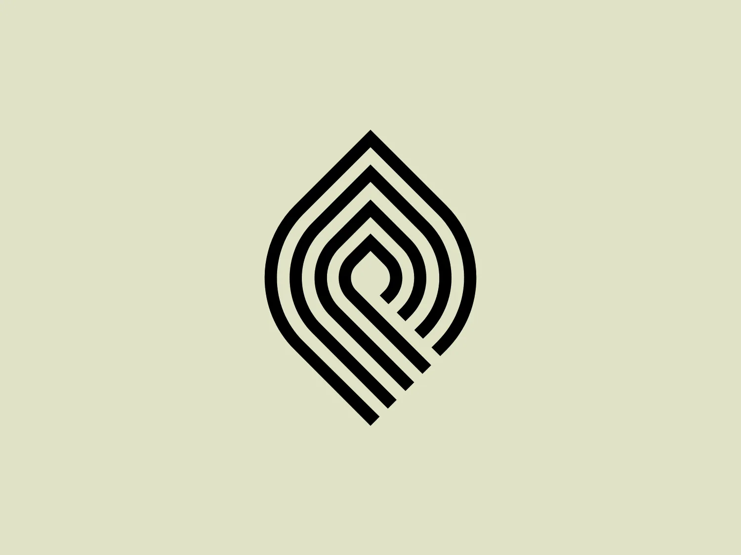
The Pelasgaea logo features a stylized, abstract design composed of concentric, rounded geometric shapes that create a sense of movement and depth. It resembles a series of undulating waves within a shield-like outline, suggesting protection or stability. The black shapes are evenly spaced and increase in size towards the outside, enhancing the visual impact of the design. The overall aesthetic is clean and modern, with a monochromatic color scheme that provides bold contrast and should stand out well against a range of background colors. Given the design elements of the Pelasgaea logo, a background that complements its modern and sleek look while providing a soft contrast would be ideal.

About Pelasgaea

Pelasgaea is a company dedicated to showcasing high-quality Greek agricultural products that align with the principles of the Mediterranean diet. The company name, Pelasgaea, draws inspiration from the term "land of the Pelasgeans," with "Gaea" symbolizing earth.

Similar logos

The MIDI Association logo features a bold and stylized design with two arches that converge to form an abstract "M" shape. The symmetrical arches create a sense of balance and stability, resulting in a simplistic and modern design with clean lines and no additional embellishments. The black logo stands out well against lighter backgrounds and has a strong visual presence due to its thick lines and distinct negative space that forms the "M." The minimalistic aesthetic ensures broad versatility for various applications.
The Framer logo consists of a bold, abstract geometric design that features two black shapes on a white background. These shapes resemble stylized arrowheads or triangular segments arranged back-to-back with a right angle between them, creating a dynamic and forward-moving impression. The overall design aesthetic is minimalist, modern, and hints at movement or transition. The logo's sharp angles and contrasting colors give it a striking appearance.
The Bardee logo is a stylized design consisting of two interlocked shapes that appear to be an abstract representation of the infinity symbol. Its contours are smooth and continuous, creating a sense of fluidity and connection. The design is black, simple, and bold against a white background, conveying elegance and modernity. The shapes are reminiscent of loops or ties, suggesting a theme of interconnectivity or eternity. The logo exudes sleekness and simplicity, making it versatile for various applications.
The logo for École des Musiques Actuelles portrays a sleek, abstract design featuring a single continuous, wavy line. This line forms a rhythmic and dynamic visual effect with delicate curves at the beginning and end, extending into two sharp peaks resembling the letter "M," a stylized heartbeat, or sound waves. Rendered in bold black, the monochromatic logo stands out sharply against a light background, exuding a modern, minimalistic, and versatile aesthetic suggestive of movement and vitality, suitable for diverse branding applications.
The Gearbest logo features a bold, black, stylized smile at its center, with the ends of the smile tapering to points. This simplistic and cheerful smile is prominently positioned against a vibrant yellow square background with rounded corners. The overall design aesthetic is modern and minimalistic, suggesting friendliness and positivity. The design's high contrast and simplicity would stand out well against a variety of backgrounds but would be particularly striking on a light, muted color to maintain its vibrancy without overwhelming its simplicity.
The Alanod logo features a stylized, abstract design composed of black concentric shapes that form a circular motif resembling the letter 'D' or a spiral in silhouette. At the center, the shapes taper into fine lines, creating a sense of movement and depth. The design is modern and clean, utilizing negative space effectively to distinguish the forms. This logo conveys a sense of innovation and dynamism.
The Akon Hidrolik logo exhibits a bold and minimalist design with a black square background. Within the square, a white geometric shape forms a stylized letter "a" with a red circle at the base, evoking the imagery of a needle's eye or a focal point. The overall aesthetic is modern and contemporary, utilizing primary colors and strong contrast to enhance its visual impact. Its simplicity renders it highly recognizable and versatile.
The BETA Technologies logo features a bold, solid black letter "B" with a white lightning bolt cutting through its center, creating a modern and minimalist design. The stark contrast between the black and white elements emphasizes the strong visual impact of the logo. The lightning bolt infuses a sense of power and energy, suggesting dynamism and force. The classic, rounded attributes of the "B" combined with the edgy, contemporary feel of the lightning bolt create a striking visual identity for the business.
The BlueDot logo is a stylized lowercase letter 'b', combining geometric forms. The main form is a bold, black loop that encircles a smaller, solid blue circle. The design is simple, modern, and clearly contrasts the deep black against the bright blue, giving it a striking and easily recognizable appearance. Due to the minimalistic design and clean lines, the logo conveys a contemporary and sleek aesthetic.
The logo for Recruitment Architects is a minimalist and contemporary design featuring a stylized letter 'R' created with bold, continuous black lines. The 'R' incorporates a perfect circle for its counter, positioned centrally and slightly towards the top. The leg of the 'R' curves inward, aligning seamlessly with the outer curve to create a harmonious and modern appearance. The overall aesthetic is devoid of additional embellishments. Given the simplicity of the design, a soft and neutral background would complement the clean lines best.