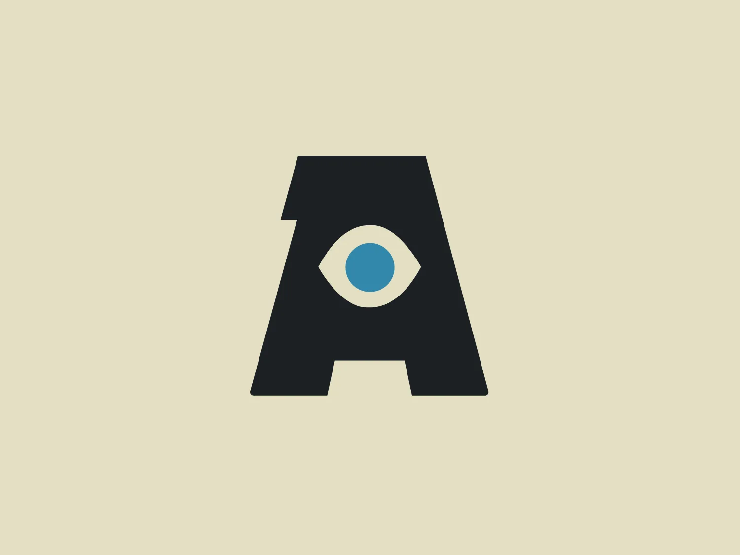
AtmosFX


What we like: The bold 'A' with the eye in the negative space is a modern and captivating design with striking contrast.
Letter
Type
Color
Style
The AtmosFX logo showcases a striking, black capital letter 'A' with a stylized eye graphic centered within the negative space. The eye design includes a white sclera, a light blue iris, and a dark pupil, giving the appearance of a watchful eye embedded in the letterform. The overall design aesthetic is minimalistic and modern, with a clean, geometric appearance that suggests vigilance or insight. The logo has a strong visual impact due to the contrast between the dark letter and the eye's brighter colors.
AtmosFX is a company that aims to revolutionize home decoration for holidays, parties, and other celebrations with its collection of beautifully animated characters, stories, and atmospherics.
Similar logos
NEW

The Leo Messi logo features a stylized, symmetrical emblem that conveys a sense of strength and modernity. Composed of bold, black shapes that resemble an abstract representation of an animal or a warrior's mask, it has pointed features that might be interpreted as ears or horns at the top and a V-like shape at the bottom that could resemble a beak or arrow tip. Its sharp angles and the use of negative space give it a fierce and edgy look, implying a sense of power and aggression.
NEW

The Browze logo features a continuous line that forms a sleek fusion of the letters 'V' and 'B'. The design exudes elegance and modernity with its fluid and organic structure. Presented in monochrome, the black against white creates a timeless and classic feel. Its minimalist aesthetic draws attention to the beauty of the line's curve and the use of negative space. The design's seamless flow may suggest connectivity or unity, and its simplicity allows for versatility and scalability.
NEW

The image shows a bold and minimalist black-and-white logo comprising an uppercase "N" centered within a three-dimensional cube for Notion. The "N" is stylized in a clean, sans-serif font that suggests modernity and strength. The cube is represented in a 3D perspective, creating an illusion of depth that makes the letter appear as though it's embossed on one of the cube's faces. The crisp lines and solid black color of the icon give it a strong visual presence, indicating a contemporary and professional brand identity. Since the logo uses a monochromatic palette, selecting a background that offers sufficient contrast while maintaining a modern feel would be ideal.
NEW

The Rossignol logo showcases a stylized white letter 'R' in the center of a bright red circular background. The 'R' includes a clean design with a striking slash through its stem, adding a modern flair. Smooth curves create a sleek look, and the red and white color scheme offers a bold and attention-grabbing contrast. The overall design aesthetic is minimalist and contemporary, making it versatile for various applications.
NEW

The Delivery Hero logo features a dynamic red comet shape with a stylized white star centered on its body. The comet tail metaphorically conveys speed, progress, or possibly a shooting star suggesting dreams and aspirations. The sharp edges of the star contrast with the smooth, curved form of the comet, giving the design a sense of forward motion. Its design is simple yet effective, easily scalable, and memorable. Considering the vibrancy of the red, a muted background that complements without competing would be ideal.
NEW

The image depicts the Akku Vertrieb logo with a bold, geometric design primarily using a bright blue color. The logo resembles an abstract depiction of an uppercase 'A' without the crossbar. It consists of three parallelogram shapes that form a stylized 'A' with white lines creating separation between them, adding a dynamic and layered effect. The design is sharp, modern, and conveys a sense of stability and professionalism. The simplicity and use of negative space give it a clean and versatile look, suitable for various applications.
NEW

The Mobileye logo features a stylized letter 'n' with a distinct geometric design. It is comprised of bold, straight lines with sharp angles, creating a modern and minimalist aesthetic. The main component of the logo is a deep blue color, giving it a professional and trustworthy feel. The design is simple yet striking, with the use of negative space on the left side that could be interpreted as an abstract arrow or a partial square bracket, which adds an element of dynamism and forward-thinking to the overall design.
NEW

The Walt Disney logo presented is a stylized, abstract design consisting of curving and overlapping black lines. The shapes are organic and flowing, giving the impression of graceful movement or calligraphy. The upper section of the logo resembles a curved hook or a stylized letter 'D,' while the lower section features a loop that intersects with the vertical stroke of the design, possibly representing a lowercase 't.' The overall aesthetic is modern and artistic, with a minimalist approach using only black and whitespace. This design could be associated with luxury, elegance, or the creative arts due to its fluid and simplistic form.
NEW

The image showcases a bold and abstract Neufquatre Éditions logo, consisting of a stylized letter "N" with a dynamic, fluid shape. The design is minimalist and modern, using negative space effectively to create the impression of motion within the letter form. The logo is monochromatic, featuring a stark black against a clean white background. The simplicity of the design lends itself to versatility, while the curvature of the lines suggests creativity and innovation.
NEW

The image is a minimalist logo consisting of two overlaid geometric shapes. The primary shape is a larger parallelogram leaning to the right, while partially beneath it is a smaller parallelogram tilted in the opposite direction, creating a sense of dynamic asymmetry. Both shapes are solid black with clean, sharp edges that suggest precision and modernity. The striking simplicity of the design makes it versatile and easily recognizable. Given the strong contrast inherent in the shapes, and to complement the Andis' modern aesthetic, a subtle background color like a light pastel would be ideal.