Easyfundraising


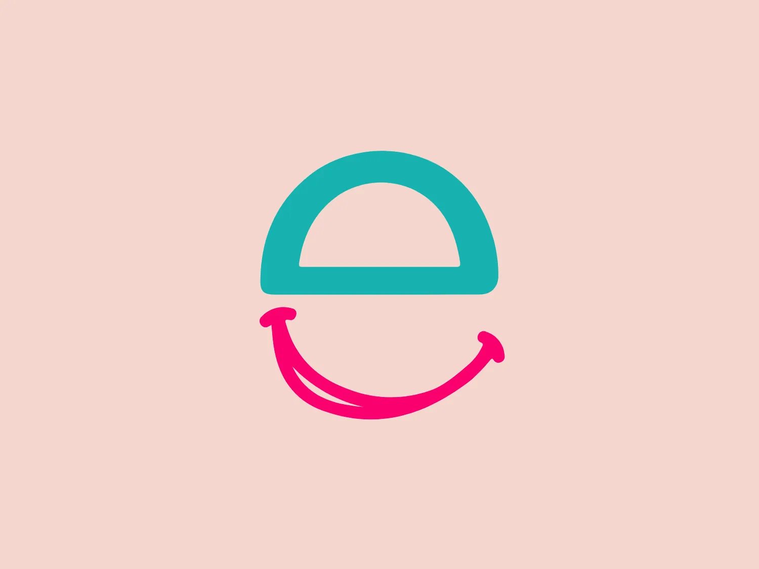
Something we enjoy: The minimalist design, vibrant colors, and happy expression make the Easyfundraising logo friendly and approachable.
Letter
Type
Color
Style
The logo presented is a stylized depiction of a smiley face. It consists of a bold, turquoise half-circle representing the top of the head or a cap, aligned above a hot pink curve that creates a smiling mouth, with upward curved ends that evoke a sense of happiness or satisfaction. The design is minimalist, using only two colors and simple shapes to convey a friendly and approachable image. The turquoise and pink colors are vibrant and contrasting, which gives the Easyfundraising logo a modern and energetic feel.
Easyfundraising is an online platform that allows users to generate funds while making purchases through various e-commerce websites.
Similar logos
NEW

The Lazada logo features a stylized three-dimensional shape reminiscent of a cube with a portion of its structure removed or invisible, creating an open corner perspective. It consists of two visible faces, with the left face in a vibrant orange and the right face in a hot pink, employing a gradient that combines the two colors seamlessly at the edge where they meet. The use of color and shading gives the logo a luminous, dynamic look, evoking a sense of innovation and modernity. There are subtle highlights and shadows on the faces that suggest depth and dimensionality. The overall design aesthetic is minimalist, bold, and contemporary, with a playful twist on geometric representation.
NEW

The Kelloggs logo is a stylized letter "K," rendered in a vibrant, solid pink/magenta color. Its design is fluid and modern, with smooth, flowing lines and tapered ends that suggest speed and dynamism. The "K" seems calligraphic, with characteristics reminiscent of a brush stroke or a signature. The design aesthetic is sleek and minimalist, appealing to contemporary sensibilities while maintaining a sense of individuality and flair. Given its color and design, a contrasting yet subtle background color would complement it well.
NEW

The Ciklum logo features a stylized letter "C" created using curved lines or arcs that decrease in size towards the center, evoking a sense of inward motion or a ripple effect. The color gradient ranges from a deep, vivid blue to a bright turquoise, suggesting fluidity and dynamism. The overall design aesthetic is modern, clean, and would likely be associated with technology, communication, or water themes due to its fluid-like appearance. The different shades of blue impart a professional and soothing visual experience.
NEW

The Moises AI logo is a modern and minimalistic design featuring three wave-like curves that undulate symmetrically, forming a pattern reminiscent of water waves or audio frequencies. Rendered in a vibrant turquoise color, the shapes are clean with rounded edges, conveying a sense of softness and approachability.
NEW

The Ramsauer logo features a stylized letter "R" contained within a circle. The design is minimalistic, with the right side of the "R" extending beyond its usual form to create a fluid, dynamic look that breaks the circular boundary on the right side, giving the appearance of motion or progress. The color is a rich, bold teal, which stands out with a modern and sleek vibe. The logo's simplicity suggests a contemporary brand identity with an affinity for elegance and innovation.
NEW

The DMarket logo features an abstract, stylized design resembling a forward-pointing arrow within a hexagon. A single, continuous ribbon twists to form the arrow and hexagon perimeter, conveying motion and direction. The gradient color creates a 3D effect, ranging from deep turquoise to lighter teal. This modern, sleek aesthetic suggests dynamism and innovation, with a subtle shadow adding to the sense of movement.
NEW

The Reckitt logo showcases a modern, stylized letter "Q" with a design that suggests dynamism and fluidity. The predominant shapes are a thick swirl and a tapered tail that conveys motion, creating an almost optical illusion as if the letter is spinning. The color gradient transitions smoothly from a vibrant pink at the top to a deep orange at the bottom, giving the logo a warm and energetic feel. The simplicity and the color gradient make the Reckitt logo appear contemporary and approachable.
NEW

The Prosper Finance logo features a modern and geometric design comprising two quarter-circle shapes that form a stylized letter 'D'. The right quarter-circle is a deep and vivid red (#FF0000), while the left one features a lighter pinkish hue (#FFC0CB), against a crisp white background. The logo's clean lines and bold colors give it a dynamic and contemporary feel, suitable for a brand looking to convey innovation and energy. Hexcode: #F8DED9
NEW

The Airbnb logo is a stylized "A," featuring a continuous line that forms an upside-down teardrop shape and a loop resembling an infinity symbol. The design is modern, simplistic, and conveys a sense of fluidity and continuity. The soft, salmon pink color offers a warm and inviting feeling.
NEW

The logo displayed is a stylized, abstract figure resembling an exclamation mark inside a rounded square. The primary element, which looks to be a combination of a splash and an exclamation point, is white and centered within a vibrant, solid pink background. The figure's top part is bulbous, much like a traditional exclamation point, but the stem is replaced with a splash-like shape, creating a dynamic, playful impression. This design suggests energy and excitement, and its simplicity aligns with modern minimalist aesthetics. Considering the palette of the Koreaboo logo, a subtle and light background color would complement it well without overpowering the vibrant pink.