MainStay Suites


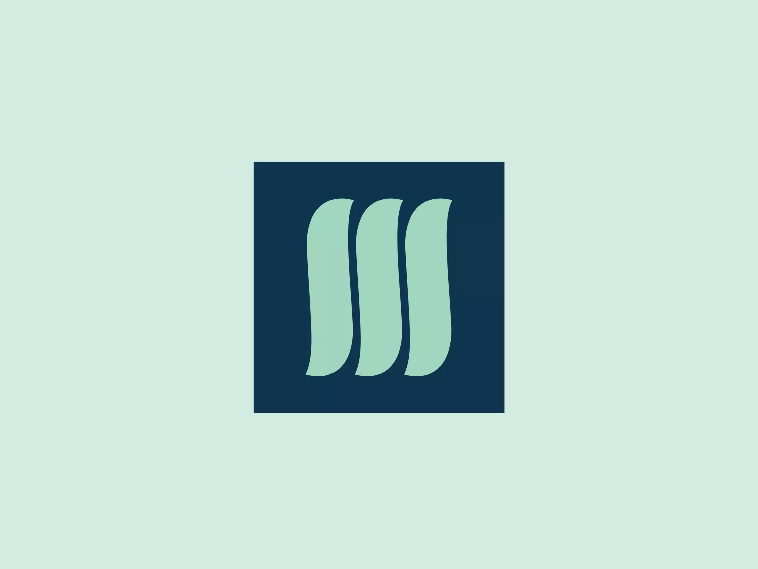
What catches our eye is the sleek and modern abstract shapes representing movement and growth, set against a striking navy background, in the MainStay Suites logo.
Letter
Type
Color
Style
The MainStay Suites logo features three identical abstract shapes arranged side by side with a slight overlap. The curved and tapered forms resemble a set of stylized, gentle waves or leaves. The soft shade of teal offers a modern and cool visual tone, set against a dark, navy-like background for a striking yet professional look. The design exudes a sense of movement and harmony, hinting at fluidity and growth.
MainStay offers spacious suites designed to accommodate short-term or long-term stays, allowing guests to maintain their lifestyle during their visit.
Similar logos
NEW

The Airbus Ventures logo features two overlapping geometric shapes forming an abstract mountain or a stylized letter "A." The deep navy blue color scheme exudes a professional and modern feel. The first shape is a right-angled triangle with its hypotenuse on the left and the smallest angle pointing downwards. The second shape follows the sloping right side of the triangle and curves inward to form a peak, creating an interlocking effect. This minimalistic design is bold and simple, making the logo versatile and easily recognizable.
NEW

The logo features a bold, uppercase letter 'T' centralized within an oval outline. The 'T' has a modern and sturdy design, presenting straight lines and squared edges that convey a sense of stability and strength. The color of both the 'T' and the oval border is a deep, navy blue, which adds to the professional and authoritative feel of the logo. The oval provides a sense of continuity and enclosure, framing the letter neatly and giving it prominence. There is an adequate amount of space between the 'T' and the oval border, highlighting the letter and making it the focal point. The simplicity of the design allows for versatility and clarity when displayed across various mediums.
NEW

The logo presented for Eredivisie is a modern and minimalist design, comprising two interlocking shapes - a circle and a stylized letter "e." Crafted with smooth, clean lines, the logo suggests continuity and connection, with a deep, elegant navy blue as the primary color, providing a professional and trustworthy feel to the design. The negative space within the "e" creates a dynamic effect, making the letter stand out distinctly against the circular outline. Overall, the aesthetic mixes a corporate sensibility with a fresh, contemporary look.
NEW

The Champion logo features a modern and clean design of the letter 'C', composed of a dark navy segment and a bright red segment. The navy portion forms the main body of the 'C' while the red segment fills in the gap, creating a sense of closure and a subtle round negative space in the center that hints at an 'O'. The bold and geometric shapes, along with the custom-designed font, give the logo a friendly and contemporary appeal.
NEW

The Waymo logo depicts a stylized letter "W" with a modern and dynamic design. It is composed of three overlapping, geometric shapes that are rounded at the ends, suggesting fluidity and movement. The color palette includes a gradient ranging from a bright teal to a deeper blue-green, creating a sense of depth and vibrancy. The overall design aesthetic is clean, contemporary, and would likely appeal to a tech-savvy or forward-thinking audience. The fluid form and gradient give the Waymo logo a sense of innovation and approachability.
NEW

The National Leasing logo features a sleek and contemporary design consisting of a stylized letter "N" with a twist, giving the impression of infinity or a Möbius strip. It is composed of two intertwining parts, creating an elegant and dynamic loop. The color is a deep, strong shade of navy blue, which conveys a sense of professionalism and reliability. The design is minimalist yet impactful, with the use of negative space enhancing the visual effect of the intertwining forms.
NEW

The image depicts a minimalistic abstract logo, primarily in a deep navy blue color. The design consists of a semi-circular shape with another incomplete semi-circle inside it, creating an effect reminiscent of a bowl or a stylized letter 'U'. Two symmetrical semi-oval shapes are placed inside the top half, suggesting eyes or leaves, giving the Wonsta logo a friendly and organic appearance. The clean lines and symmetrical balance convey a sense of modernity and simplicity with a playful touch. Considering the color and style of the Wonsta logo, a light and unobtrusive background would complement it well.
NEW

The VetPool logo showcases a stylized lowercase letter 'v' combined with a speech bubble element, symbolizing communication and a personal touch. The bold, mint green 'v' with softened edges exudes a modern and approachable vibe, while the simple, flat white speech bubble with a round tail conveys dialogue. Against a deep navy blue backdrop, the elements stand out, creating a clean, minimalistic, and contemporary aesthetic. This logo is suitable for a brand or service centered on communication, individuality, or technology.
NEW

The Xavier University logo features a stylized letter "X" with a bold, sans-serif typeface. The central part of the "X" is a deep navy blue, while it features a double outline with a thick white inner band and a thin navy blue outer edge that matches the central color. The design includes two diamond shapes that are cut out of the "X," symmetrically positioned within the upper and lower arms of the letter, giving it a refined and somewhat prestigious look. The design is simple, modern, and carries a professional aesthetic that would suit corporate or technological branding.
NEW

The MSGCU logo features a bold, geometric design enclosed within a diamond shape. Within the diamond, there is a dark navy blue 'M' that appears three-dimensional, with shaded sides to give the impression of depth. Above the 'M', a maroon or wine-colored pentagon acts as a highlight or the top of the letter, enhancing the three-dimensional effect. The entire logo is outlined by a thin, light border, adding a crisp finish to the edges. The design conveys a sense of stability and professionalism, with its sharp angles and clean lines.