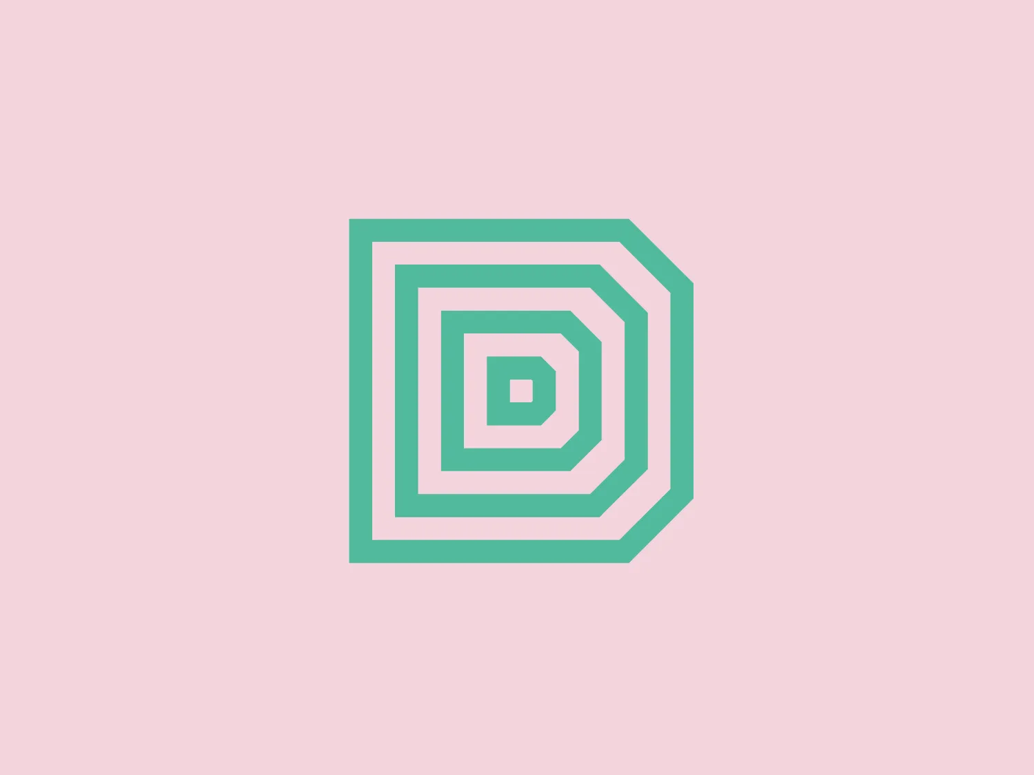
Direct Turbine Controls


Letter
Type
Color
Style
The Direct Turbine Controls logo presents a stylized, geometric design with a series of concentric, hexagonal shapes with rounded corners that form a captivating tunnel or spiral effect. The monochromatic color scheme in varying shades of teal exudes a modern and clean aesthetic, emphasizing sleek and precise lines that convey technological sophistication and stability. Complemented by a warm and subtle background color, this logo exudes a sense of precision and innovation.
Direct Turbine Controls is a company specializing in providing comprehensive control system solutions. They have a particular expertise in repairing and supplying parts for GE Speedtronic Controls. The company offers a range of services to meet the control system needs of various industries.
Similar logos


