Andrews McMeel Universal

15
Something we like about the Andrews McMeel Universal logo is the clever use of negative space to create an abstract theatrical mask, representing both comedy and tragedy.

Andrews McMeel Universal Logo

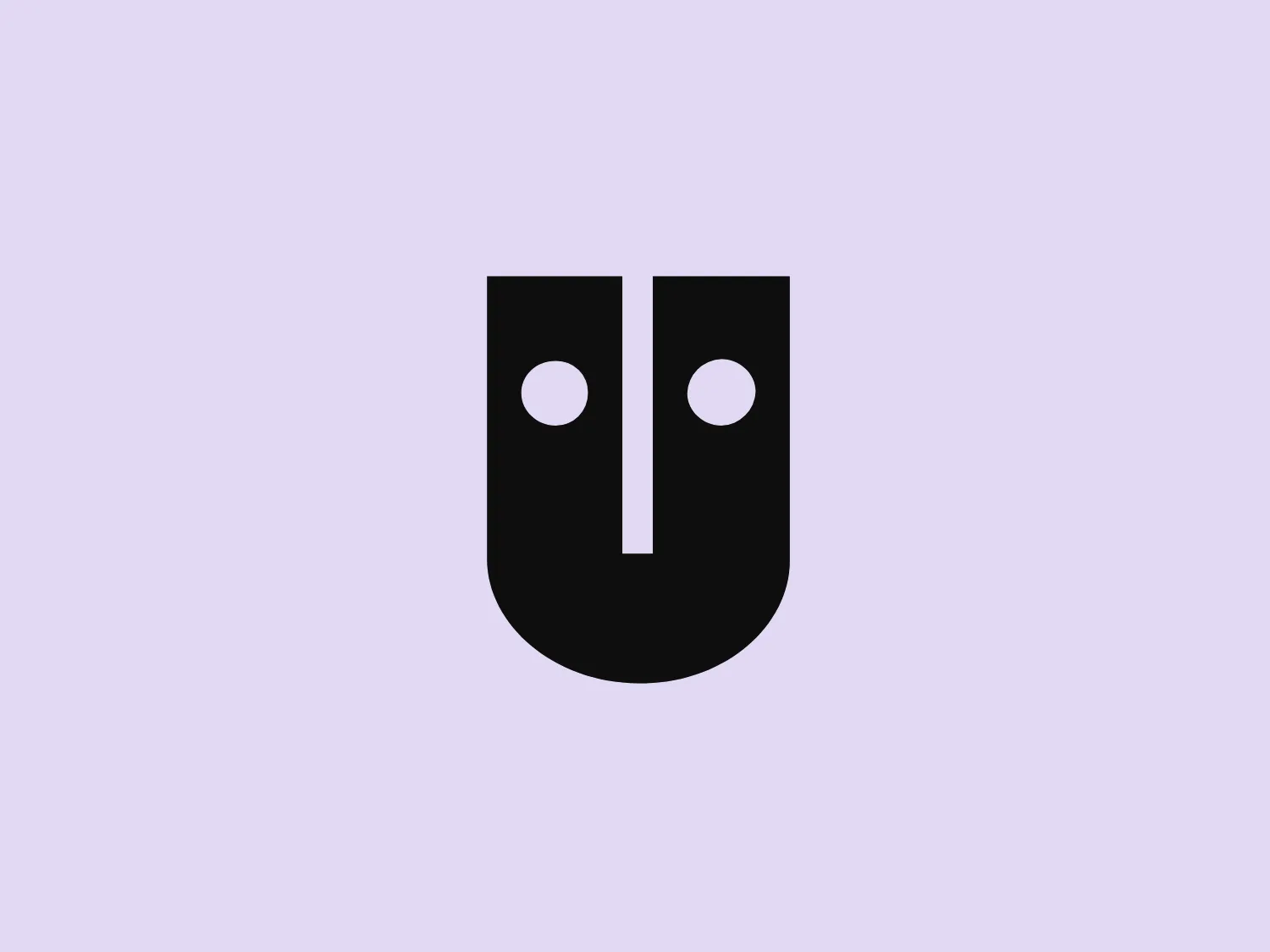
The Andrews McMeel Universal logo features a stylized representation of a theatrical mask, embodying both the comedy and tragedy aspects in a simplified form. The overall shape is an upright rectangle with a flattened bottom edge, giving the impression of a shield or badge. It is bisected vertically, with each side mirroring the other. The design utilizes a bold, purple color that gives it a modern and dynamic feel. The two circular 'eyes' and the long 'nose' create an abstract human-like face. There is a clever use of negative space that forms the outline of the mask and the division between comedy and tragedy.

About Andrews McMeel Universal

Andrews McMeel Universal is an independent, global media company that collaborates with and empowers a diverse range of creative talent on a global scale.

Similar logos

The Qmedics logo showcases a stylized letter Q in a 3D ribbon-like form with smooth, flowing curves. It incorporates warm red and pink tones transitioning to cooler purples and blues on the interior, creating a vibrant and energetic look. The modern, playful design uses gradients to convey depth and movement, evoking an aesthetic of creativity and dynamism.
The eParana logo features a modern and friendly lowercase "e" with a fluid, curvy design. It is predominantly purple with a dynamic gradient, creating a three-dimensional effect. The "eye" of the "e" is highlighted with a light blue dot, adding a distinctive touch. The overall aesthetic is clean, with smooth curves and vibrant colors that complement a subtle background.
The Gong logo features a dynamic starburst design with multiple layers. The central shape resembles a traditional star with points radiating outward, enclosed by a larger, jagged contour that adds a sense of energy and motion. The color is a bold and vivid shade of purple, giving the logo a modern and vibrant feel. This design offers a feeling of excitement and standout appeal, potentially conveying innovation or excellence. To complement this vibrant Gong logo, a neutral yet fresh background would be ideal.
The logo for Olelo showcases a stylized white speech bubble enclosed within a rounded purple rectangle. The speech bubble aligns to the right side and creates a seamless contour with the edge of the rectangle. This design choice has a clean and modern aesthetic and hints at communication, conversation, or messaging services. The color palette of white and purple offers a strong contrast that enhances visibility and brand recognition.
The logo featured for Mayo Performing Arts Center is a typographic representation consisting of two characters, possibly initials. The first character is a stylized lowercase ‘n’ with a right-angled vertex at the bottom, creating a sharp contrast to the otherwise curvaceous line that forms the letter. The second character resembles an uppercase ‘I’ with serifs at its base and top, but with unusually thick lines, giving it a bold presence. Both characters share a deep purple color, exuding luxury and professionalism. Embracing minimalism, the logo is distinguished by the simplicity and the balance between the roundness of the ‘n’ and the solidity of the ‘I,’ coming together to create a visually harmonious yet dynamic duality.
The Figma logo is a simple yet modern design composed of a vertical stack of four rounded rectangles in different colors, including warm red, bright purple, sky blue, and grassy green. These rectangles overlap, creating a cohesive and interconnected look, while also generating mixed colors at the intersections. This dynamic and playful design with a touch of sophistication conveys a sense of creativity and innovation.
The Andeavor logo showcases a bold purple geometric design, with a right-angled triangle and a perfect circle. The solid shapes exhibit a vibrant flat purple tone without any gradients, embodying a clean, modern, and minimalistic aesthetic that emphasizes simplicity and visual impact. The balanced and proportionate arrangement of the shapes conveys stability and harmony.
The logo for Realm showcases a modern and minimalist design, featuring a stylized, abstract depiction of a lowercase 'b'. The distinct letterform is formed by a semi-circle paired with a straight, vertical line, utilizing vibrant, solid purple color for a bold and energetic presence. The clean and contemporary aesthetic focuses attention on the brand identity, making it suitable for a light and understated background.
The Pusher logo features a stylized, geometric design comprising a series of parallel lines that create an abstract representation of a cube or an open book, depending on the viewer's interpretation. The design employs a deep purple shade that adds a sense of sophistication and modernity. Its use of negative space and perspective gives an illusion of depth and three-dimensionality. The logo has a clean, minimalistic look with sharp edges, making it versatile and scalable for various applications. The aesthetic is professional and would suit a technology company, a financial institution, or a creative agency.
The Warwick University logo features a simple yet bold geometric design, showcasing a stylized letter "W." Comprised of two solid purple triangles in perfect alignment, the negative space forms an inverted triangle at the center, creating the illusion of the letter "W." The minimalist and modern aesthetic, along with the regal and innovative touch of the purple color palette, make this logo stand out. A background that complements its simplicity and sophistication would be an ideal pairing.