Normalyze


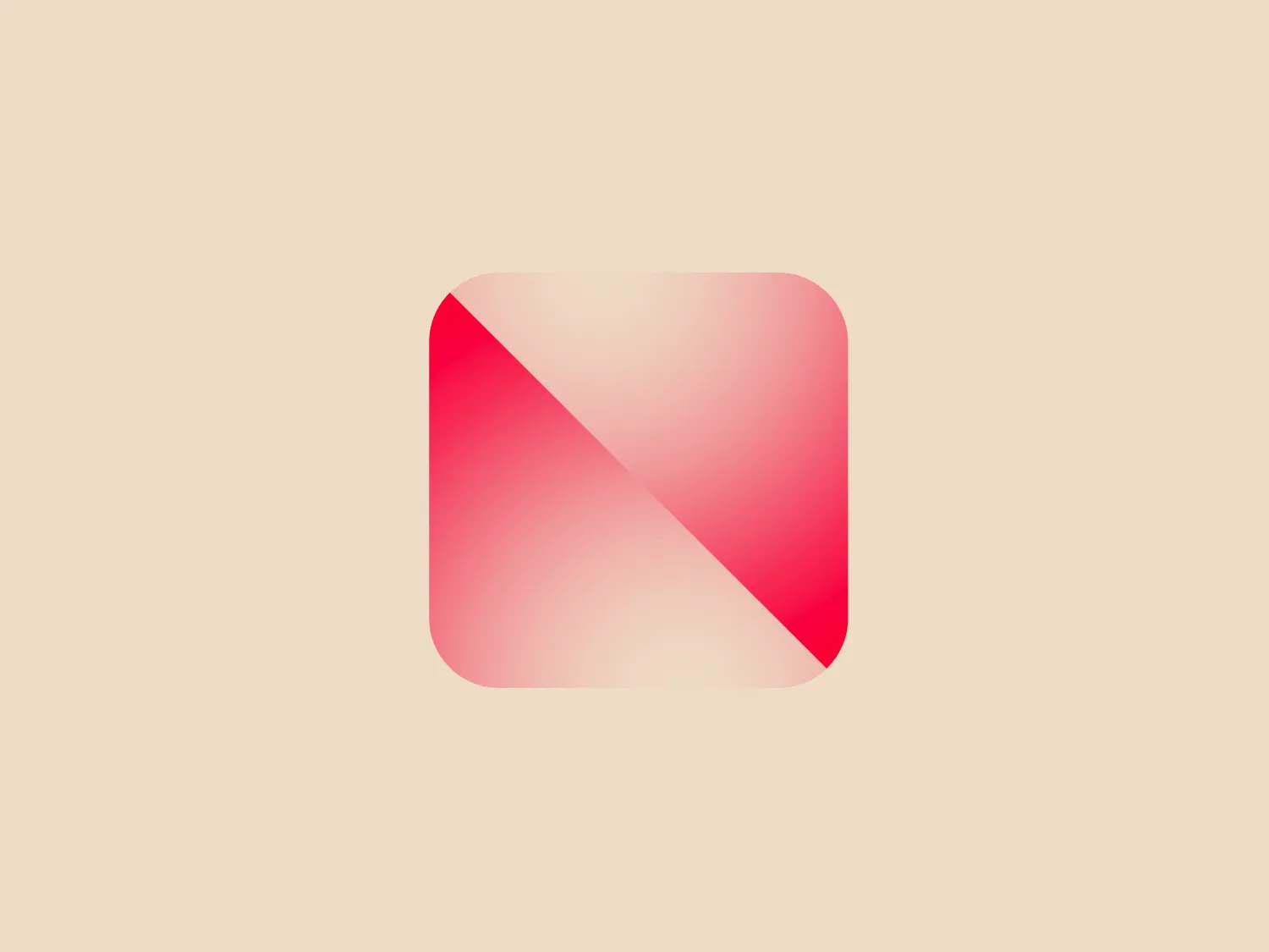
What catches our eye is the sleek and minimalist design of the Normalyze logo, with a geometric shape and gradient fill that adds depth and modern appeal.
Letter
Type
Color
Style
The Normalyze logo showcases a sleek and minimalist design with a geometric shape, evoking a stylized letter or abstract symbol. A rounded square with a gradient fill transitions from light pink to a vivid pink, creating depth. A diagonal cut separates two shades, adding a play of light and shadow. This modern design complements a subtle background.
Normalyze is a prominent company offering cloud data security solutions, with a focus on protecting data, applications, identities, and infrastructure in hybrid cloud environments. The company's platform empowers organizations to efficiently identify and visualize their data attack surface, providing real-time visibility and control over their security posture.
Similar logos
NEW

The Lazada logo features a stylized three-dimensional shape reminiscent of a cube with a portion of its structure removed or invisible, creating an open corner perspective. It consists of two visible faces, with the left face in a vibrant orange and the right face in a hot pink, employing a gradient that combines the two colors seamlessly at the edge where they meet. The use of color and shading gives the logo a luminous, dynamic look, evoking a sense of innovation and modernity. There are subtle highlights and shadows on the faces that suggest depth and dimensionality. The overall design aesthetic is minimalist, bold, and contemporary, with a playful twist on geometric representation.
NEW

The Kelloggs logo is a stylized letter "K," rendered in a vibrant, solid pink/magenta color. Its design is fluid and modern, with smooth, flowing lines and tapered ends that suggest speed and dynamism. The "K" seems calligraphic, with characteristics reminiscent of a brush stroke or a signature. The design aesthetic is sleek and minimalist, appealing to contemporary sensibilities while maintaining a sense of individuality and flair. Given its color and design, a contrasting yet subtle background color would complement it well.
NEW

The Reckitt logo showcases a modern, stylized letter "Q" with a design that suggests dynamism and fluidity. The predominant shapes are a thick swirl and a tapered tail that conveys motion, creating an almost optical illusion as if the letter is spinning. The color gradient transitions smoothly from a vibrant pink at the top to a deep orange at the bottom, giving the logo a warm and energetic feel. The simplicity and the color gradient make the Reckitt logo appear contemporary and approachable.
NEW

The Prosper Finance logo features a modern and geometric design comprising two quarter-circle shapes that form a stylized letter 'D'. The right quarter-circle is a deep and vivid red (#FF0000), while the left one features a lighter pinkish hue (#FFC0CB), against a crisp white background. The logo's clean lines and bold colors give it a dynamic and contemporary feel, suitable for a brand looking to convey innovation and energy. Hexcode: #F8DED9
NEW

The Airbnb logo is a stylized "A," featuring a continuous line that forms an upside-down teardrop shape and a loop resembling an infinity symbol. The design is modern, simplistic, and conveys a sense of fluidity and continuity. The soft, salmon pink color offers a warm and inviting feeling.
NEW

The logo displayed is a stylized, abstract figure resembling an exclamation mark inside a rounded square. The primary element, which looks to be a combination of a splash and an exclamation point, is white and centered within a vibrant, solid pink background. The figure's top part is bulbous, much like a traditional exclamation point, but the stem is replaced with a splash-like shape, creating a dynamic, playful impression. This design suggests energy and excitement, and its simplicity aligns with modern minimalist aesthetics. Considering the palette of the Koreaboo logo, a subtle and light background color would complement it well without overpowering the vibrant pink.
NEW

The Kimchi Lee logo is a stylized monogram melding the letters 'K' and 'C' into an elegant and cohesive design. The color is a soft, muted pink with a subtle gradient that adds depth and gives the logo a gentle, sophisticated aesthetic. It features curvaceous lines with swirls and loops, reminiscent of calligraphy, reflecting a sense of luxury and attention to detail. The absence of a solid fill within the lines and the ample use of negative space lends the design an airy and modern feel, making it versatile for a variety of backgrounds.
NEW

The logo for Winni consists of two shapes that form an overlapping heart, resembling pills or capsules. The left half is deep purple (#6A328D), and the right half is vivid pinkish-red (#EC008C). The design is modern and clean, with a clear emphasis on health or pharmaceutical themes suggested by the pill shapes. Gradients give the shapes dimension and a sense of motion or merging. The light background complements the logo without overwhelming the design. Hexcode: #F2E2D0
NEW

The Quicki logo features a dark navy blue speech bubble with a tail curving around to the left, encapsulating a bright pink play icon at its center. The speech bubble resembles the letter "Q", adding a layer of cleverness to the design. The pink triangle stands out against the darker background, giving off a vibrant and playful vibe. It's a modern and minimalist design, blending communication and dynamism through the combination of a speech symbol and a universally recognized media play button.
NEW

The XRecruiter logo features a symmetrical, abstract design with a central cross shape composed of elongated ovals of varying sizes, overlaid in a dynamic, pinwheel arrangement. The color palette is vibrant and includes shades of purple, blue, green, and pink, with an orange dot situated below the cross, creating a sense of balance. The overall design aesthetic is modern and playful, with a sense of movement and connectivity implied by the interlocking shapes. The gradient within each shape adds depth and a digital, energetic vibe to the logo.