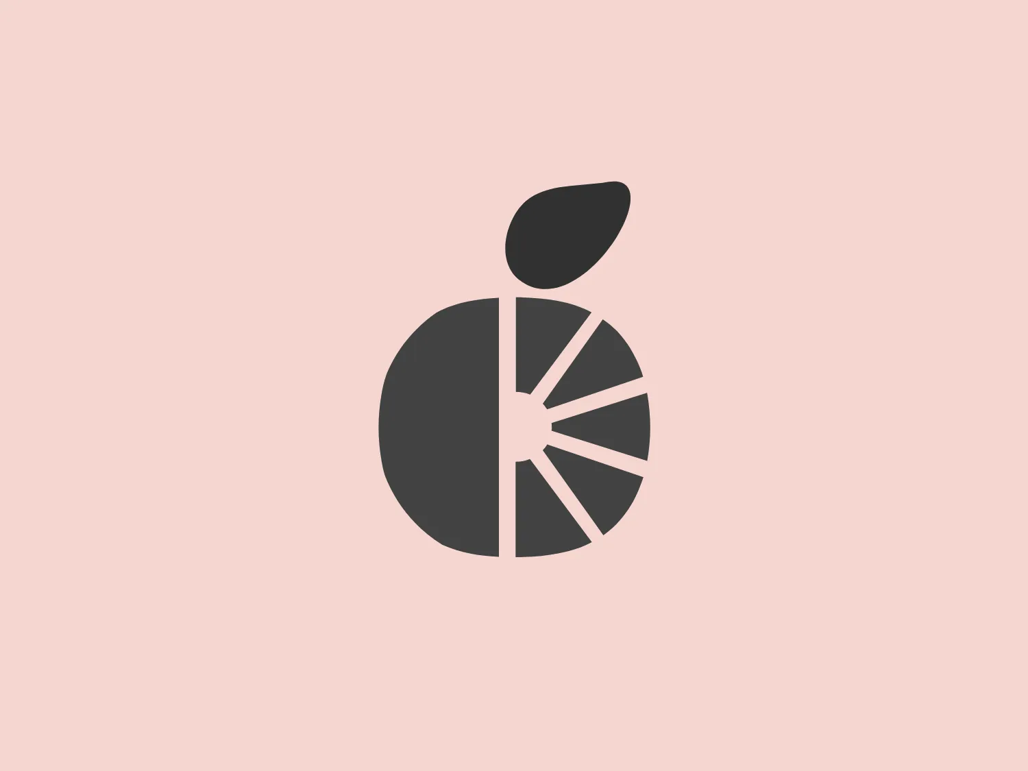
Grocery Market


We like the clean, modern design of The Grocery Market logo featuring a stylized orange slice and a bold, minimalistic aesthetic.
Letter
Type
Color
Style
The Grocery Market logo features a stylized image resembling an orange slice or fruit. It's a simple yet modern design with bold, flat shapes. The main part of the logo is a segmented circle filled with a bright orange color, mimicking the sections of an orange. Adjacent to this circle is a single, solid, leaf-like shape in a deeper shade of green, giving a clear representation of freshness and natural produce. The overall aesthetic is minimalistic and would appeal to a brand looking for a clean, healthy, and organic image. This display of vivid colors and uncomplicated forms embodies a youthful and energetic spirit.
Similar logos
NEW

The Lazada logo features a stylized three-dimensional shape reminiscent of a cube with a portion of its structure removed or invisible, creating an open corner perspective. It consists of two visible faces, with the left face in a vibrant orange and the right face in a hot pink, employing a gradient that combines the two colors seamlessly at the edge where they meet. The use of color and shading gives the logo a luminous, dynamic look, evoking a sense of innovation and modernity. There are subtle highlights and shadows on the faces that suggest depth and dimensionality. The overall design aesthetic is minimalist, bold, and contemporary, with a playful twist on geometric representation.
NEW

The Matsuura logo features a stylized depiction of three overlapping, rounded shapes in a vibrant green color. The design exudes a modern and minimalist aesthetic with a nod to nature or growth themes, implying movement and connectivity. The shapes suggest leaves, pebbles, or abstract representations of increasing value/momentum.
NEW

The Cornerstone logo features a simplistic and modern design, consisting of a stylized, abstract shape that somewhat resembles a flower or starburst within a circle. The primary element is a brilliant, solid red-orange color that gives the logo a vibrant and energetic feel. The inner white shape has softened edges which contrast smoothly with the circular boundary. Its symmetry and clean lines convey a sense of balance and professionalism. Considering the color palette of the logo, a soft, neutral background color would complement it well without competing for attention.
NEW

The Prodigy logo showcases a contemporary, fluid lowercase 'p' in a striking orange color. The design features soft curves and a dynamic loop, along with a sharp cut in the descender, creating a modern and slightly abstract appearance. This clean and minimalistic logo exudes energy and approachability while the vibrant orange color conveys creativity and enthusiasm.
NEW

The BitX Capital logo showcases a stylized, abstract design with a dynamic feel. It comprises interlocking shapes resembling a three-dimensional impossible loop. The main elements consist of two intertwined ribbons with a gradation of green shades that provide a sense of depth and movement. The contrast between the lighter and darker greens enhances the interweaving effect. Overall, the logo presents a modern and clean appearance, suggesting innovation and connectivity.
NEW

The Meralco logo features a stylized, angular lightning bolt in white, cutting dynamically across a vibrant, solid orange circle. The bolt itself has sharp edges and points, conveying a sense of energy and power. The simplicity of the design gives it a modern and impactful aesthetic, as the high-contrast color scheme makes the logo stand out boldly. The circular shape envelops the bolt, suggesting completeness and a global or universal aspect to the brand identity.
NEW

The Subway logo features two bold, interlocking arrows forming an 'S' shape, with the top arrow colored in a striking green and the bottom in a vibrant yellow. The design is clean and modern, with a dynamic sense of movement implied by the arrows pointing in opposite directions. This creates a sense of exchange, circulation, or progression, which might suggest a company involved in logistics, technology, or finance. The flat color treatment and lack of additional embellishments give it a contemporary and straightforward aesthetic.
NEW

The Holiday Inn logo features a stylized, abstract design that appears to be a pair of overlapping, slanted letter H's or a hash symbol (#) with a modern twist. It's composed of four bold, green lines with soft curves and slightly varied lengths, giving it a dynamic and contemporary feel. The use of negative space between the elements of the logo adds to its visual interest. The green color is vibrant and would stand well against a soft, pale background providing a contrast that is not too harsh.
NEW

The Chainalysis logo features a bold, minimalistic design with interlocking shapes. The primary shape is a circle, within which three curved elements intertwine in a trefoil knot-like configuration, suggesting motion and connectivity. The logo is a vibrant, solid orange color, conveying energy and creativity. The thick lines and smooth curves contribute to a modern and dynamic aesthetic, appearing abstract yet conveying a sense of unity and continuity.
NEW

The Mensa International logo features a bold, white capital letter 'M' centered within a circular badge. Above the letter 'M', a stylized white globe icon emphasizes international presence. The letter rests against a vibrant orange background, creating a striking contrast that accentuates the white elements. The modern and concise design utilizes simple geometric shapes and clear iconography, suggesting a professional and global brand identity.