Oklahoma


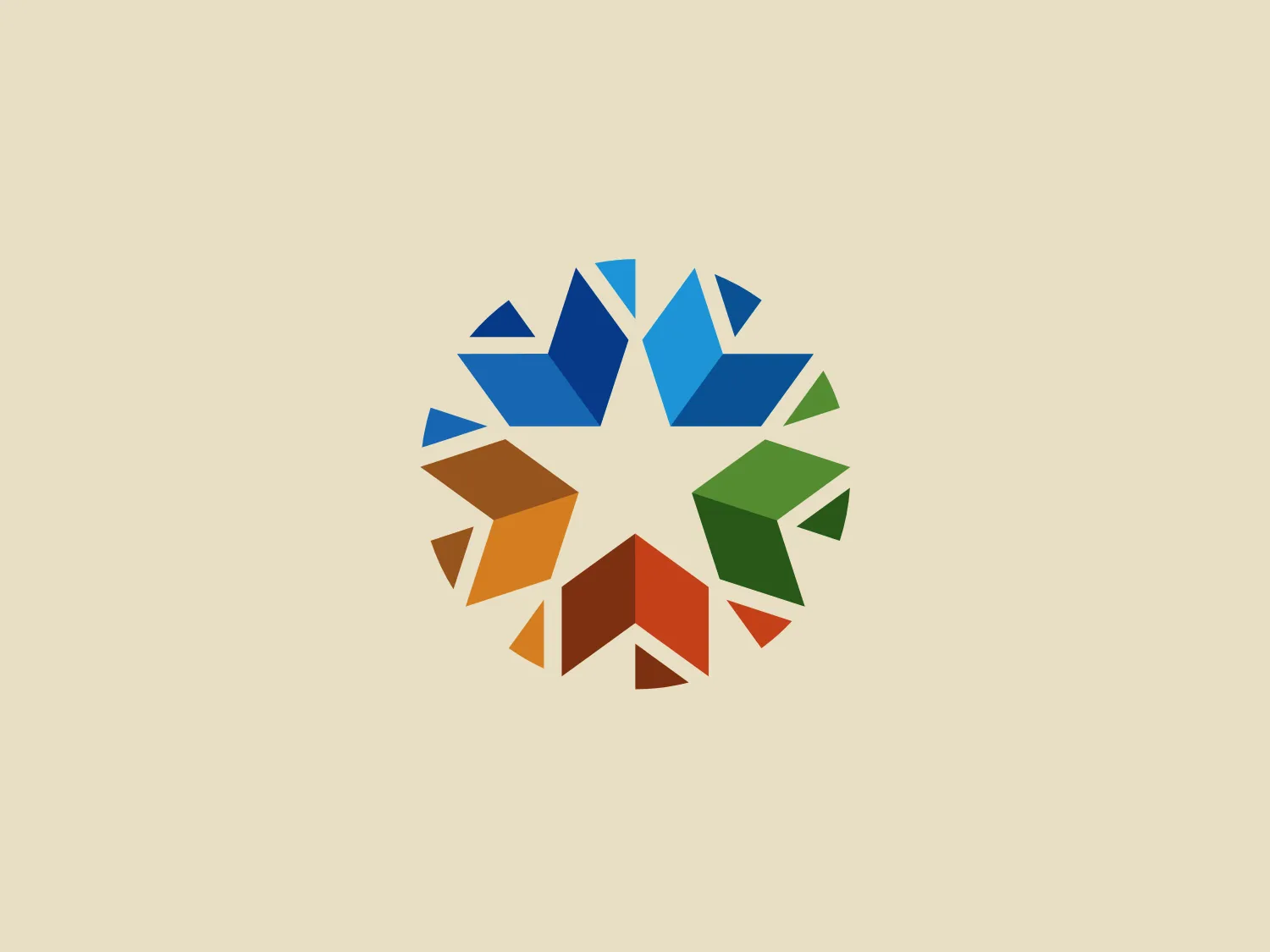
We like the circular, pinwheel-like design formed by colorful triangles that represent diversity and interconnectivity.
Letter
Type
Color
Style
The logo for Oklahoma features a circular, pinwheel-like design formed by multiple colorful triangles converging towards the center, representing diversity and interconnectivity. The vibrant spectrum of colors, including shades of blue, green, orange, and brown, symbolizes a range of services or values. The arrangement of shapes and use of negative space give the logo a sense of movement and collaboration, while suggesting unity and harmony.
Oklahoma, located in the central southern United States of America, is situated north of Texas. The name "Oklahoma" originates from the Choctaw language, with "okla" meaning "man" and "humma" meaning "red," collectively translating to "the land of the red man."
Similar logos
NEW

The Lazada logo features a stylized three-dimensional shape reminiscent of a cube with a portion of its structure removed or invisible, creating an open corner perspective. It consists of two visible faces, with the left face in a vibrant orange and the right face in a hot pink, employing a gradient that combines the two colors seamlessly at the edge where they meet. The use of color and shading gives the logo a luminous, dynamic look, evoking a sense of innovation and modernity. There are subtle highlights and shadows on the faces that suggest depth and dimensionality. The overall design aesthetic is minimalist, bold, and contemporary, with a playful twist on geometric representation.
NEW

The Matsuura logo features a stylized depiction of three overlapping, rounded shapes in a vibrant green color. The design exudes a modern and minimalist aesthetic with a nod to nature or growth themes, implying movement and connectivity. The shapes suggest leaves, pebbles, or abstract representations of increasing value/momentum.
NEW

The image depicts the Akku Vertrieb logo with a bold, geometric design primarily using a bright blue color. The logo resembles an abstract depiction of an uppercase 'A' without the crossbar. It consists of three parallelogram shapes that form a stylized 'A' with white lines creating separation between them, adding a dynamic and layered effect. The design is sharp, modern, and conveys a sense of stability and professionalism. The simplicity and use of negative space give it a clean and versatile look, suitable for various applications.
NEW

The Mobileye logo features a stylized letter 'n' with a distinct geometric design. It is comprised of bold, straight lines with sharp angles, creating a modern and minimalist aesthetic. The main component of the logo is a deep blue color, giving it a professional and trustworthy feel. The design is simple yet striking, with the use of negative space on the left side that could be interpreted as an abstract arrow or a partial square bracket, which adds an element of dynamism and forward-thinking to the overall design.
NEW

The Cornerstone logo features a simplistic and modern design, consisting of a stylized, abstract shape that somewhat resembles a flower or starburst within a circle. The primary element is a brilliant, solid red-orange color that gives the logo a vibrant and energetic feel. The inner white shape has softened edges which contrast smoothly with the circular boundary. Its symmetry and clean lines convey a sense of balance and professionalism. Considering the color palette of the logo, a soft, neutral background color would complement it well without competing for attention.
NEW

The Unilever logo appears to consist of intricate and stylized illustrations forming a shield-like shape. The design features a collection of floral and organic patterns, ranging from leaves and flowers to abstract swirls, all densely packed to create a cohesive emblem. It is monochromatic, using a deep blue color which gives it a classic and professional appearance. The contrast between the negative space and the blue areas creates an engaging and dynamic visual effect, suggesting detail and craftsmanship. The logo has a symmetrical layout that adds to its balanced and harmonious look.
NEW

The logo features a bold, uppercase letter 'T' centralized within an oval outline. The 'T' has a modern and sturdy design, presenting straight lines and squared edges that convey a sense of stability and strength. The color of both the 'T' and the oval border is a deep, navy blue, which adds to the professional and authoritative feel of the logo. The oval provides a sense of continuity and enclosure, framing the letter neatly and giving it prominence. There is an adequate amount of space between the 'T' and the oval border, highlighting the letter and making it the focal point. The simplicity of the design allows for versatility and clarity when displayed across various mediums.
NEW

The Prodigy logo showcases a contemporary, fluid lowercase 'p' in a striking orange color. The design features soft curves and a dynamic loop, along with a sharp cut in the descender, creating a modern and slightly abstract appearance. This clean and minimalistic logo exudes energy and approachability while the vibrant orange color conveys creativity and enthusiasm.
NEW

The Commodore logo features a large, bold, blue letter "C" that encircles a smaller red shape resembling a right-pointing arrow or a play button symbol. The stark contrast between the blue and red hues creates a striking and modern aesthetic. The absence of additional elements or embellishments underscores a commitment to clarity and efficiency in the design, striking a balance between visual impact and straightforward symbolism.
NEW

The BitX Capital logo showcases a stylized, abstract design with a dynamic feel. It comprises interlocking shapes resembling a three-dimensional impossible loop. The main elements consist of two intertwined ribbons with a gradation of green shades that provide a sense of depth and movement. The contrast between the lighter and darker greens enhances the interweaving effect. Overall, the logo presents a modern and clean appearance, suggesting innovation and connectivity.