Hurdlr

15
What we like is the playful, anthropomorphic character, simple geometric shapes, and friendly facial features in the Hurdlr logo.

Hurdlr Logo

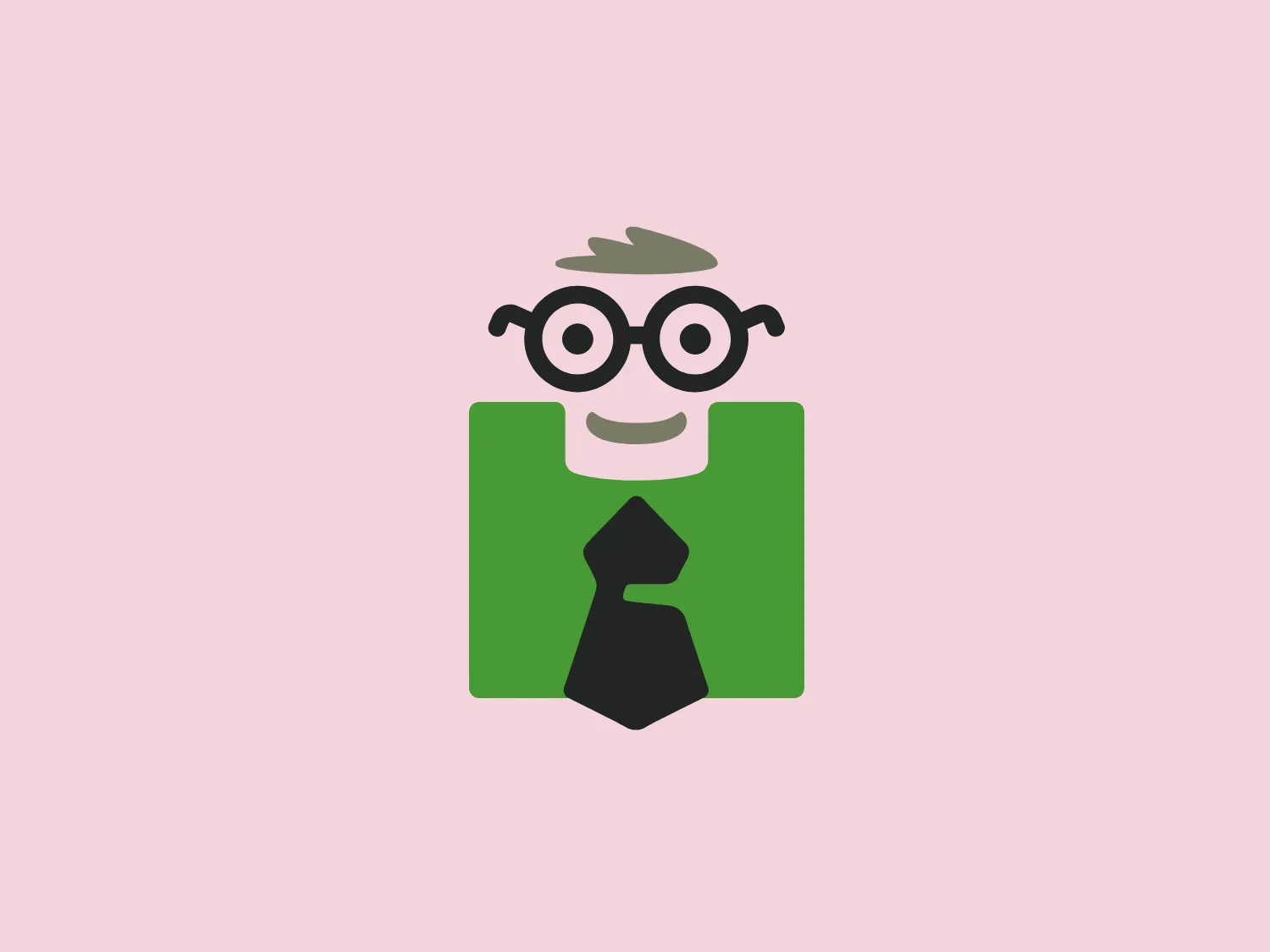
The image presents a stylized logo featuring a playful, anthropomorphic character composed of simple geometric shapes. The character, representing the Hurdlr brand, consists of a solid dark green square with rounded corners, which forms the body, with a light gray negative space shaped like a tie centered on it. The head is a white square with softened edges, topped with a small tuft of hair depicted by a gray squiggle. Facial features include two black-rimmed, circular glasses with hints of light reflections, and a simple, curved black line for a mouth. Dark gray semi-circles represent the ears, aligned with the glasses. The logo has a youthful, approachable look and feels due to its cartoonish simplicity and the friendly face of the character. The color combination of dark green, black, light gray, and white gives it a professional but whimsical aesthetic.

About Hurdlr

Hurdlr is a mobile application designed to help independent workers, freelancers, and solopreneurs effortlessly manage their business finances in real time, enabling them to save time and maximize productivity.

Similar logos

The Deliveroo logo features a stylized, geometric representation of a lowercase letter 'v' with rounded terminals and a playful, cut-in contour on the right side. This creates a sense of motion or a smiling face with two dots representing eyes. The bright, aqua-green color gives the logo a modern, minimalist, and friendly vibe, suggesting creativity and innovation.
The MIDI Association logo features a bold and stylized design with two arches that converge to form an abstract "M" shape. The symmetrical arches create a sense of balance and stability, resulting in a simplistic and modern design with clean lines and no additional embellishments. The black logo stands out well against lighter backgrounds and has a strong visual presence due to its thick lines and distinct negative space that forms the "M." The minimalistic aesthetic ensures broad versatility for various applications.
The Framer logo consists of a bold, abstract geometric design that features two black shapes on a white background. These shapes resemble stylized arrowheads or triangular segments arranged back-to-back with a right angle between them, creating a dynamic and forward-moving impression. The overall design aesthetic is minimalist, modern, and hints at movement or transition. The logo's sharp angles and contrasting colors give it a striking appearance.
The Bardee logo is a stylized design consisting of two interlocked shapes that appear to be an abstract representation of the infinity symbol. Its contours are smooth and continuous, creating a sense of fluidity and connection. The design is black, simple, and bold against a white background, conveying elegance and modernity. The shapes are reminiscent of loops or ties, suggesting a theme of interconnectivity or eternity. The logo exudes sleekness and simplicity, making it versatile for various applications.
The logo for École des Musiques Actuelles portrays a sleek, abstract design featuring a single continuous, wavy line. This line forms a rhythmic and dynamic visual effect with delicate curves at the beginning and end, extending into two sharp peaks resembling the letter "M," a stylized heartbeat, or sound waves. Rendered in bold black, the monochromatic logo stands out sharply against a light background, exuding a modern, minimalistic, and versatile aesthetic suggestive of movement and vitality, suitable for diverse branding applications.
The logo in the image displays a symmetrical design resembling an abstract butterfly or a pair of wings. It consists of multiple leaf-like shapes radiating from the center, creating a harmonious pattern. Vibrant colors such as pink, orange, yellow, green, light blue, and teal are used, outlined with a thin black border that enhances their individuality. The overall design aesthetic is lively and organic, suggesting a sense of growth or transformation. The black background makes the colors pop, giving the logo a bold and energetic appearance.
The Afirme logo features an abstract design with three stylized, pointed shapes that resemble peaks or arrows, arranged in a dynamic and ascending pattern. The primary color used is a rich, flat green, without any gradients or shades, which conveys a sense of growth, vitality, or eco-friendliness. The overall aesthetic is modern and minimalist, with clean lines and sharp angles creating a sense of forward movement and progress. The simplicity of the design ensures versatility and readability across various mediums. For this logo, a light and subtle background would complement it well without overwhelming its simplicity.
The Gearbest logo features a bold, black, stylized smile at its center, with the ends of the smile tapering to points. This simplistic and cheerful smile is prominently positioned against a vibrant yellow square background with rounded corners. The overall design aesthetic is modern and minimalistic, suggesting friendliness and positivity. The design's high contrast and simplicity would stand out well against a variety of backgrounds but would be particularly striking on a light, muted color to maintain its vibrancy without overwhelming its simplicity.
The Generale Bank logo is a minimalist design featuring a bold and modern 'G' created with sharp lines and curves. The solid, white letter sits centrally against a vibrant, flat, coral red square background. The 'G' has a geometric quality with its upper case form and is designed with a cutout that cleverly contributes to reading the letter correctly. The contrast between the bright white and the bold red makes the logo pop, indicative of a brand that aims to be seen as energetic and confident.
The Alanod logo features a stylized, abstract design composed of black concentric shapes that form a circular motif resembling the letter 'D' or a spiral in silhouette. At the center, the shapes taper into fine lines, creating a sense of movement and depth. The design is modern and clean, utilizing negative space effectively to distinguish the forms. This logo conveys a sense of innovation and dynamism.