Flightfox

15
What we like: The Flightfox logo's sleek 'X' in gray transitioning into a vibrant orange flame creates a bold, modern, and dynamic design.

Flightfox Logo

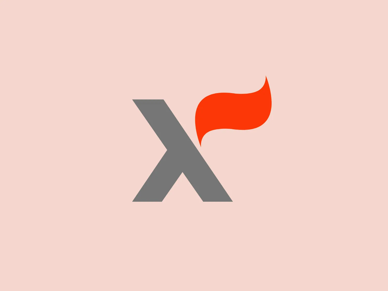
The Flightfox logo features a stylized 'X' in a bold, sans-serif typeface with a sharp, modern appearance. The 'X' is primarily in a sleek gray color, suggestive of metal or technology, with one section on the upper right side transitioning into a vibrant orange flame. This flame motif adds a dynamic and energetic quality to the design, implying heat, power, or passion associated with the brand. The contrast between the gray and orange colors creates a striking visual impact, and the simplicity of the shapes ensures the logo is easily recognizable and scalable. The overall aesthetic is contemporary and suggests innovation or transformation.

About Flightfox

Flightfox is an online platform that offers travel booking and management services for individuals and teams. The company leverages a combination of advanced software and human expertise to optimize travel experiences and reduce costs for its users.

Similar logos

The Lazada logo features a stylized three-dimensional shape reminiscent of a cube with a portion of its structure removed or invisible, creating an open corner perspective. It consists of two visible faces, with the left face in a vibrant orange and the right face in a hot pink, employing a gradient that combines the two colors seamlessly at the edge where they meet. The use of color and shading gives the logo a luminous, dynamic look, evoking a sense of innovation and modernity. There are subtle highlights and shadows on the faces that suggest depth and dimensionality. The overall design aesthetic is minimalist, bold, and contemporary, with a playful twist on geometric representation.
The Cornerstone logo features a simplistic and modern design, consisting of a stylized, abstract shape that somewhat resembles a flower or starburst within a circle. The primary element is a brilliant, solid red-orange color that gives the logo a vibrant and energetic feel. The inner white shape has softened edges which contrast smoothly with the circular boundary. Its symmetry and clean lines convey a sense of balance and professionalism. Considering the color palette of the logo, a soft, neutral background color would complement it well without competing for attention.
The Chainalysis logo features a bold, minimalistic design with interlocking shapes. The primary shape is a circle, within which three curved elements intertwine in a trefoil knot-like configuration, suggesting motion and connectivity. The logo is a vibrant, solid orange color, conveying energy and creativity. The thick lines and smooth curves contribute to a modern and dynamic aesthetic, appearing abstract yet conveying a sense of unity and continuity.
The Prodigy logo showcases a contemporary, fluid lowercase 'p' in a striking orange color. The design features soft curves and a dynamic loop, along with a sharp cut in the descender, creating a modern and slightly abstract appearance. This clean and minimalistic logo exudes energy and approachability while the vibrant orange color conveys creativity and enthusiasm.
The Meralco logo features a stylized, angular lightning bolt in white, cutting dynamically across a vibrant, solid orange circle. The bolt itself has sharp edges and points, conveying a sense of energy and power. The simplicity of the design gives it a modern and impactful aesthetic, as the high-contrast color scheme makes the logo stand out boldly. The circular shape envelops the bolt, suggesting completeness and a global or universal aspect to the brand identity.
The Banreservas logo showcases a capitalized letter "R" in a dark grey tone using a modern, bold sans-serif typeface. Below the "R," three curved swooshes flow to the left, colored in gradients of light blue, blue, and orange, creating a dynamic contrast. The design presents a clean, contemporary look that suggests energy, speed, or growth.
The image is a stylized logo that appears to represent the letter "B." The design consists of a bold, orange-colored main body with dynamic lines and curves, suggesting movement and energy. The logo has a modern and sleek aesthetic, with the lighter shades creating a gradient effect that adds depth to the design. The lines converge at the lower-left point of the "B," emphasizing speed and direction. This dynamic logo design would stand out nicely against a subtle and clean background.
The logo for Zenith Bank is a stylized representation of the letter 'Z.' It features two main components with contrasting colors: a dark gray plane that forms the upper part of the 'Z' and a bold red plane creating the lower part. The logo has a sharp, modern look, characterized by its angular design and the use of negative space to enhance the division between the upper and lower sections. The absence of curves and the choice of a sans-serif style typeface give the design a strong, industrial feel. Its overall aesthetic is dynamic and suggests a sense of forward motion or progress.
The logo for MidFirst Bank is a stylized letter "M" composed of three bold, vertical bars connected by angular lines at the top, giving it a crown-like appearance or a simplified city skyline. It features a modern and sleek design with a minimalist aesthetic that suggests sophistication and stability. The color of the logo is a vivid orange, which is energetic and eye-catching, and its simplicity and boldness would pair well with a subtle background that doesn't compete for attention.
The Nationale Nederlanden logo exhibits a modern and dynamic design, featuring a stylized letter "N" enclosed within a circular shape. The minimalist "N" showcases sharp angles and a bold presence, with a gradient color scheme transitioning from vibrant orange to deep yellow, evoking energy and innovation. The circular background lends a sense of inclusivity or a global perspective, while the clean lines and digital feel make it suitable for a brand associated with technology, creativity, or communication.