Iguana IT
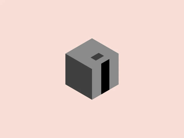


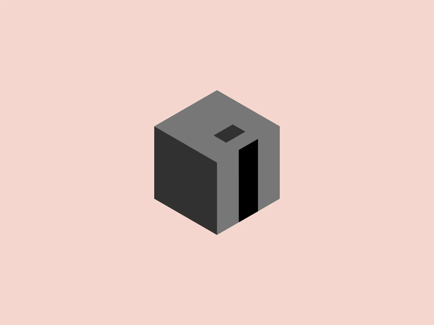
What catches our eye is the modern, minimalist, and three-dimensional cube design of the Iguana IT logo, with its clean and subtle color palette.
Letter
Type
Color
Style
The Iguana IT logo features a modern, minimalist, three-dimensional cube with a clean and subtle design. The cube is comprised of light teal, slate gray, and darker charcoal shades, creating depth through shading and perspective. The interplay between edges and surfaces suggests dimensionality, while the shading adds sophistication and volume. Hexcode: #E9E5CF
Iguana IT specializes in developing custom software utilizing the latest and most innovative technologies. The company focuses on the implementation of enterprise solutions, e-commerce platforms, internet portals, and website development.
Similar logos
NEW

The Banreservas logo showcases a capitalized letter "R" in a dark grey tone using a modern, bold sans-serif typeface. Below the "R," three curved swooshes flow to the left, colored in gradients of light blue, blue, and orange, creating a dynamic contrast. The design presents a clean, contemporary look that suggests energy, speed, or growth.
NEW

The logo for Zenith Bank is a stylized representation of the letter 'Z.' It features two main components with contrasting colors: a dark gray plane that forms the upper part of the 'Z' and a bold red plane creating the lower part. The logo has a sharp, modern look, characterized by its angular design and the use of negative space to enhance the division between the upper and lower sections. The absence of curves and the choice of a sans-serif style typeface give the design a strong, industrial feel. Its overall aesthetic is dynamic and suggests a sense of forward motion or progress.
NEW

The Waymo logo depicts a stylized letter "W" with a modern and dynamic design. It is composed of three overlapping, geometric shapes that are rounded at the ends, suggesting fluidity and movement. The color palette includes a gradient ranging from a bright teal to a deeper blue-green, creating a sense of depth and vibrancy. The overall design aesthetic is clean, contemporary, and would likely appeal to a tech-savvy or forward-thinking audience. The fluid form and gradient give the Waymo logo a sense of innovation and approachability.
NEW

The Le Monde logo features a stylized, abstract design that appears to be a representation of three vertical bars or pillars, with curvatures suggesting movement or fluidity. The design is monochromatic, utilizing varying shades of black and gray to create dimension and a sense of depth through shading and highlights. Its aesthetic leans towards modern and sleek, with clean lines and a minimalist approach that avoids any superfluous details. The use of negative space between the elements is cleverly managed to maintain the structure and integrity of each bar while imparting a dynamic and slightly futuristic look.
NEW

The logo presented for Photopea is a simplistic and modern design consisting of a single white spiral shape set against a flat teal square background. The spiral starts from the border near the lower-left corner and curves inward towards the center of the square, resembling a stylized letter "P" or a nautilus shell. The white spiral on the teal creates a striking contrast, making the logo memorable and visually impactful. Overall, the design is clean with a balance between organic curves and geometric form.
NEW

The DMarket logo features an abstract, stylized design resembling a forward-pointing arrow within a hexagon. A single, continuous ribbon twists to form the arrow and hexagon perimeter, conveying motion and direction. The gradient color creates a 3D effect, ranging from deep turquoise to lighter teal. This modern, sleek aesthetic suggests dynamism and innovation, with a subtle shadow adding to the sense of movement.
NEW

The SABC 3 logo features a stylized number 3 at its center, depicted in a bold, sans-serif typeface with a slight italicization, giving it a dynamic feel. Surrounding the numeral is a series of concentric circles made up of slices that alternate in color. These slices transition smoothly through a spectrum of cool hues, ranging from deep purples, blues, and greens to teal, creating a visual effect similar to that of a camera aperture or the blades of a turbine. The design exudes modernity and technological sophistication, hinting at dynamism and innovation. The use of gradients in the slices adds a sense of depth and dimensionality to the overall design.
NEW

The Samco logo features a modern and minimalistic stylized letter 'S' composed of three interlocking shapes in dark navy and grey colors. The bold, geometric forms create a sense of movement and connectivity, with negative space mirroring the curves of the 'S' for enhanced dynamism. The gradient effect adds depth and a 3D effect.
NEW

The logo for UKG is a stylized smiley face composed of a thick, U-shaped figure in dark teal, evoking a mouth, paired with two solid circles above it, suggesting eyes. The design is minimalistic, modern, and friendly, with a playful touch thanks to its simple, clean lines and rounded forms. The color scheme consists of a contrasting palette where the dark teal elements stand out against a white background, providing a strong visual impact.
NEW

The reCAPTCHA logo features a sleek and modern design with an amalgamation of arrow-shaped components in various shades of blue and grey. The dynamic aesthetic suggests motion and transformation, enhanced by the use of gradients for depth and sophistication.