Delta Assurances

15
What catches our eye is the sleek, modern design and bold use of geometric shapes and colors in the Delta Assurances logo, creating a contemporary and tech-oriented brand identity.

Letter

Type

Color

Red
548

Delta Assurances Logo

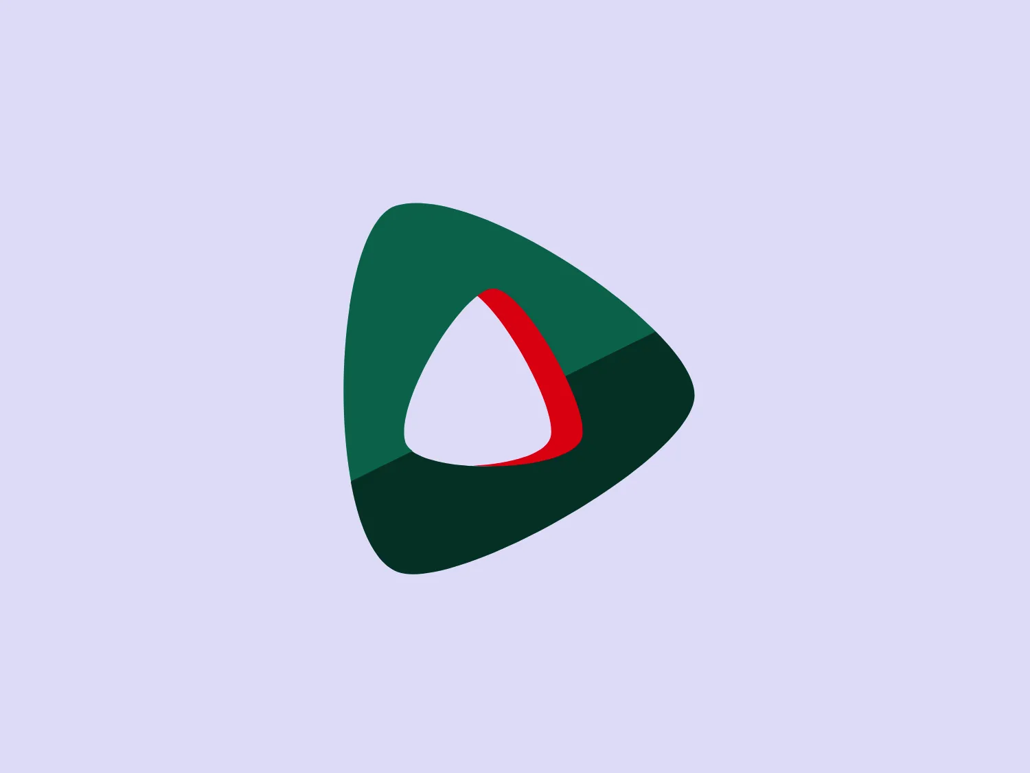
The Delta Assurances logo is a stylized triangular emblem composed of layered shapes. It features a large dark green triangle with a rounded corner pointing downwards as the base layer. Above that, a smaller triangle in a lighter shade of green mirrors the shape of the larger one but is oriented to point to the right. Nestled within the larger shapes is a smaller red triangle with a more acute angle, creating a vivid contrast and a sense of dynamic movement. The modern and sleek aesthetic, paired with the use of geometric forms and bold colors, suggests a contemporary and tech-oriented brand.

About Delta Assurances

Delta Assurances is an experienced insurance broker with a century-long legacy. The company provides advisory services and customizes insurance programs for clients in France and internationally. Specializing in social protection, business risks, and financial risks, Delta Assurances is dedicated to promoting business growth and ensuring peace of mind through innovative solutions.

Similar logos

The Angi logo showcases a sleek "A" in a vibrant coral red color. Its modern and minimalistic design includes a flowing curve that creates an engaging loop at the base, imparting a friendly and professional look. The bold typeface with smooth edges balances thick and thin strokes, exuding both weight and elegance. The logo's style and color suggest a preference for a complementary background that doesn't overshadow it.
The Deliveroo logo features a stylized, geometric representation of a lowercase letter 'v' with rounded terminals and a playful, cut-in contour on the right side. This creates a sense of motion or a smiling face with two dots representing eyes. The bright, aqua-green color gives the logo a modern, minimalist, and friendly vibe, suggesting creativity and innovation.
The logo in the image displays a symmetrical design resembling an abstract butterfly or a pair of wings. It consists of multiple leaf-like shapes radiating from the center, creating a harmonious pattern. Vibrant colors such as pink, orange, yellow, green, light blue, and teal are used, outlined with a thin black border that enhances their individuality. The overall design aesthetic is lively and organic, suggesting a sense of growth or transformation. The black background makes the colors pop, giving the logo a bold and energetic appearance.
The Afirme logo features an abstract design with three stylized, pointed shapes that resemble peaks or arrows, arranged in a dynamic and ascending pattern. The primary color used is a rich, flat green, without any gradients or shades, which conveys a sense of growth, vitality, or eco-friendliness. The overall aesthetic is modern and minimalist, with clean lines and sharp angles creating a sense of forward movement and progress. The simplicity of the design ensures versatility and readability across various mediums. For this logo, a light and subtle background would complement it well without overwhelming its simplicity.
The Qmedics logo showcases a stylized letter Q in a 3D ribbon-like form with smooth, flowing curves. It incorporates warm red and pink tones transitioning to cooler purples and blues on the interior, creating a vibrant and energetic look. The modern, playful design uses gradients to convey depth and movement, evoking an aesthetic of creativity and dynamism.
The image depicts a minimalist logo for Wildist, featuring three solid triangles arranged in ascending order from left to right, creating a simplified mountain range. The uniformly colored deep, dark green triangles stand out against a light background, projecting a modern and clean aesthetic. The use of geometric shapes and a monochromatic color scheme hints at nature, stability, and growth. The largest triangle on the right conveys a sense of hierarchy and progression.
The Akon Hidrolik logo exhibits a bold and minimalist design with a black square background. Within the square, a white geometric shape forms a stylized letter "a" with a red circle at the base, evoking the imagery of a needle's eye or a focal point. The overall aesthetic is modern and contemporary, utilizing primary colors and strong contrast to enhance its visual impact. Its simplicity renders it highly recognizable and versatile.
The Monday logo boasts a minimalist design with three simple geometric shapes, exuding a modern and playful aesthetic. It showcases two oblong shapes, one vibrant pink and the other bright yellow, slightly slanted and positioned in parallel, hinting at forward motion or connectivity. A small, solid green circle sits below them to the right, providing a visual anchor and adding a touch of contrast. The clean lines and bold, primary colors infuse the logo with a sense of approachability and energy.
The Logo for Tender Greens consists of two solid circles stacked vertically. The top circle is slightly smaller and has a small, quarter-circle notch at the top right, reminiscent of a stemmed fruit such as a cherry or an apple. Both circles and the stem-like feature share a bold, saturated red color, offering a striking contrast that would stand out on a lighter background. The design is simplistic with a flat, two-dimensional appearance and lacks additional detailing, which contributes to its modern and minimalist aesthetic.
The logo for Lifetime is a simple yet bold design consisting of variations of circular shapes with a modern twist. The primary color of the logo is a bright red, creating a striking visual impact. The design features a large, solid red circle, from which a smaller circle and a swoosh-like shape have been subtracted, giving the appearance of a stylized letter "Q" or an abstract representation of a person. The negative space within the Lifetime logo is particularly effective in creating a dynamic and unique figure, promoting a sense of elegance and fluidity in the overall aesthetic.