Rambert

15
What catches our eye about the Rambert logo is the bold and modern design with vibrant colors and an intriguing overlap, giving it a playful and energetic aesthetic.

Rambert Logo

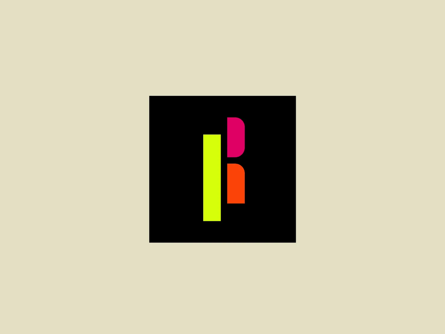
The Rambert logo features a bold and modern design with three stylized letterforms that form the "I", "B", and "R" set against a solid black square background. The "I" is presented in bright lime green on the left side, the "B" in vibrant hot pink on the right top, and the "R" in vivid orange on the right bottom. The shapes are geometrically simple but create an intriguing overlap where the pink and orange meet, suggesting a layered effect. The overall aesthetic is playful and energetic, with a clear focus on high contrast and visibility.

About Rambert

Rambert is committed to redefining conventional spaces through captivating, bold, and energetic dance presentations. Their goal is to connect with a wide range of audiences and participants by providing a diverse range of performances, classes, and community outreach programs tailored for individuals of all ages and capabilities.

Similar logos

The Lazada logo features a stylized three-dimensional shape reminiscent of a cube with a portion of its structure removed or invisible, creating an open corner perspective. It consists of two visible faces, with the left face in a vibrant orange and the right face in a hot pink, employing a gradient that combines the two colors seamlessly at the edge where they meet. The use of color and shading gives the logo a luminous, dynamic look, evoking a sense of innovation and modernity. There are subtle highlights and shadows on the faces that suggest depth and dimensionality. The overall design aesthetic is minimalist, bold, and contemporary, with a playful twist on geometric representation.
The Matsuura logo features a stylized depiction of three overlapping, rounded shapes in a vibrant green color. The design exudes a modern and minimalist aesthetic with a nod to nature or growth themes, implying movement and connectivity. The shapes suggest leaves, pebbles, or abstract representations of increasing value/momentum.
The Cornerstone logo features a simplistic and modern design, consisting of a stylized, abstract shape that somewhat resembles a flower or starburst within a circle. The primary element is a brilliant, solid red-orange color that gives the logo a vibrant and energetic feel. The inner white shape has softened edges which contrast smoothly with the circular boundary. Its symmetry and clean lines convey a sense of balance and professionalism. Considering the color palette of the logo, a soft, neutral background color would complement it well without competing for attention.
The Prodigy logo showcases a contemporary, fluid lowercase 'p' in a striking orange color. The design features soft curves and a dynamic loop, along with a sharp cut in the descender, creating a modern and slightly abstract appearance. This clean and minimalistic logo exudes energy and approachability while the vibrant orange color conveys creativity and enthusiasm.
The BitX Capital logo showcases a stylized, abstract design with a dynamic feel. It comprises interlocking shapes resembling a three-dimensional impossible loop. The main elements consist of two intertwined ribbons with a gradation of green shades that provide a sense of depth and movement. The contrast between the lighter and darker greens enhances the interweaving effect. Overall, the logo presents a modern and clean appearance, suggesting innovation and connectivity.
The Nationale Nederlanden logo exhibits a modern and dynamic design, featuring a stylized letter "N" enclosed within a circular shape. The minimalist "N" showcases sharp angles and a bold presence, with a gradient color scheme transitioning from vibrant orange to deep yellow, evoking energy and innovation. The circular background lends a sense of inclusivity or a global perspective, while the clean lines and digital feel make it suitable for a brand associated with technology, creativity, or communication.
The Kenner logo is a stylized, abstract representation of the letter 'K'. It features sharp angles and bold geometry, with a right-angled triangular shape forming the backbone of the 'K' that is met by two asymmetric arms at the top and bottom. This gives the letter an energetic and dynamic feel. The color of the logo is a vivid and saturated shade of orange, which gives it a sense of vibrancy and excitement, perfect for a brand looking to stand out. The overall aesthetic is modern and minimalist with a twist of creativity. For a background that complements yet contrasts pleasantly with the logo’s vivacious orange, a light and serene shade would be ideal. The hexcode #ECE4CF, a soft, pale peach, provides a gentle backdrop that would allow the logo to remain the focal point without overwhelming it.
The Kelloggs logo is a stylized letter "K," rendered in a vibrant, solid pink/magenta color. Its design is fluid and modern, with smooth, flowing lines and tapered ends that suggest speed and dynamism. The "K" seems calligraphic, with characteristics reminiscent of a brush stroke or a signature. The design aesthetic is sleek and minimalist, appealing to contemporary sensibilities while maintaining a sense of individuality and flair. Given its color and design, a contrasting yet subtle background color would complement it well.
The logo for Eldorado Gold features an abstract, circular design with three green curved shapes or leaves converging to suggest dynamic motion and organic growth. The curves are elegantly separated by white negative space giving the impression of a spinning globe or a plant in motion. The design evokes themes of nature, sustainability, and renewal, with the deep green color symbolizing growth, harmony, and freshness.
The Frontier Airlines logo is a modern, sleek design comprised of three bold, dark green, horizontal stripes that form an abstract letter "E". The upper and lower stripes are longer and angled slightly downward towards the right, while the center stripe is shorter, creating a sense of movement and dynamism. The negative space between the stripes reinforces the "E" shape. The color has a professional and serious tone, and the logo's simplicity gives it a timeless and versatile feel. It has a clean, geometric quality, and there are no additional embellishments, making it highly adaptable for various applications.