Vale

15
Here's what we like: The abstract, minimalist design of the Vale logo with flowing lines creating a sense of movement and freedom.

Letter

Color

Vale Logo

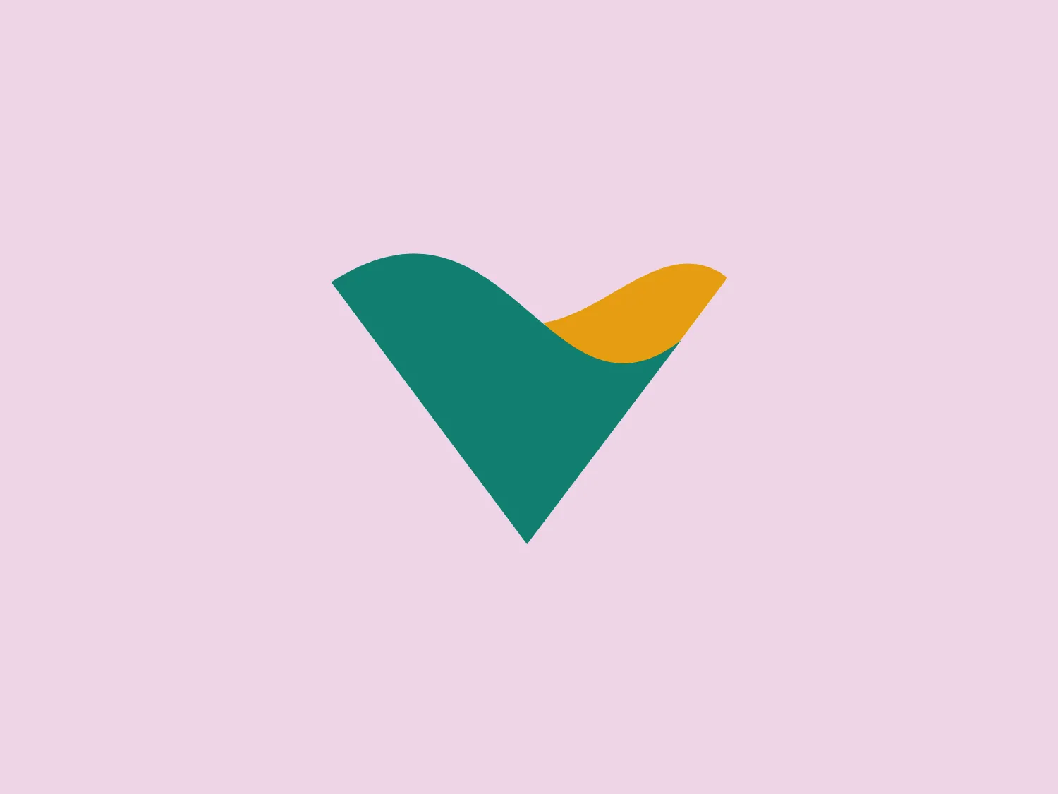
The Vale logo features an abstract, stylized representation of a bird in flight. The design is minimalist and modern, with smooth, flowing lines creating a sense of movement and freedom. It is composed of two main shapes: a large teal-colored shape that forms the body and wings, and a smaller, golden-yellow shape that suggests the bird's head and beak. The teal shape resembles a checkmark, adding a potential connotation of positivity or approval. The colors are vibrant and contrasting, yet complementary, lending the logo an energetic and dynamic feel. The simplicity of the design allows for versatility in various applications and sizes.

About Vale

Vale is a prominent player in the global mining industry, specializing in the production of iron ore, nickel, copper, coal, manganese, ferroalloys, fertilizers, cobalt, and platinum group metals.

Similar logos

The ICICI Bank logo features a stylized, abstract design with a fluid, organic shape. The central element resembles a lowercase "i" with a dot hovering above what could be interpreted as an abstract human figure or a dynamic swirl. Its bold lines curve to create a sense of movement. The color scheme consists of a gradient transition from a deep, warm red to a rich, golden orange, giving the logo an energetic and inviting appearance. Noteworthy is the way the white space between the "i" and its dot creates a pathway, emphasizing the motion and adding an element of negative space to the design.
The business logo for Glow Bar is a stylized, modern design portraying the lowercase letter 'g'. The design is fluid and continuous, with a bold, looping structure. The logo is a warm, pale gold color, conveying luxury and elegance, with a glossy finish for a premium feel. A small, five-pointed star sits above the upper curve of the 'g,' suggesting excellence or a premium grade.
The Nationale Nederlanden logo exhibits a modern and dynamic design, featuring a stylized letter "N" enclosed within a circular shape. The minimalist "N" showcases sharp angles and a bold presence, with a gradient color scheme transitioning from vibrant orange to deep yellow, evoking energy and innovation. The circular background lends a sense of inclusivity or a global perspective, while the clean lines and digital feel make it suitable for a brand associated with technology, creativity, or communication.
The Washington Commanders logo features three interconnected diamond shapes forming a stylized letter "W." The primary color is a deep maroon with a thick golden yellow border, creating a sharp contrast and a dynamic feel. The use of geometric shapes and bold colors conveys strength and modernity.
The eTactica logo showcases a simple and geometric design composed of four differently colored quarter-circle sectors arranged in a circular pattern, resembling a spinning wheel or pie chart. The transition from vibrant red to yellow, green, and blue creates a smooth and balanced look. The use of primary and secondary colors gives the logo an energetic and optimistic feel. The white negative space in the center subtly forms a 'C' shape, possibly representing the initial of the company or brand.
The logo presented for Photopea is a simplistic and modern design consisting of a single white spiral shape set against a flat teal square background. The spiral starts from the border near the lower-left corner and curves inward towards the center of the square, resembling a stylized letter "P" or a nautilus shell. The white spiral on the teal creates a striking contrast, making the logo memorable and visually impactful. Overall, the design is clean with a balance between organic curves and geometric form.
The Waymo logo depicts a stylized letter "W" with a modern and dynamic design. It is composed of three overlapping, geometric shapes that are rounded at the ends, suggesting fluidity and movement. The color palette includes a gradient ranging from a bright teal to a deeper blue-green, creating a sense of depth and vibrancy. The overall design aesthetic is clean, contemporary, and would likely appeal to a tech-savvy or forward-thinking audience. The fluid form and gradient give the Waymo logo a sense of innovation and approachability.
The Vanderbilt University logo is a stylized letter "V" with a modern and sleek design. It features sharp angles converging towards the bottom to form a precise and cutting-edge base. The logo is gold-toned, with a gradient transitioning from lighter to darker, giving it a luxurious and refined appearance.
The DMarket logo features an abstract, stylized design resembling a forward-pointing arrow within a hexagon. A single, continuous ribbon twists to form the arrow and hexagon perimeter, conveying motion and direction. The gradient color creates a 3D effect, ranging from deep turquoise to lighter teal. This modern, sleek aesthetic suggests dynamism and innovation, with a subtle shadow adding to the sense of movement.
The Oberoi logo features a stylized bloom or sunburst, with a multitude of pointed petals or rays emanating from a central point. It utilizes a two-tone color scheme with shades of gold, giving it a warm, inviting look. The design is symmetrical, suggesting balance and harmony. The overall aesthetic is clean and modern, with a touch of elegance due to the refined curves of each petal and the gradient effect that provides a sense of depth. The simplicity of the design allows for versatility in its application.