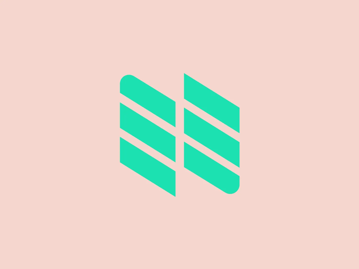
Nylas


This logo's clever dual letter illusion and vibrant cyan color give it a fresh and contemporary feel.
Letter
Type
Color
Style
The Nylas logo is a stylized, abstract letterform that creates a dual letter illusion, resembling a combination of the letters "E" and "M" or "W." The three-dimensional parallelogram shapes are arranged in a mirrored configuration, with rounded corners for a modern and soft appearance. Vibrant cyan color adds a fresh and contemporary feel, and the clever use of negative space between the shapes contributes to the logo's dynamic and versatile appearance.
Nylas is a Communication Platform-as-a-Service (CPaaS) company that enables businesses to access and utilize their communications data.
Similar logos
NEW

The logo for Luma AI showcases a stylized, geometric design with two overlapping planes. The primary shape resembles a three-dimensional rhombus or skewed cube, creating depth and perspective. A vibrant cyan transitions smoothly to a rich, deep blue, suggesting movement and energy. The overall aesthetic is modern and dynamic, with clean lines and a minimalist approach, conveying a sleek, professional image.
NEW

The Brandcast logo features a stylized letter "B" composed of four distinct, quarter-circle sections that create a segmented modern look. The colors transition beautifully from a bold purple at the top left, to a deep blue at the top right, then to a bright cyan transitioning to a vibrant pink at the bottom. The design is clean and minimalist with a soft, rounded typeface. The color palette evokes creativity and innovation with a gradient that gives the illusion of a three-dimensional object. The merging of colors suggests connectivity and integration.
NEW

The Microsoft Edge logo features an abstract design reminiscent of a swirling wave or a dynamic circular motion, composed of two main elements that resemble a stylized letter "C". The right portion is painted in gradients of blue, cyan, and dark navy, suggesting depth and fluidity. On the left, the design transitions to a soft green, inferring energy and growth. The overall aesthetic is modern and sleek, characterized by the seamless gradient transition and the fluidity of the shapes. There's a sense of movement and connectivity in the design, perhaps symbolizing networking, communication, or environmental dynamics.
NEW

The logo for Mailbox features a minimalist geometric design resembling an abstract envelope or a downward-facing chevron inside a trapezoid shape. The primary color of the logo is a bright, flat cyan tone, invoking a sense of modernity and digital communication. There are no gradients or additional embellishments, emphasizing a clean and straightforward aesthetic that would suit a technology or correspondence-related brand. The sharp angles and the negative space in the center forming a 'V' or a peak add a dynamic quality to the design.
NEW

The E-ridez logo showcases a circular shape with a stylized letter "Z" at the center. It consists of overlapping triangular and polygonal elements, with a gradient effect transitioning from deep violet to vibrant cyan. The design exudes a modern and dynamic aesthetic, representing movement and cutting-edge technology. The graphic elements, including sharp angles and whitespace within the "Z," contribute to the overall sense of energy and innovation in the design.
NEW

The Sentry logo is a modern and abstract design that resembles a stylized letter "S". It features a dynamic and fluid shape with a sweeping curve that forms two swirls. The logo's color gradient shifts smoothly from a deep navy blue on the left, representing professionalism and reliability, to a vibrant cyan on the right, symbolizing energy and innovation. This gradient creates a sense of motion and transformation, giving the logo a sleek, minimalistic, and contemporary appearance.
NEW

The image shows the Bank Beirut logo, which consists of a modern, geometric shape resembling a letter "B" or a digit "8" split vertically in the middle. The design employs a gradient color scheme that transitions smoothly from a dark navy blue at the top to a vibrant cyan blue at the bottom. Highlights and shadows create a sense of depth, suggesting a subtle three-dimensional effect. The logo's clean lines and gradient give it a sleek and professional appearance. The design balances both sharp and smooth edges, infusing the logo with a dynamic and forward-thinking vibe.
NEW

The City of Regina logo features a stylized lowercase letter 'a' with a fluid, ribbon-like design that intersects with itself, conveying a sense of dynamism and continuity. It employs a gradient color scheme that blends from red to blue, with shades of yellow and cyan in between, creating a vibrant and modern look. The overall design aesthetically suggests movement and connectivity with its overlapping and intertwining form. The smooth gradients and curved lines would complement a subtle background.
NEW

The Creative Folkestone logo features a series of six square shapes arranged in a 2x3 grid. Each square showcases a bold and vibrant color palette, including blue, green, pink, yellow, dark gray, and cyan. The modern and simplistic design adopts a flat color aesthetic with no gradients or shadows, giving it a contemporary and digital feel. The tightly packed squares convey a sense of cohesion and unity within the logo.
NEW

The logo displayed is a simple yet bold design, consisting of Tradify's stylized letter "T" in a bright, flat cyan color. The "T" features a unique cut on the top right corner, giving it a modern and slightly asymmetrical appearance. This geometric modification adds a sense of movement or evolution to the otherwise traditional letterform. The logo’s clean lines and lack of additional embellishments suggest a minimalist design approach, suitable for contemporary branding. The cyan color is vivid and would stand out effectively against a light pastel background.