Mytilineos


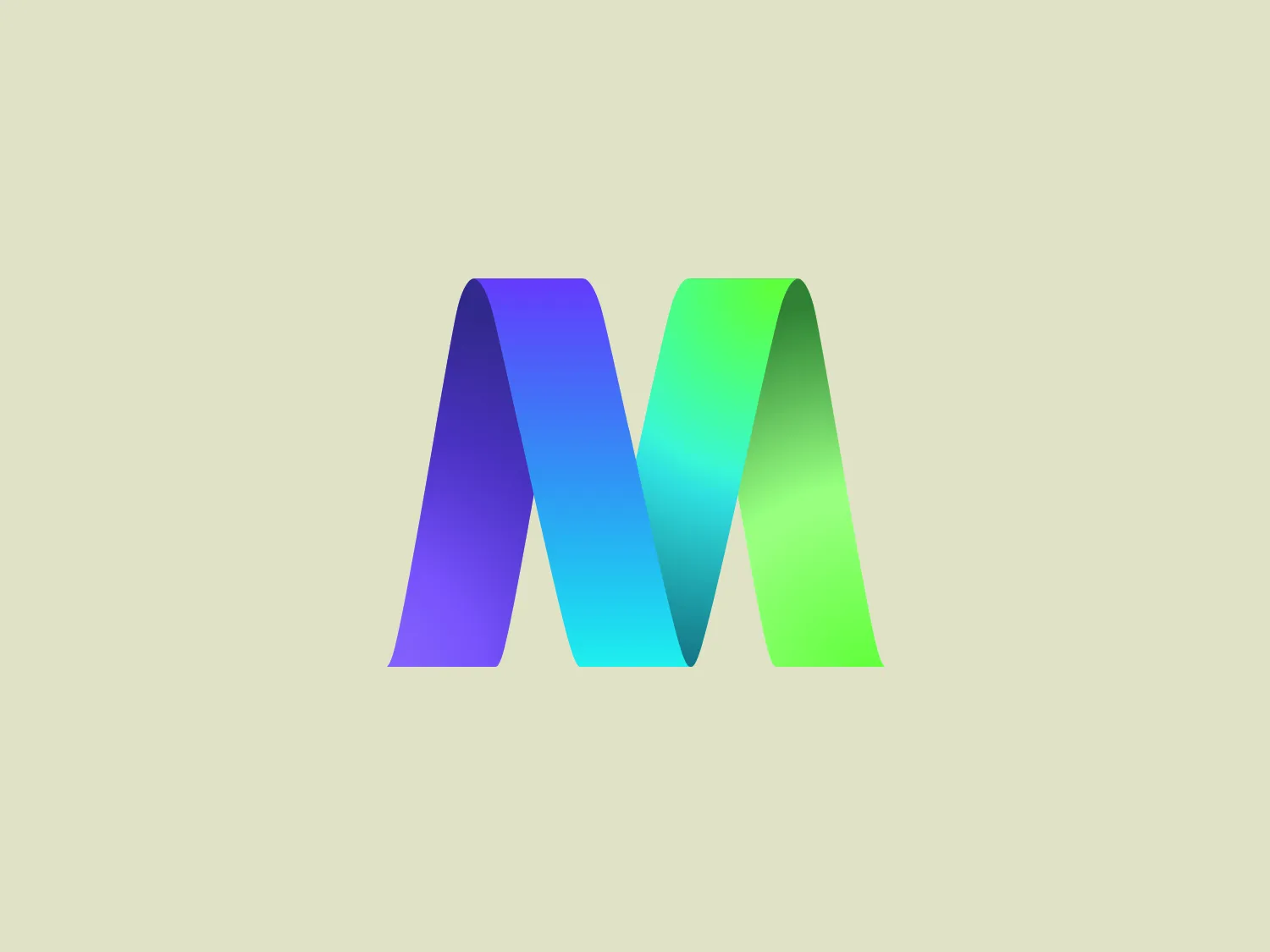
We like the polished "M" logo with its dynamic ribbon effect, gradient colors, and futuristic design.
Letter
Type
Color
Style
The Mytilineos logo showcases a stylized letter "M" with a contemporary and polished design. Comprising three-dimensional facets, the "M" creates a ribbon-like effect, lending it a dynamic and fluid appearance. Smoothly transitioning from deep violet to bright green, the color gradient flows through shades of blue and cyan. The minimalist and futuristic design is accentuated by gradients and subtle shadows, imbuing the logo with a sense of depth and prominence against the background.
Mytilineos is a prominent global industrial and energy conglomerate with a significant presence across all five continents. The company specializes in metallurgy, energy, and EPC sectors.
No items found.
Similar logos
NEW

The logo for Luma AI showcases a stylized, geometric design with two overlapping planes. The primary shape resembles a three-dimensional rhombus or skewed cube, creating depth and perspective. A vibrant cyan transitions smoothly to a rich, deep blue, suggesting movement and energy. The overall aesthetic is modern and dynamic, with clean lines and a minimalist approach, conveying a sleek, professional image.
NEW

The Boonli logo features a stylized, continuous loop resembling an abstract figure-eight or infinity symbol. It consists of two intertwined segments with a gradient color transition, starting from a rich magenta on one end, blending into a deep violet, and finishing with a vibrant orange on the other extremity. The colors give it a dynamic and modern feel, while the smooth curves suggest fluidity and connection. This design is sleek and minimalistic, with no additional embellishments, making it versatile and easily recognizable.
NEW

The logo for Ciklum showcases a stylized letter "C" made up of three distinct semi-circular arcs that intertwine to create a dynamic and modern design. The outermost arc is a vibrant orange, the middle arc is a bright blue, and the innermost arc is a deep violet, which results in a striking color contrast. The shapes have a sleek, flat design with no gradients or textures, giving the logo a contemporary and digital-friendly appearance. The rounded forms convey accessibility and movement, while the open space in the center of the "C" suggests openness and innovation.
NEW

The Vee Beneficios logo features a bold, violet "V" enclosed within a lighter purple circle. The "V" has serifs and is styled with a break in the lines, creating dynamics and a stencil-like effect. The sharp angles of the "V" contrast with the soft, circular boundary, combining modernity with a subtle, approachable feel. The color contrast between the violet and lighter purple indicates depth and vibrancy, suggesting creativity and innovation.
NEW

The Brandcast logo features a stylized letter "B" composed of four distinct, quarter-circle sections that create a segmented modern look. The colors transition beautifully from a bold purple at the top left, to a deep blue at the top right, then to a bright cyan transitioning to a vibrant pink at the bottom. The design is clean and minimalist with a soft, rounded typeface. The color palette evokes creativity and innovation with a gradient that gives the illusion of a three-dimensional object. The merging of colors suggests connectivity and integration.
NEW

The Microsoft Edge logo features an abstract design reminiscent of a swirling wave or a dynamic circular motion, composed of two main elements that resemble a stylized letter "C". The right portion is painted in gradients of blue, cyan, and dark navy, suggesting depth and fluidity. On the left, the design transitions to a soft green, inferring energy and growth. The overall aesthetic is modern and sleek, characterized by the seamless gradient transition and the fluidity of the shapes. There's a sense of movement and connectivity in the design, perhaps symbolizing networking, communication, or environmental dynamics.
NEW

The logo for Mailbox features a minimalist geometric design resembling an abstract envelope or a downward-facing chevron inside a trapezoid shape. The primary color of the logo is a bright, flat cyan tone, invoking a sense of modernity and digital communication. There are no gradients or additional embellishments, emphasizing a clean and straightforward aesthetic that would suit a technology or correspondence-related brand. The sharp angles and the negative space in the center forming a 'V' or a peak add a dynamic quality to the design.
NEW

The E-ridez logo showcases a circular shape with a stylized letter "Z" at the center. It consists of overlapping triangular and polygonal elements, with a gradient effect transitioning from deep violet to vibrant cyan. The design exudes a modern and dynamic aesthetic, representing movement and cutting-edge technology. The graphic elements, including sharp angles and whitespace within the "Z," contribute to the overall sense of energy and innovation in the design.
NEW

The Sentry logo is a modern and abstract design that resembles a stylized letter "S". It features a dynamic and fluid shape with a sweeping curve that forms two swirls. The logo's color gradient shifts smoothly from a deep navy blue on the left, representing professionalism and reliability, to a vibrant cyan on the right, symbolizing energy and innovation. This gradient creates a sense of motion and transformation, giving the logo a sleek, minimalistic, and contemporary appearance.
NEW

The image shows the Bank Beirut logo, which consists of a modern, geometric shape resembling a letter "B" or a digit "8" split vertically in the middle. The design employs a gradient color scheme that transitions smoothly from a dark navy blue at the top to a vibrant cyan blue at the bottom. Highlights and shadows create a sense of depth, suggesting a subtle three-dimensional effect. The logo's clean lines and gradient give it a sleek and professional appearance. The design balances both sharp and smooth edges, infusing the logo with a dynamic and forward-thinking vibe.