PadRabbit

15
Something we like about the PadRabbit logo is its clever use of negative space to form a rabbit within the letter "R," creating a modern and minimalist design.

PadRabbit Logo

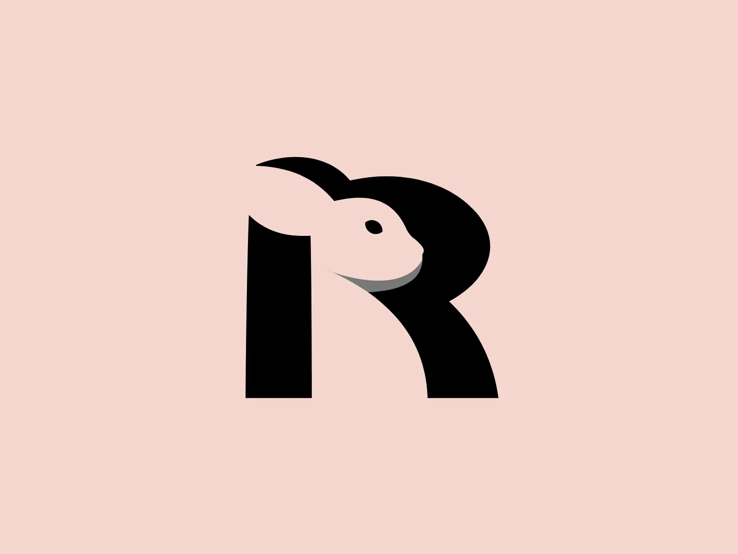
The PadRabbit logo features a stylized, abstract design of a rabbit cleverly incorporated into the negative space of a bold, black letter "R." The black and white color scheme is striking and minimalist, highlighting the clever use of space within the letter to suggest the form of the rabbit, complete with a suggestion of an eye, ears, and head. The overall design aesthetic is modern, clean, and would be highly recognizable even from a distance. The design effectively captures attention through its simplicity and the surprise element of the hidden animal figure.

About PadRabbit

PadRabbit is dedicated to providing a seamless and hassle-free rental home search experience in Brooklyn. The company aims to assist individuals in finding their next place to live as they move from one location to another.
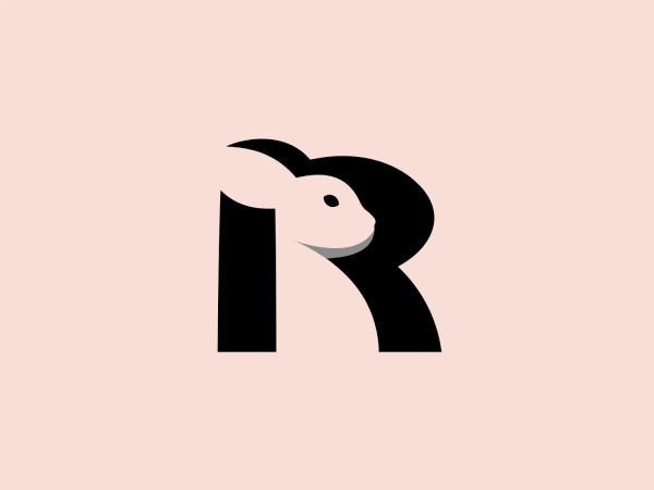
Similar logos

The MIDI Association logo features a bold and stylized design with two arches that converge to form an abstract "M" shape. The symmetrical arches create a sense of balance and stability, resulting in a simplistic and modern design with clean lines and no additional embellishments. The black logo stands out well against lighter backgrounds and has a strong visual presence due to its thick lines and distinct negative space that forms the "M." The minimalistic aesthetic ensures broad versatility for various applications.
The Framer logo consists of a bold, abstract geometric design that features two black shapes on a white background. These shapes resemble stylized arrowheads or triangular segments arranged back-to-back with a right angle between them, creating a dynamic and forward-moving impression. The overall design aesthetic is minimalist, modern, and hints at movement or transition. The logo's sharp angles and contrasting colors give it a striking appearance.
The Bardee logo is a stylized design consisting of two interlocked shapes that appear to be an abstract representation of the infinity symbol. Its contours are smooth and continuous, creating a sense of fluidity and connection. The design is black, simple, and bold against a white background, conveying elegance and modernity. The shapes are reminiscent of loops or ties, suggesting a theme of interconnectivity or eternity. The logo exudes sleekness and simplicity, making it versatile for various applications.
The logo for École des Musiques Actuelles portrays a sleek, abstract design featuring a single continuous, wavy line. This line forms a rhythmic and dynamic visual effect with delicate curves at the beginning and end, extending into two sharp peaks resembling the letter "M," a stylized heartbeat, or sound waves. Rendered in bold black, the monochromatic logo stands out sharply against a light background, exuding a modern, minimalistic, and versatile aesthetic suggestive of movement and vitality, suitable for diverse branding applications.
The Gearbest logo features a bold, black, stylized smile at its center, with the ends of the smile tapering to points. This simplistic and cheerful smile is prominently positioned against a vibrant yellow square background with rounded corners. The overall design aesthetic is modern and minimalistic, suggesting friendliness and positivity. The design's high contrast and simplicity would stand out well against a variety of backgrounds but would be particularly striking on a light, muted color to maintain its vibrancy without overwhelming its simplicity.
The Generale Bank logo is a minimalist design featuring a bold and modern 'G' created with sharp lines and curves. The solid, white letter sits centrally against a vibrant, flat, coral red square background. The 'G' has a geometric quality with its upper case form and is designed with a cutout that cleverly contributes to reading the letter correctly. The contrast between the bright white and the bold red makes the logo pop, indicative of a brand that aims to be seen as energetic and confident.
The Alanod logo features a stylized, abstract design composed of black concentric shapes that form a circular motif resembling the letter 'D' or a spiral in silhouette. At the center, the shapes taper into fine lines, creating a sense of movement and depth. The design is modern and clean, utilizing negative space effectively to distinguish the forms. This logo conveys a sense of innovation and dynamism.
The Columbia SC logo features a vibrant, deep red rectangular background with rounded corners, creating a bold and attention-grabbing design. Centered on the background is a clean and modern white capital letter "H" with a contemporary aesthetic, featuring a slight gap between the vertical and horizontal strokes. The logo's balance of rounded edges and straight lines creates a dynamic and harmonious visual effect.
The Akon Hidrolik logo exhibits a bold and minimalist design with a black square background. Within the square, a white geometric shape forms a stylized letter "a" with a red circle at the base, evoking the imagery of a needle's eye or a focal point. The overall aesthetic is modern and contemporary, utilizing primary colors and strong contrast to enhance its visual impact. Its simplicity renders it highly recognizable and versatile.
The BETA Technologies logo features a bold, solid black letter "B" with a white lightning bolt cutting through its center, creating a modern and minimalist design. The stark contrast between the black and white elements emphasizes the strong visual impact of the logo. The lightning bolt infuses a sense of power and energy, suggesting dynamism and force. The classic, rounded attributes of the "B" combined with the edgy, contemporary feel of the lightning bolt create a striking visual identity for the business.