Rombach Holzwerk

15
We like the bold "R" with a striking red triangle on top, creating a modern and impactful design for Rombach Holzwerk.

Rombach Holzwerk Logo

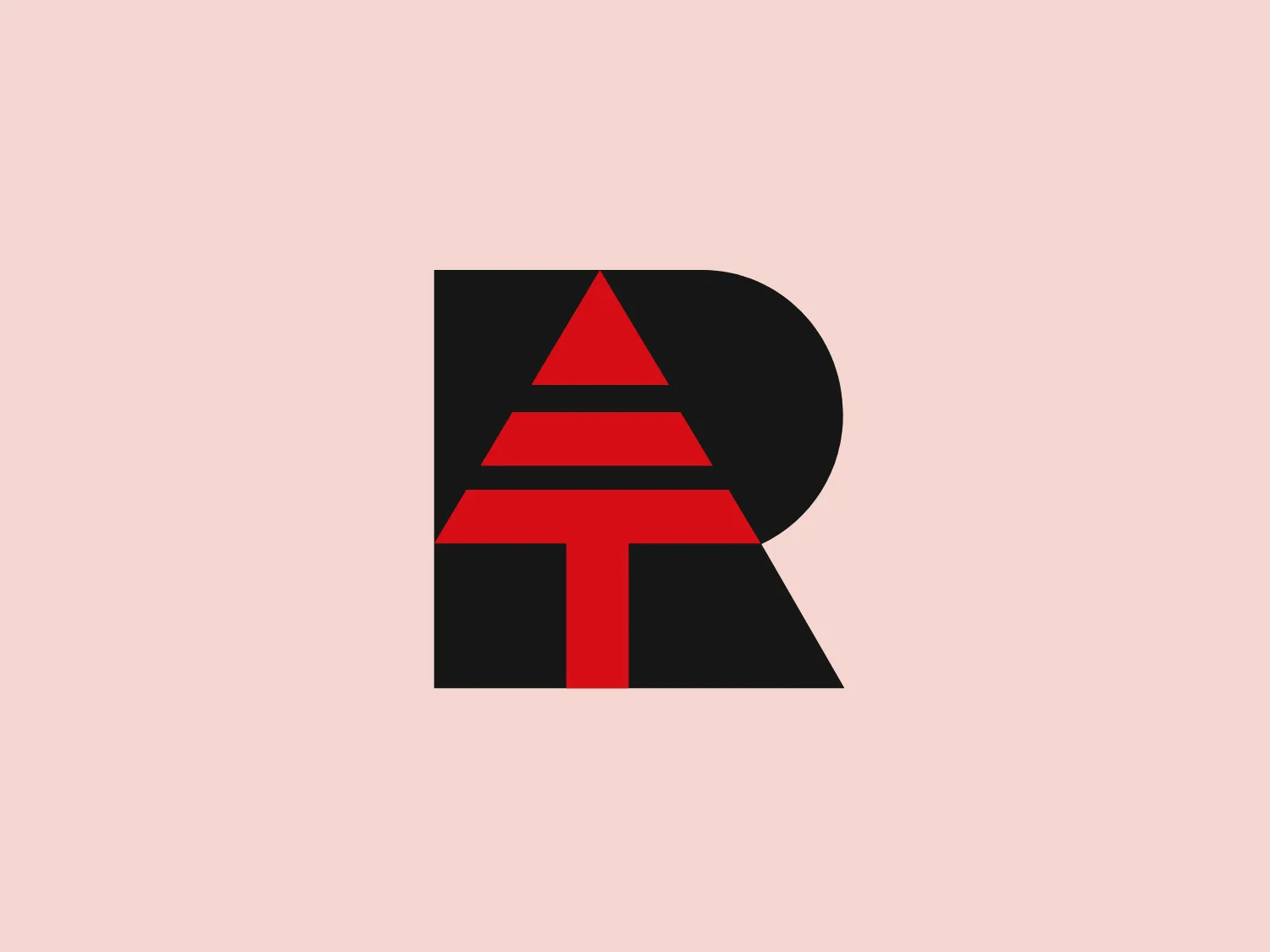
The logo for Rombach Holzwerk is a graphical combination of a bold black letter "R" with a straight vertical line and an extended curving arc. Superimposed on the "R" is a red, stylized triangle with its base aligned on the horizontal axis, symbolizing upward movement or growth. The contrast between the deep black and the vivid red creates a striking visual impact, while the overall design is simple, modern, and easily recognizable. Considering the dark tones of the logo, a light and subtle background color would complement it well.

About Rombach Holzwerk

Established by Johann Rombach in 1885, Rombach Holzwerk has transformed from a traditional sawmill into a modern company integrating state-of-the-art technology. With a strong legacy and a dedication to pioneering advancements, the company maintains its focus on superior quality and exemplary standards.

Similar logos

The Angi logo showcases a sleek "A" in a vibrant coral red color. Its modern and minimalistic design includes a flowing curve that creates an engaging loop at the base, imparting a friendly and professional look. The bold typeface with smooth edges balances thick and thin strokes, exuding both weight and elegance. The logo's style and color suggest a preference for a complementary background that doesn't overshadow it.
The MIDI Association logo features a bold and stylized design with two arches that converge to form an abstract "M" shape. The symmetrical arches create a sense of balance and stability, resulting in a simplistic and modern design with clean lines and no additional embellishments. The black logo stands out well against lighter backgrounds and has a strong visual presence due to its thick lines and distinct negative space that forms the "M." The minimalistic aesthetic ensures broad versatility for various applications.
The Framer logo consists of a bold, abstract geometric design that features two black shapes on a white background. These shapes resemble stylized arrowheads or triangular segments arranged back-to-back with a right angle between them, creating a dynamic and forward-moving impression. The overall design aesthetic is minimalist, modern, and hints at movement or transition. The logo's sharp angles and contrasting colors give it a striking appearance.
The Bardee logo is a stylized design consisting of two interlocked shapes that appear to be an abstract representation of the infinity symbol. Its contours are smooth and continuous, creating a sense of fluidity and connection. The design is black, simple, and bold against a white background, conveying elegance and modernity. The shapes are reminiscent of loops or ties, suggesting a theme of interconnectivity or eternity. The logo exudes sleekness and simplicity, making it versatile for various applications.
The logo for École des Musiques Actuelles portrays a sleek, abstract design featuring a single continuous, wavy line. This line forms a rhythmic and dynamic visual effect with delicate curves at the beginning and end, extending into two sharp peaks resembling the letter "M," a stylized heartbeat, or sound waves. Rendered in bold black, the monochromatic logo stands out sharply against a light background, exuding a modern, minimalistic, and versatile aesthetic suggestive of movement and vitality, suitable for diverse branding applications.
The Gearbest logo features a bold, black, stylized smile at its center, with the ends of the smile tapering to points. This simplistic and cheerful smile is prominently positioned against a vibrant yellow square background with rounded corners. The overall design aesthetic is modern and minimalistic, suggesting friendliness and positivity. The design's high contrast and simplicity would stand out well against a variety of backgrounds but would be particularly striking on a light, muted color to maintain its vibrancy without overwhelming its simplicity.
The Qmedics logo showcases a stylized letter Q in a 3D ribbon-like form with smooth, flowing curves. It incorporates warm red and pink tones transitioning to cooler purples and blues on the interior, creating a vibrant and energetic look. The modern, playful design uses gradients to convey depth and movement, evoking an aesthetic of creativity and dynamism.
The Alanod logo features a stylized, abstract design composed of black concentric shapes that form a circular motif resembling the letter 'D' or a spiral in silhouette. At the center, the shapes taper into fine lines, creating a sense of movement and depth. The design is modern and clean, utilizing negative space effectively to distinguish the forms. This logo conveys a sense of innovation and dynamism.
The Akon Hidrolik logo exhibits a bold and minimalist design with a black square background. Within the square, a white geometric shape forms a stylized letter "a" with a red circle at the base, evoking the imagery of a needle's eye or a focal point. The overall aesthetic is modern and contemporary, utilizing primary colors and strong contrast to enhance its visual impact. Its simplicity renders it highly recognizable and versatile.
The BETA Technologies logo features a bold, solid black letter "B" with a white lightning bolt cutting through its center, creating a modern and minimalist design. The stark contrast between the black and white elements emphasizes the strong visual impact of the logo. The lightning bolt infuses a sense of power and energy, suggesting dynamism and force. The classic, rounded attributes of the "B" combined with the edgy, contemporary feel of the lightning bolt create a striking visual identity for the business.