Kome Collective

15
What we like is the modern, dynamic design with fluid, graceful lines and a warm, energetic color palette.

Letter

Color

Kome Collective Logo

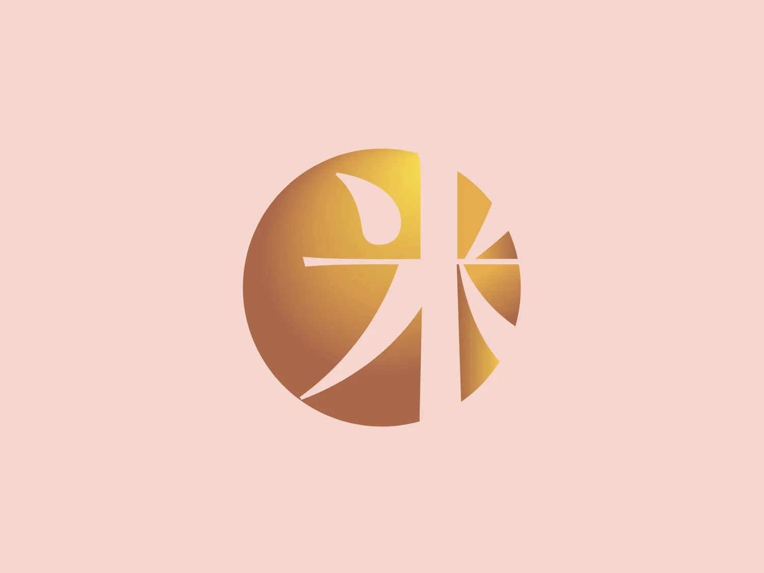
The logo depicted is a stylized, abstract design consisting of a circular shape segmented into various curving slices. The color palette transitions smoothly from a warm, golden yellow to a pale yellow hue, suggesting a gradient. The slices are created by white lines that curve gracefully, adding a sense of motion and fluidity to the design. The overall aesthetic is modern and dynamic, with a simplicity that allows for versatility in use. The choice of colors conveys energy and optimism.

About Kome Collective

Komé Collective is a diverse group consisting of traditional and forward-thinking thought leaders, producers, and brands, all focused on Japanese culture. They offer an extensive sake portfolio in the US, renowned for its comprehensiveness and diversity, along with unique and inspirational Japanese spirits.

Similar logos

The Browze logo features a continuous line that forms a sleek fusion of the letters 'V' and 'B'. The design exudes elegance and modernity with its fluid and organic structure. Presented in monochrome, the black against white creates a timeless and classic feel. Its minimalist aesthetic draws attention to the beauty of the line's curve and the use of negative space. The design's seamless flow may suggest connectivity or unity, and its simplicity allows for versatility and scalability.
The Delivery Hero logo features a dynamic red comet shape with a stylized white star centered on its body. The comet tail metaphorically conveys speed, progress, or possibly a shooting star suggesting dreams and aspirations. The sharp edges of the star contrast with the smooth, curved form of the comet, giving the design a sense of forward motion. Its design is simple yet effective, easily scalable, and memorable. Considering the vibrancy of the red, a muted background that complements without competing would be ideal.
The BETA Technologies logo features a bold, solid black letter "B" with a white lightning bolt cutting through its center, creating a modern and minimalist design. The stark contrast between the black and white elements emphasizes the strong visual impact of the logo. The lightning bolt infuses a sense of power and energy, suggesting dynamism and force. The classic, rounded attributes of the "B" combined with the edgy, contemporary feel of the lightning bolt create a striking visual identity for the business.
The Rossignol logo showcases a stylized white letter 'R' in the center of a bright red circular background. The 'R' includes a clean design with a striking slash through its stem, adding a modern flair. Smooth curves create a sleek look, and the red and white color scheme offers a bold and attention-grabbing contrast. The overall design aesthetic is minimalist and contemporary, making it versatile for various applications.
The image showcases a bold and abstract Neufquatre Éditions logo, consisting of a stylized letter "N" with a dynamic, fluid shape. The design is minimalist and modern, using negative space effectively to create the impression of motion within the letter form. The logo is monochromatic, featuring a stark black against a clean white background. The simplicity of the design lends itself to versatility, while the curvature of the lines suggests creativity and innovation.
The Breitling logo depicts a stylized, fluid letter "B" with elongated, curved strokes, giving it an elegant and dynamic appearance. The design is minimalist, using a bold golden yellow color that suggests luxury, quality, and sophistication. The overall aesthetic is modern and sleek, with a sense of movement and possibly creativity, hinted by the smooth lines that evoke a sense of continuity. Given the vibrancy of the golden hue, a subtle and light background would complement it well without competing for attention.
The Meralco logo features a stylized, angular lightning bolt in white, cutting dynamically across a vibrant, solid orange circle. The bolt itself has sharp edges and points, conveying a sense of energy and power. The simplicity of the design gives it a modern and impactful aesthetic, as the high-contrast color scheme makes the logo stand out boldly. The circular shape envelops the bolt, suggesting completeness and a global or universal aspect to the brand identity.
The Osiris Shoes logo is a simple and modern design featuring geometric shapes. It includes a large black semicircle balanced above a smaller white circle, with an even smaller black circle at its center. The minimalist aesthetics and use of negative space create a sense of harmony and balance. The monochromatic color scheme gives the logo a versatile and timeless feel. A soft and neutral background would complement the logo without overwhelming its design.
The TV6 Lithuania logo features a stylized numeral "6" encapsulated within a circular form. It is crafted with a modern aesthetic, featuring smooth curves and a thick, consistent stroke width. The design consists of three colors: black, white, and a bold red. The red part emphasizes the inner loop of the "6," while black creates a striking contrast for the outer circular boundary. This design combines simplicity with a striking color contrast to produce a clean and recognizable brand image.
The Nationale Nederlanden logo exhibits a modern and dynamic design, featuring a stylized letter "N" enclosed within a circular shape. The minimalist "N" showcases sharp angles and a bold presence, with a gradient color scheme transitioning from vibrant orange to deep yellow, evoking energy and innovation. The circular background lends a sense of inclusivity or a global perspective, while the clean lines and digital feel make it suitable for a brand associated with technology, creativity, or communication.