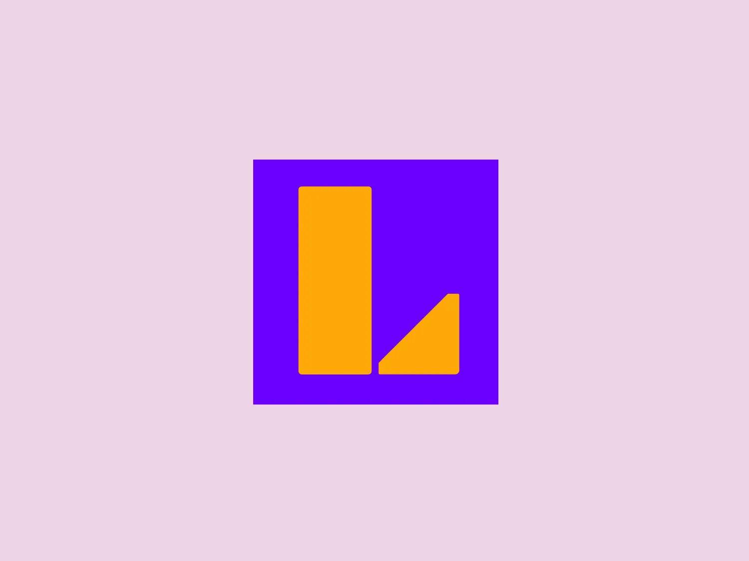
Latina TV


What we like about the Latina TV logo is the bold use of vibrant yellow and rich purple, creating a visually striking and modern design.
Letter
Type
Color
Style
The logo for Latina TV features a tall vertical rectangle and a shorter, right-triangle with a vertical hypotenuse, both in a vibrant yellow color. These shapes are superimposed on a rich purple square backdrop, offering a stark and attractive contrast. The design aesthetic is bold and modern, with a simplicity that enhances its visual impact. The use of bright, contrasting colors makes the logo pop and the absence of any text or additional elements ensures the shapes themselves are the focal point of the design.
Latina TV is a brand that offers multiscreen audiovisual products, focused on creating engaging and high-quality content that celebrates and enhances the unique cultural elements of Peru.
Similar logos
NEW

The Kuda Bank logo features a stylized letter 'K' mirrored and joined in the middle to form a symmetrical design that resembles a chevron or arrow pointing to the left. The 'K' shapes are composed of four solid stripes with sharp angles, creating a dynamic and modern look. The color of the logo is a deep, rich purple, giving it a sense of sophistication and regality. There are no additional embellishments, allowing the clean and bold geometry of the letterforms to stand out.
NEW

The Breitling logo depicts a stylized, fluid letter "B" with elongated, curved strokes, giving it an elegant and dynamic appearance. The design is minimalist, using a bold golden yellow color that suggests luxury, quality, and sophistication. The overall aesthetic is modern and sleek, with a sense of movement and possibly creativity, hinted by the smooth lines that evoke a sense of continuity. Given the vibrancy of the golden hue, a subtle and light background would complement it well without competing for attention.
NEW

The Subway logo features two bold, interlocking arrows forming an 'S' shape, with the top arrow colored in a striking green and the bottom in a vibrant yellow. The design is clean and modern, with a dynamic sense of movement implied by the arrows pointing in opposite directions. This creates a sense of exchange, circulation, or progression, which might suggest a company involved in logistics, technology, or finance. The flat color treatment and lack of additional embellishments give it a contemporary and straightforward aesthetic.
NEW

The logo presents a stylized circular shape with a smaller circle connected to its upper right, resembling an abstract representation of a person or a molecule. The main circle has an even, hollow center, contributing to the minimalist design. The design is composed of a solid, deep purple color, giving it a professional and modern appearance. The logo for Fresco's simplicity makes it versatile and easily recognizable. The absence of additional elements ensures the focus remains on this unique, clean geometric form.
NEW

The Nationale Nederlanden logo exhibits a modern and dynamic design, featuring a stylized letter "N" enclosed within a circular shape. The minimalist "N" showcases sharp angles and a bold presence, with a gradient color scheme transitioning from vibrant orange to deep yellow, evoking energy and innovation. The circular background lends a sense of inclusivity or a global perspective, while the clean lines and digital feel make it suitable for a brand associated with technology, creativity, or communication.
NEW

The Marberg logo features a stylized, geometric design made of three parallelograms arranged to create a sense of perspective and three-dimensionality. The shapes are aligned to give an impression of depth, with the largest at the front and the smallest at the back. It uses a solid, dark purplish color for the shapes, which adds to its modern and sophisticated aesthetic. The simplicity of the Marberg logo makes it versatile and easily recognizable.
NEW

The Windesheim logo features a bold, modern design of a stylized letter "W" with sharp angles and a two-dimensional appearance. It is a vibrant, solid yellow color, creating a strong visual presence that is immediately eye-catching. The minimalist aesthetic and contemporary feel are accentuated by the use of a single bright color. The logo's angles convey a sense of movement and dynamism, resonating well with brands seeking to convey innovation or energy.
NEW

The Shangri-La Group logo features a stylized, abstract design consisting of smooth, curvilinear shapes. It is composed of golden yellow lines that form a central symbol reminiscent of a bird in flight or a leaf, enclosed within a perfect circle. The lines are bold and flowing, creating a sense of movement and harmony. The overall aesthetic is modern, minimalistic, and organic, suggesting elegance, freedom, or growth. The simplicity of the design allows for versatile use across various media.
NEW

The Resonator logo is a stylized letter 'R' crafted with bold, geometric shapes and a modern, minimalist aesthetic. It features a vibrant purple color, evoking creativity and uniqueness. The 'R' is constructed with seamless straight and curved lines, creating a sense of continuity and flow. The top part extends outward with a slight curve, while the leg is formed by a downward stroke that curls inward at the bottom, giving the logo a distinct and memorable look.
NEW

The logo presented for Proximus is a stylized, symmetric icon that resembles a combination of the letter "X" and an infinity symbol. It consists of smooth curves and loops, with the ends of the "X" shape thickening into rounded terminations, creating a sense of continuous movement or looping. The logo's color is a shade of deep purple, which adds a feel of sophistication and modernity. An interesting feature is the illusion of interweaving paths that could symbolize connection or interaction. The overall design aesthetic is minimalistic, clean, and would suit a contemporary brand or technology company.