ReachifyMe

15
Something we like: The modern and minimalist design featuring a stylized yellow square with bold, contrasting black elements, creating a dynamic and energetic feel for ReachifyMe.

ReachifyMe Logo

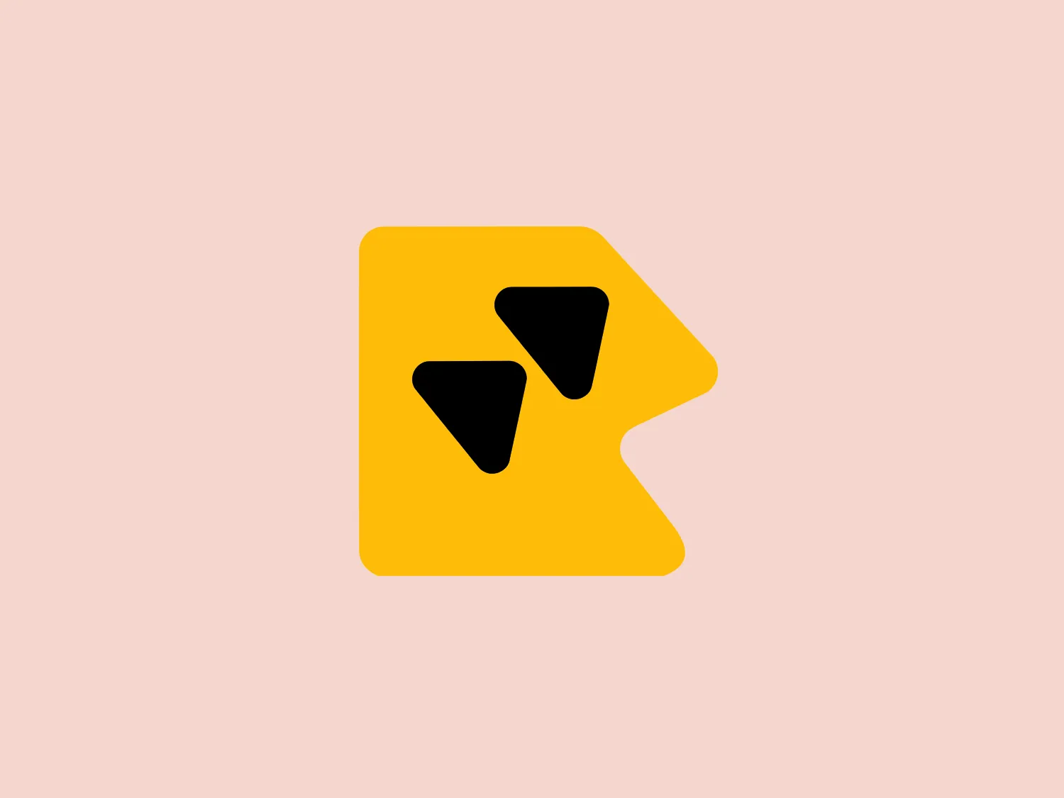
The image displays a stylized, yellow square logo with its upper right corner folded inward towards the center, creating a dual-layered effect for ReachifyMe. Two black shapes, resembling arrowheads or simplistic bird silhouettes, are positioned near the center of the square, angled in such a way that they appear to be in motion or pointing diagonally upward to the right. The design aesthetic is modern and minimalist, with bold colors and geometric simplicity. The bright yellow of the square contrasts starkly with the solid black figures, drawing attention and suggesting energy or forward momentum.

About ReachifyMe

ReachifyMe provides a platform for professionals to enhance their personal brand by connecting with like-minded individuals and increasing their online visibility. The tool enables users to develop and elevate their online presence, ultimately boosting their chances of attracting potential employers and business collaborators.

Similar logos

The Nationale Nederlanden logo exhibits a modern and dynamic design, featuring a stylized letter "N" enclosed within a circular shape. The minimalist "N" showcases sharp angles and a bold presence, with a gradient color scheme transitioning from vibrant orange to deep yellow, evoking energy and innovation. The circular background lends a sense of inclusivity or a global perspective, while the clean lines and digital feel make it suitable for a brand associated with technology, creativity, or communication.
The Breitling logo depicts a stylized, fluid letter "B" with elongated, curved strokes, giving it an elegant and dynamic appearance. The design is minimalist, using a bold golden yellow color that suggests luxury, quality, and sophistication. The overall aesthetic is modern and sleek, with a sense of movement and possibly creativity, hinted by the smooth lines that evoke a sense of continuity. Given the vibrancy of the golden hue, a subtle and light background would complement it well without competing for attention.
The logo presents a dynamic swirl with a gradient transition from a deep orange to a bright yellow, representing movement or energy. The design resembles a stylized sun or a spinning object with rounded triangular shapes emanating outward, simulating rays or rotation. The overall design aesthetic is modern and vibrant, invoking feelings of creativity, warmth, and motion. The smooth transition of colors gives it a sleek, gradient look that could imply heat, speed, or innovation. The Logo for Grafana Labs.
The Subway logo features two bold, interlocking arrows forming an 'S' shape, with the top arrow colored in a striking green and the bottom in a vibrant yellow. The design is clean and modern, with a dynamic sense of movement implied by the arrows pointing in opposite directions. This creates a sense of exchange, circulation, or progression, which might suggest a company involved in logistics, technology, or finance. The flat color treatment and lack of additional embellishments give it a contemporary and straightforward aesthetic.
The Webster Bank logo features a stylized letter "W" composed of two overlapping chevron shapes in a bold yellow color, set against a white background enclosed within a thick blue circular border. The design aesthetic is modern and minimalistic, with the use of sharp angles and clean lines conveying a sense of dynamism and forward movement. The simplicity and contrast between the yellow and blue make the logo stand out and easily recognizable. The design effectively balances negative space within the "W" to create a sense of depth and layering.
The eTactica logo showcases a simple and geometric design composed of four differently colored quarter-circle sectors arranged in a circular pattern, resembling a spinning wheel or pie chart. The transition from vibrant red to yellow, green, and blue creates a smooth and balanced look. The use of primary and secondary colors gives the logo an energetic and optimistic feel. The white negative space in the center subtly forms a 'C' shape, possibly representing the initial of the company or brand.
The Gearbest logo features a bold, black, stylized smile at its center, with the ends of the smile tapering to points. This simplistic and cheerful smile is prominently positioned against a vibrant yellow square background with rounded corners. The overall design aesthetic is modern and minimalistic, suggesting friendliness and positivity. The design's high contrast and simplicity would stand out well against a variety of backgrounds but would be particularly striking on a light, muted color to maintain its vibrancy without overwhelming its simplicity.
The Windesheim logo features a bold, modern design of a stylized letter "W" with sharp angles and a two-dimensional appearance. It is a vibrant, solid yellow color, creating a strong visual presence that is immediately eye-catching. The minimalist aesthetic and contemporary feel are accentuated by the use of a single bright color. The logo's angles convey a sense of movement and dynamism, resonating well with brands seeking to convey innovation or energy.
The image is a minimalist logo that consists of geometric shapes: a large square with a smaller square situated at its upper right-hand corner. The shape arrangement creates a sense of depth, suggesting a three-dimensional cube slightly offset to the bottom left. The color of the logo is a solid, vivid yellow, giving it a bright and bold appearance. The design is simple yet effective, likely representing structure, stability, and innovation. The aesthetic is modern and would suit a technology company or a creative agency well.
The Varta logo is a stylized representation of an envelope formed by simple geometric shapes. It features a large blue rectangle as the base of the envelope and an inverted yellow triangle as the flap. The design is minimalist with bold color contrast, using flat colors without gradient or shadow for a modern and clean aesthetic. The rectangular shape conveys stability and reliability, while the bright yellow triangle adds a dynamic element, suggesting movement or opening, in a universally recognized motif associated with mail and communication.