Monday


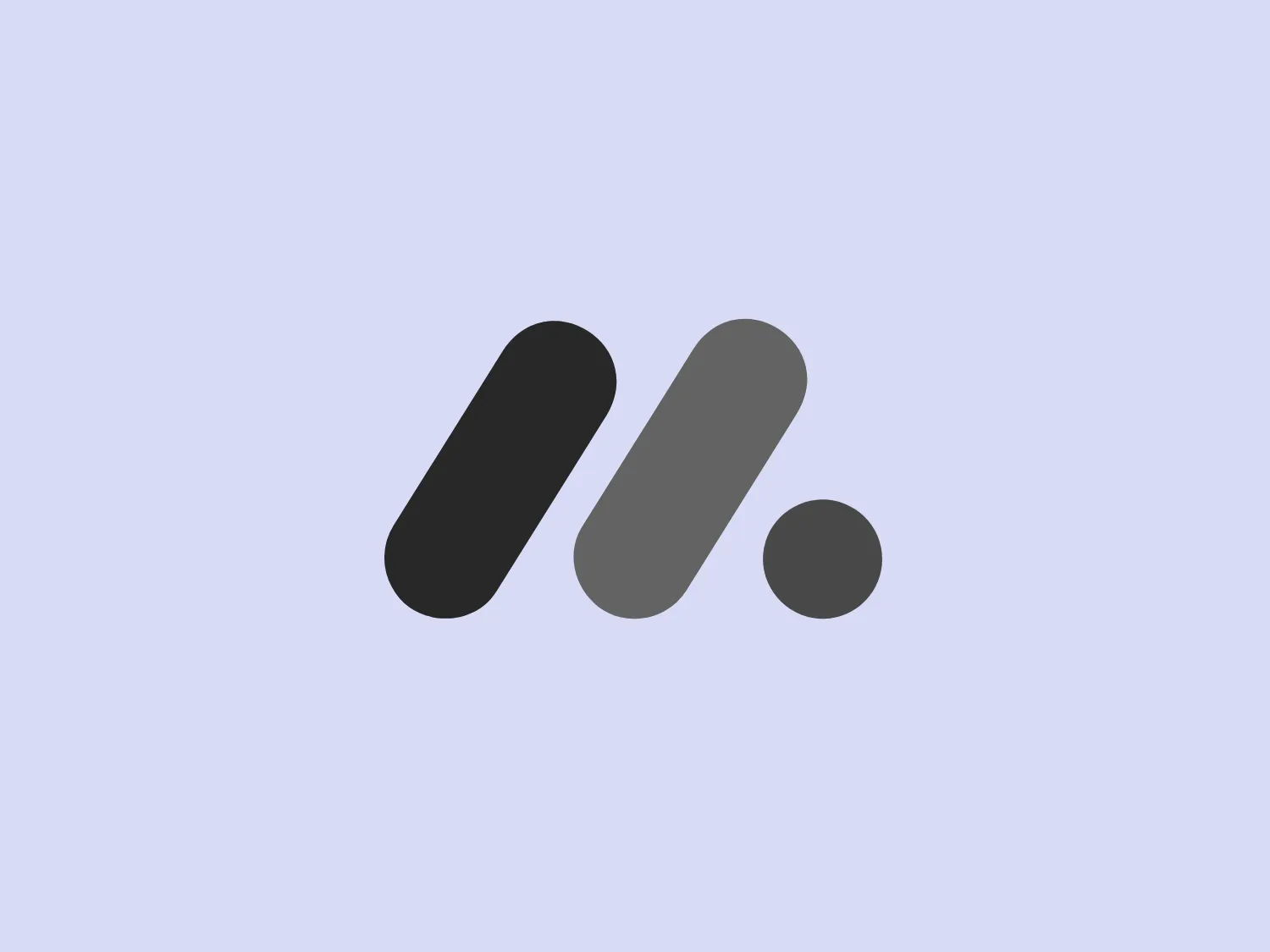
What catches our eye is the minimalist design with vibrant geometric shapes that exude a modern and playful aesthetic for the Monday logo.
Letter
Type
Color
Style
The Monday logo boasts a minimalist design with three simple geometric shapes, exuding a modern and playful aesthetic. It showcases two oblong shapes, one vibrant pink and the other bright yellow, slightly slanted and positioned in parallel, hinting at forward motion or connectivity. A small, solid green circle sits below them to the right, providing a visual anchor and adding a touch of contrast. The clean lines and bold, primary colors infuse the logo with a sense of approachability and energy.
Monday.com provides a cloud-based Work OS that serves as a project management tool, designed to enhance team management, communication, and productivity for businesses.
Similar logos
NEW

The Lazada logo features a stylized three-dimensional shape reminiscent of a cube with a portion of its structure removed or invisible, creating an open corner perspective. It consists of two visible faces, with the left face in a vibrant orange and the right face in a hot pink, employing a gradient that combines the two colors seamlessly at the edge where they meet. The use of color and shading gives the logo a luminous, dynamic look, evoking a sense of innovation and modernity. There are subtle highlights and shadows on the faces that suggest depth and dimensionality. The overall design aesthetic is minimalist, bold, and contemporary, with a playful twist on geometric representation.
NEW

The Matsuura logo features a stylized depiction of three overlapping, rounded shapes in a vibrant green color. The design exudes a modern and minimalist aesthetic with a nod to nature or growth themes, implying movement and connectivity. The shapes suggest leaves, pebbles, or abstract representations of increasing value/momentum.
NEW

The Breitling logo depicts a stylized, fluid letter "B" with elongated, curved strokes, giving it an elegant and dynamic appearance. The design is minimalist, using a bold golden yellow color that suggests luxury, quality, and sophistication. The overall aesthetic is modern and sleek, with a sense of movement and possibly creativity, hinted by the smooth lines that evoke a sense of continuity. Given the vibrancy of the golden hue, a subtle and light background would complement it well without competing for attention.
NEW

The BitX Capital logo showcases a stylized, abstract design with a dynamic feel. It comprises interlocking shapes resembling a three-dimensional impossible loop. The main elements consist of two intertwined ribbons with a gradation of green shades that provide a sense of depth and movement. The contrast between the lighter and darker greens enhances the interweaving effect. Overall, the logo presents a modern and clean appearance, suggesting innovation and connectivity.
NEW

The Subway logo features two bold, interlocking arrows forming an 'S' shape, with the top arrow colored in a striking green and the bottom in a vibrant yellow. The design is clean and modern, with a dynamic sense of movement implied by the arrows pointing in opposite directions. This creates a sense of exchange, circulation, or progression, which might suggest a company involved in logistics, technology, or finance. The flat color treatment and lack of additional embellishments give it a contemporary and straightforward aesthetic.
NEW

The Holiday Inn logo features a stylized, abstract design that appears to be a pair of overlapping, slanted letter H's or a hash symbol (#) with a modern twist. It's composed of four bold, green lines with soft curves and slightly varied lengths, giving it a dynamic and contemporary feel. The use of negative space between the elements of the logo adds to its visual interest. The green color is vibrant and would stand well against a soft, pale background providing a contrast that is not too harsh.
NEW

The Nationale Nederlanden logo exhibits a modern and dynamic design, featuring a stylized letter "N" enclosed within a circular shape. The minimalist "N" showcases sharp angles and a bold presence, with a gradient color scheme transitioning from vibrant orange to deep yellow, evoking energy and innovation. The circular background lends a sense of inclusivity or a global perspective, while the clean lines and digital feel make it suitable for a brand associated with technology, creativity, or communication.
NEW

The Frontier Airlines logo is a modern, sleek design comprised of three bold, dark green, horizontal stripes that form an abstract letter "E". The upper and lower stripes are longer and angled slightly downward towards the right, while the center stripe is shorter, creating a sense of movement and dynamism. The negative space between the stripes reinforces the "E" shape. The color has a professional and serious tone, and the logo's simplicity gives it a timeless and versatile feel. It has a clean, geometric quality, and there are no additional embellishments, making it highly adaptable for various applications.
NEW

The Bentley Motors logo features a stylized letter "B" with a modern and minimalist aesthetic. It is composed of two contrasting circular shapes, creating a bold and distinctive character. The design uses a dark green color that conveys a sense of growth, stability, and prosperity. Its simple yet striking design allows for versatile use across various media. To complement the dark green hue of the logo and to ensure it stands out, a light neutral background color from the provided options would be ideal.
NEW

The logo for Grammarly features a stylized white letter 'G,' designed in a modern sans-serif typeface with clean, smooth lines, centrally placed within a solid green circle. This design gives the logo a minimalist and contemporary feel. The negative space within the 'G' forms an arrow pointing to the top left, suggesting movement or direction. The vibrant green color and circular boundary create a bold and complete visual identity.