2degrees Marketing

15
What we like is the modern, playful arrangement of vibrant, interconnected rings, suggesting creativity and energy.

2degrees Marketing Logo

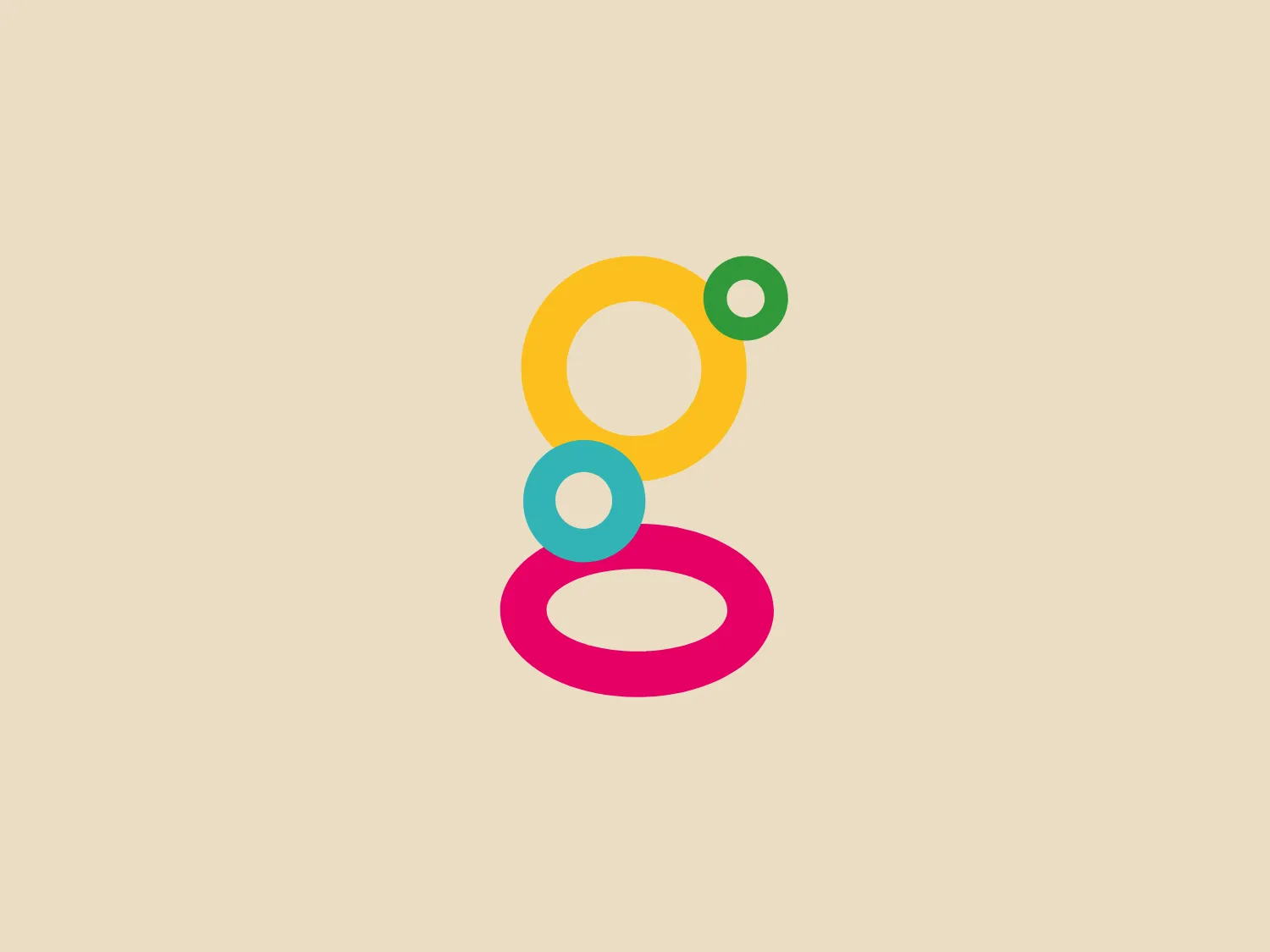
The 2degrees Marketing logo features a vertical stack of three distinctly colored rings. The first ring is a vibrant pink, the middle ring is a matte sky blue, and the topmost ring is a muted sunshine yellow, with a tiny dark green dot-circle intersecting it. The rings are not perfectly aligned, creating a playful and dynamic arrangement. The colors pop with saturation and warmth, suggesting creativity and energy. The overall design aesthetic is modern and minimalistic, with clean lines and a flat design devoid of gradients or shadows. An interesting feature is that the rings are not complete circles; their cuts give an impression of interconnectedness and continuity.

About 2degrees Marketing

2degrees is an online platform that facilitates international connections and collaborations for sustainable businesses. The platform enables businesses to take measurable actions that contribute to achieving financial targets and sustainability commitments.

Similar logos

The Lazada logo features a stylized three-dimensional shape reminiscent of a cube with a portion of its structure removed or invisible, creating an open corner perspective. It consists of two visible faces, with the left face in a vibrant orange and the right face in a hot pink, employing a gradient that combines the two colors seamlessly at the edge where they meet. The use of color and shading gives the logo a luminous, dynamic look, evoking a sense of innovation and modernity. There are subtle highlights and shadows on the faces that suggest depth and dimensionality. The overall design aesthetic is minimalist, bold, and contemporary, with a playful twist on geometric representation.
The Matsuura logo features a stylized depiction of three overlapping, rounded shapes in a vibrant green color. The design exudes a modern and minimalist aesthetic with a nod to nature or growth themes, implying movement and connectivity. The shapes suggest leaves, pebbles, or abstract representations of increasing value/momentum.
The image depicts the Akku Vertrieb logo with a bold, geometric design primarily using a bright blue color. The logo resembles an abstract depiction of an uppercase 'A' without the crossbar. It consists of three parallelogram shapes that form a stylized 'A' with white lines creating separation between them, adding a dynamic and layered effect. The design is sharp, modern, and conveys a sense of stability and professionalism. The simplicity and use of negative space give it a clean and versatile look, suitable for various applications.
The Mobileye logo features a stylized letter 'n' with a distinct geometric design. It is comprised of bold, straight lines with sharp angles, creating a modern and minimalist aesthetic. The main component of the logo is a deep blue color, giving it a professional and trustworthy feel. The design is simple yet striking, with the use of negative space on the left side that could be interpreted as an abstract arrow or a partial square bracket, which adds an element of dynamism and forward-thinking to the overall design.
The Commodore logo features a large, bold, blue letter "C" that encircles a smaller red shape resembling a right-pointing arrow or a play button symbol. The stark contrast between the blue and red hues creates a striking and modern aesthetic. The absence of additional elements or embellishments underscores a commitment to clarity and efficiency in the design, striking a balance between visual impact and straightforward symbolism.
The Unilever logo appears to consist of intricate and stylized illustrations forming a shield-like shape. The design features a collection of floral and organic patterns, ranging from leaves and flowers to abstract swirls, all densely packed to create a cohesive emblem. It is monochromatic, using a deep blue color which gives it a classic and professional appearance. The contrast between the negative space and the blue areas creates an engaging and dynamic visual effect, suggesting detail and craftsmanship. The logo has a symmetrical layout that adds to its balanced and harmonious look.
The Breitling logo depicts a stylized, fluid letter "B" with elongated, curved strokes, giving it an elegant and dynamic appearance. The design is minimalist, using a bold golden yellow color that suggests luxury, quality, and sophistication. The overall aesthetic is modern and sleek, with a sense of movement and possibly creativity, hinted by the smooth lines that evoke a sense of continuity. Given the vibrancy of the golden hue, a subtle and light background would complement it well without competing for attention.
The Banreservas logo showcases a capitalized letter "R" in a dark grey tone using a modern, bold sans-serif typeface. Below the "R," three curved swooshes flow to the left, colored in gradients of light blue, blue, and orange, creating a dynamic contrast. The design presents a clean, contemporary look that suggests energy, speed, or growth.
The Valvoline logo features a stylized letter 'V' composed of two diagonally opposite chevrons. The left chevron is filled with a vibrant red color, while the right chevron sports a deep blue hue. Both chevrons are set against a plain white background, which makes the contrasting colors pop and adds to the visual impact of the design. The logo boasts a modern and minimalist aesthetic, employing sharp lines and a bold color scheme to convey dynamism and innovation.
The Ferrellgas logo is a minimalist, abstract design that features a single, fluid shape suggesting movement and dynamism. Resembling a stylized letter "F," the design has an elongated top arm sweeping forward and a shorter bottom arm curving underneath. Its bold, solid blue color exudes a strong, modern, and professional appearance, while the curvaceous lines convey a sense of flexibility and innovation. The simplicity and solid blue color make it adaptable for various applications without losing its visual impact.