Deeyeo

15
The Deeyeo logo incorporates a harmonious blend of organic and geometric shapes in a playful pastel palette, creating a modern and approachable aesthetic.

Deeyeo Logo

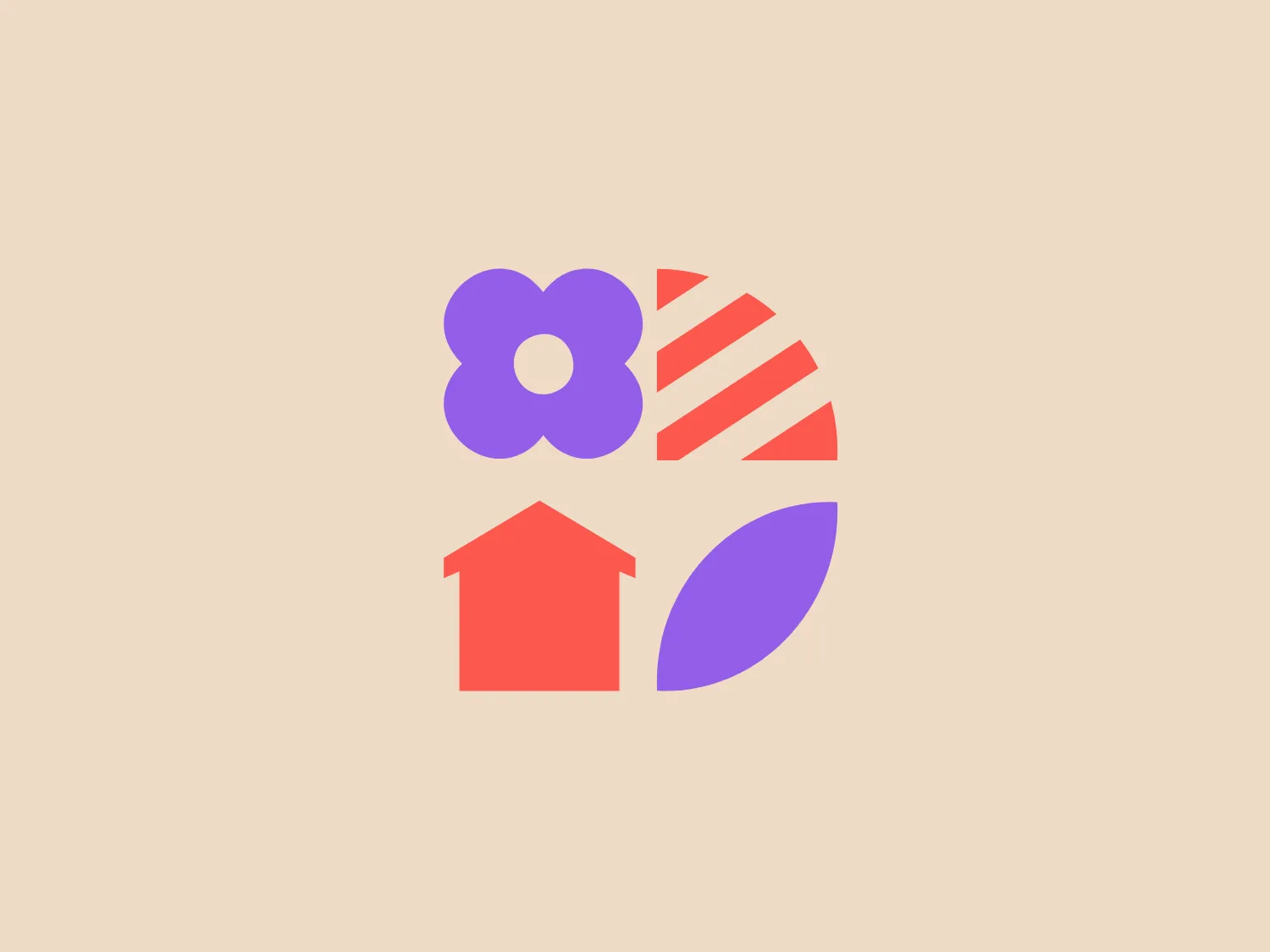
The Deeyeo logo consists of a stylized arrangement of four different symbols with a varied color and shape, creating a balanced, quadrant-style layout. On the top left, a lilac-colored flower with rounded petals introduces an organic element. Adjacent to it, the top right features an abstract shape with orange and white stripes, adding a dynamic quality to the design. The bottom left includes a simple, solid coral red house silhouette which grounds the logo with a familiar icon. Completing the design on the bottom right is a large, purple leaf or teardrop shape that provides a smooth, flowing counterpoint to the more geometric shapes. The overall aesthetic is playful and modern, with a pastel color palette that conveys approachability and friendliness.

About Deeyeo

Deeyeo is a prominent provider of disposable hygiene products, offering a comprehensive range of items. The company is known for its three well-established brands: Deeyeo, Soulcare, and Wizzpet.

Similar logos

The Lazada logo features a stylized three-dimensional shape reminiscent of a cube with a portion of its structure removed or invisible, creating an open corner perspective. It consists of two visible faces, with the left face in a vibrant orange and the right face in a hot pink, employing a gradient that combines the two colors seamlessly at the edge where they meet. The use of color and shading gives the logo a luminous, dynamic look, evoking a sense of innovation and modernity. There are subtle highlights and shadows on the faces that suggest depth and dimensionality. The overall design aesthetic is minimalist, bold, and contemporary, with a playful twist on geometric representation.
The Rossignol logo showcases a stylized white letter 'R' in the center of a bright red circular background. The 'R' includes a clean design with a striking slash through its stem, adding a modern flair. Smooth curves create a sleek look, and the red and white color scheme offers a bold and attention-grabbing contrast. The overall design aesthetic is minimalist and contemporary, making it versatile for various applications.
The Delivery Hero logo features a dynamic red comet shape with a stylized white star centered on its body. The comet tail metaphorically conveys speed, progress, or possibly a shooting star suggesting dreams and aspirations. The sharp edges of the star contrast with the smooth, curved form of the comet, giving the design a sense of forward motion. Its design is simple yet effective, easily scalable, and memorable. Considering the vibrancy of the red, a muted background that complements without competing would be ideal.
The Cornerstone logo features a simplistic and modern design, consisting of a stylized, abstract shape that somewhat resembles a flower or starburst within a circle. The primary element is a brilliant, solid red-orange color that gives the logo a vibrant and energetic feel. The inner white shape has softened edges which contrast smoothly with the circular boundary. Its symmetry and clean lines convey a sense of balance and professionalism. Considering the color palette of the logo, a soft, neutral background color would complement it well without competing for attention.
The Kuda Bank logo features a stylized letter 'K' mirrored and joined in the middle to form a symmetrical design that resembles a chevron or arrow pointing to the left. The 'K' shapes are composed of four solid stripes with sharp angles, creating a dynamic and modern look. The color of the logo is a deep, rich purple, giving it a sense of sophistication and regality. There are no additional embellishments, allowing the clean and bold geometry of the letterforms to stand out.
The logo for New Zealand Post showcases a stylized image integrated into a circular shape. The primary element resembles a path or a route with curves and lines that suggest motion or a journey. The design features white lines creating a single continuous path against a vibrant solid red background. The overall aesthetic is modern, minimalistic, and dynamic, enabling easy recognition and versatile application across various media. The smooth and rounded shapes contribute to a friendly and approachable feel.
The Commodore logo features a large, bold, blue letter "C" that encircles a smaller red shape resembling a right-pointing arrow or a play button symbol. The stark contrast between the blue and red hues creates a striking and modern aesthetic. The absence of additional elements or embellishments underscores a commitment to clarity and efficiency in the design, striking a balance between visual impact and straightforward symbolism.
The ICICI Bank logo features a stylized, abstract design with a fluid, organic shape. The central element resembles a lowercase "i" with a dot hovering above what could be interpreted as an abstract human figure or a dynamic swirl. Its bold lines curve to create a sense of movement. The color scheme consists of a gradient transition from a deep, warm red to a rich, golden orange, giving the logo an energetic and inviting appearance. Noteworthy is the way the white space between the "i" and its dot creates a pathway, emphasizing the motion and adding an element of negative space to the design.
The image displays the Tesla logo, characterized by its sleek and modern design. The logo consists of a stylized 'T' that represents the cross-section of an electric motor, aligning with the company's focus on electric vehicles. The 'T' is in a vivid red color (#E82127) that stands out and conveys a sense of energy and innovation. Its sharp edges and flowing lines give it a futuristic look. The design is minimalist, using negative space effectively to create a distinct and recognizable symbol. The top part of the 'T' flares out slightly, suggesting movement and speed.
The Angi logo showcases a sleek "A" in a vibrant coral red color. Its modern and minimalistic design includes a flowing curve that creates an engaging loop at the base, imparting a friendly and professional look. The bold typeface with smooth edges balances thick and thin strokes, exuding both weight and elegance. The logo's style and color suggest a preference for a complementary background that doesn't overshadow it.