Grupo Mateus

15
What we like about the Grupo Mateus logo is the modern, minimalist representation of a heart, using bold red color and negative space to create a sense of unity.

Letter

Type

Color

Red
547

Grupo Mateus Logo

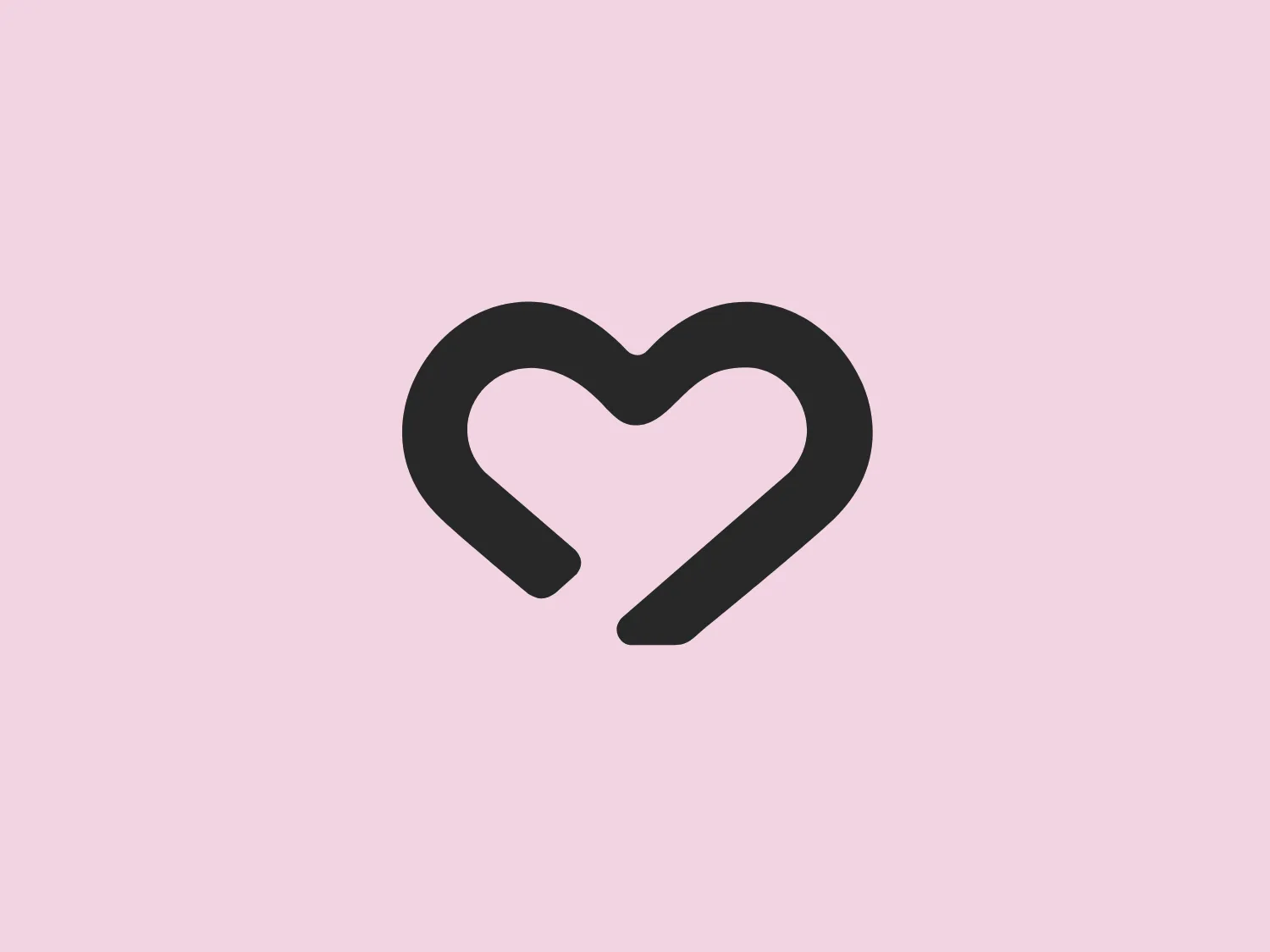
The logo for Grupo Mateus is a minimalist representation of a heart, with two red halves seamlessly converging to form the iconic shape. The bold, rich red color suggests passion or love. The design features smooth, curving lines that mimic the natural asymmetry found in actual human hearts, diverging from the typical perfectly symmetrical heart iconography. This modern and approachable logo makes effective use of negative space to create a sense of completeness and unity within the design.

About Grupo Mateus

Grupo Mateus is a prominent conglomerate involved in a wide range of sectors, encompassing supermarkets, cash and carry, furniture, appliances, bakery, medicine distribution, and construction. It is recognized as the 5th largest retail company in the country.

Similar logos

The Angi logo showcases a sleek "A" in a vibrant coral red color. Its modern and minimalistic design includes a flowing curve that creates an engaging loop at the base, imparting a friendly and professional look. The bold typeface with smooth edges balances thick and thin strokes, exuding both weight and elegance. The logo's style and color suggest a preference for a complementary background that doesn't overshadow it.
The Qmedics logo showcases a stylized letter Q in a 3D ribbon-like form with smooth, flowing curves. It incorporates warm red and pink tones transitioning to cooler purples and blues on the interior, creating a vibrant and energetic look. The modern, playful design uses gradients to convey depth and movement, evoking an aesthetic of creativity and dynamism.
The Akon Hidrolik logo exhibits a bold and minimalist design with a black square background. Within the square, a white geometric shape forms a stylized letter "a" with a red circle at the base, evoking the imagery of a needle's eye or a focal point. The overall aesthetic is modern and contemporary, utilizing primary colors and strong contrast to enhance its visual impact. Its simplicity renders it highly recognizable and versatile.
The Logo for Tender Greens consists of two solid circles stacked vertically. The top circle is slightly smaller and has a small, quarter-circle notch at the top right, reminiscent of a stemmed fruit such as a cherry or an apple. Both circles and the stem-like feature share a bold, saturated red color, offering a striking contrast that would stand out on a lighter background. The design is simplistic with a flat, two-dimensional appearance and lacks additional detailing, which contributes to its modern and minimalist aesthetic.
The logo for Lifetime is a simple yet bold design consisting of variations of circular shapes with a modern twist. The primary color of the logo is a bright red, creating a striking visual impact. The design features a large, solid red circle, from which a smaller circle and a swoosh-like shape have been subtracted, giving the appearance of a stylized letter "Q" or an abstract representation of a person. The negative space within the Lifetime logo is particularly effective in creating a dynamic and unique figure, promoting a sense of elegance and fluidity in the overall aesthetic.
The Peru logo presents a simple and modern design featuring concentric spiral lines in a bold red color. The spiral's end curls outward on the top-left side, creating a minimalist and clean aesthetic that conveys motion and fluidity. The use of negative space within and around the spiral adds visual interest and sophistication to the design, while the color provides a strong contrast against a light background and conveys a sense of energy and passion.
The logo for Loja Kildare is a modern, clean design consisting of a bold and stylized letter "K." It features a striking red color with clear cutouts that create dynamic white spaces, giving the impression of forward motion or pivoting. The design is minimalist, utilizing sharp angles to convey a sense of precision and professionalism. The simplicity of the logo makes it versatile for various applications, and the contrast between the red and the white spaces adds visual interest.
The Sunny Recruitment logo features a stylized, abstract mark composed of two swirling forms that intertwine, creating a dynamic and fluid motion. The shapes suggest a sense of continuity and interconnectivity. The color gradient transitions smoothly from a warm, vivid red at one end to a deep, soft orange at the other end, conveying energy and passion. The overall design aesthetic is modern, sleek, and appears to be easily recognizable. The use of negative space between the two forms creates a visual pause and adds a layer of sophistication to the design.
The Matterport logo presents a stylized letter 'M' with a three-dimensional effect, consisting of various shades of pink and red. It features sharp angles and clean lines that give it a modern and geometric appearance. The clever use of gradient and shadowing creates an illusion of depth, making the 'M' appear to stand upright. The overall design aesthetic is contemporary and sleek, suitable for a brand aiming to convey innovation and sophistication.
The Bandist logo depicts a modern and abstract interpretation of a lowercase letter 'b'. It features a bold and flowing red shape resembling a 'b', alongside a smaller, soft pink element that adds depth and contrast to the design. The angular cut in the red form instills a sense of precision and forward-thinking aesthetic. The vibrant color palette exudes energy and attention-grabbing qualities.