News4Jax


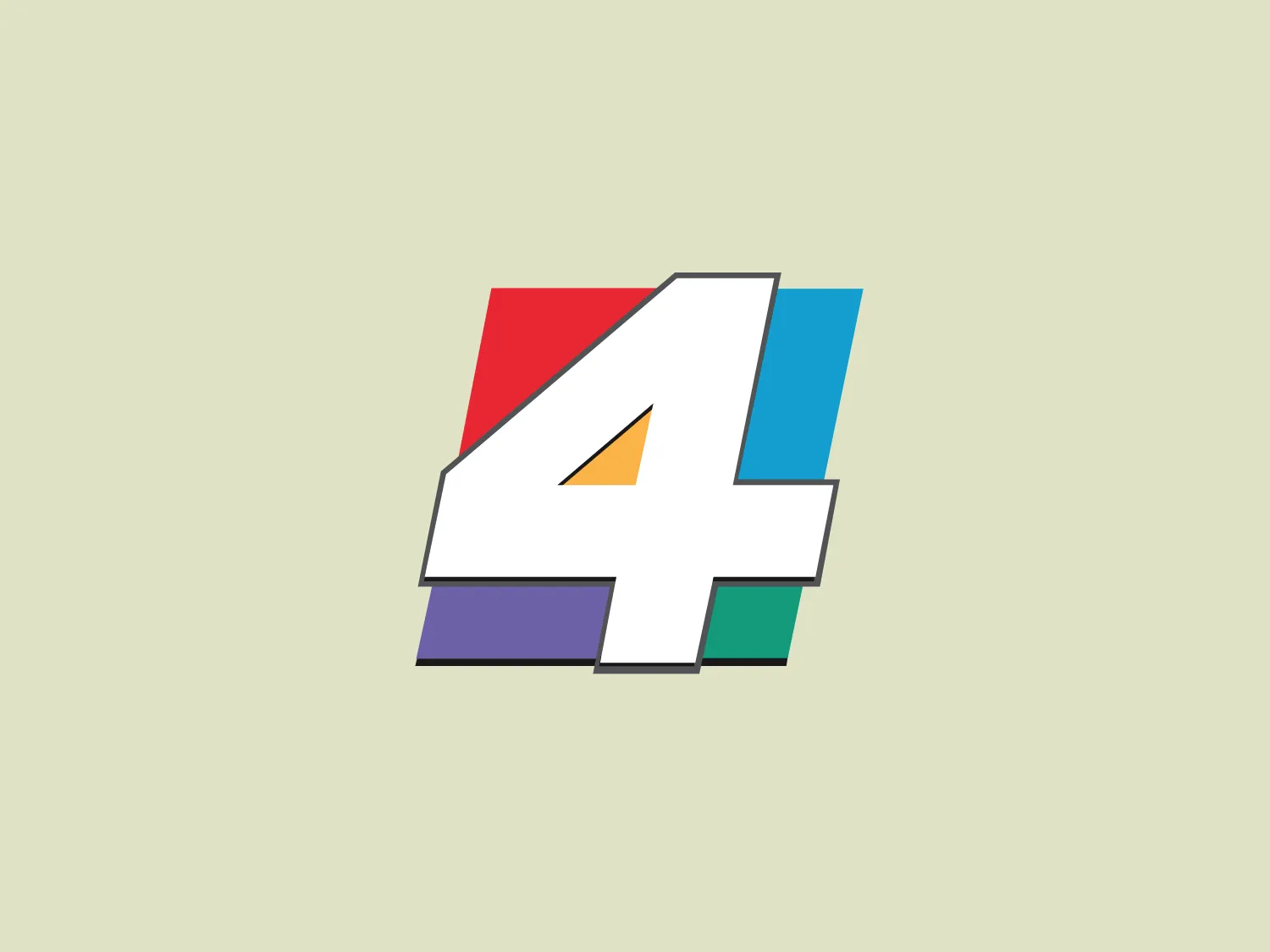
What catches our eye: The sleek and modern stylized number 4 with vibrant color-blocking creates a playful yet balanced aesthetic.
Letter
Type
Color
Style
The News4Jax logo features a sleek and modern stylized number 4, formed by thick white lines and filled with flat, solid colors including red, blue, green, purple, and yellow. A thin grey line outlines the colorful shapes, maintaining a clean and structured look. The design is minimalistic and bold, utilizing color-blocking to achieve a playful yet balanced aesthetic.
News4JAX is a regional news outlet serving Northeast Florida and Southeast Georgia, providing reliable local news coverage. Operating as a fully local TV station, it is owned by Graham Holdings and based in Jacksonville, Florida.
No items found.
Similar logos
NEW

The Browze logo features a continuous line that forms a sleek fusion of the letters 'V' and 'B'. The design exudes elegance and modernity with its fluid and organic structure. Presented in monochrome, the black against white creates a timeless and classic feel. Its minimalist aesthetic draws attention to the beauty of the line's curve and the use of negative space. The design's seamless flow may suggest connectivity or unity, and its simplicity allows for versatility and scalability.
NEW

The Rossignol logo showcases a stylized white letter 'R' in the center of a bright red circular background. The 'R' includes a clean design with a striking slash through its stem, adding a modern flair. Smooth curves create a sleek look, and the red and white color scheme offers a bold and attention-grabbing contrast. The overall design aesthetic is minimalist and contemporary, making it versatile for various applications.
NEW

The Delivery Hero logo features a dynamic red comet shape with a stylized white star centered on its body. The comet tail metaphorically conveys speed, progress, or possibly a shooting star suggesting dreams and aspirations. The sharp edges of the star contrast with the smooth, curved form of the comet, giving the design a sense of forward motion. Its design is simple yet effective, easily scalable, and memorable. Considering the vibrancy of the red, a muted background that complements without competing would be ideal.
NEW

The Kuda Bank logo features a stylized letter 'K' mirrored and joined in the middle to form a symmetrical design that resembles a chevron or arrow pointing to the left. The 'K' shapes are composed of four solid stripes with sharp angles, creating a dynamic and modern look. The color of the logo is a deep, rich purple, giving it a sense of sophistication and regality. There are no additional embellishments, allowing the clean and bold geometry of the letterforms to stand out.
NEW

The image showcases a bold and abstract Neufquatre Éditions logo, consisting of a stylized letter "N" with a dynamic, fluid shape. The design is minimalist and modern, using negative space effectively to create the impression of motion within the letter form. The logo is monochromatic, featuring a stark black against a clean white background. The simplicity of the design lends itself to versatility, while the curvature of the lines suggests creativity and innovation.
NEW

The BETA Technologies logo features a bold, solid black letter "B" with a white lightning bolt cutting through its center, creating a modern and minimalist design. The stark contrast between the black and white elements emphasizes the strong visual impact of the logo. The lightning bolt infuses a sense of power and energy, suggesting dynamism and force. The classic, rounded attributes of the "B" combined with the edgy, contemporary feel of the lightning bolt create a striking visual identity for the business.
NEW

The BOSS logo features a blue square with rounded corners, enclosing a modern and minimalist white letter 'b'. The 'b' has a sleek, open design created from a single line with a smooth curve, and the vibrant blue contrasts sharply against the white, offering a bold and clean appearance. The simplicity of the logo makes it versatile for various applications and suggests a brand identity associated with innovation or technology.
NEW

The Breitling logo depicts a stylized, fluid letter "B" with elongated, curved strokes, giving it an elegant and dynamic appearance. The design is minimalist, using a bold golden yellow color that suggests luxury, quality, and sophistication. The overall aesthetic is modern and sleek, with a sense of movement and possibly creativity, hinted by the smooth lines that evoke a sense of continuity. Given the vibrancy of the golden hue, a subtle and light background would complement it well without competing for attention.
NEW

The Meralco logo features a stylized, angular lightning bolt in white, cutting dynamically across a vibrant, solid orange circle. The bolt itself has sharp edges and points, conveying a sense of energy and power. The simplicity of the design gives it a modern and impactful aesthetic, as the high-contrast color scheme makes the logo stand out boldly. The circular shape envelops the bolt, suggesting completeness and a global or universal aspect to the brand identity.
NEW

The Osiris Shoes logo is a simple and modern design featuring geometric shapes. It includes a large black semicircle balanced above a smaller white circle, with an even smaller black circle at its center. The minimalist aesthetics and use of negative space create a sense of harmony and balance. The monochromatic color scheme gives the logo a versatile and timeless feel. A soft and neutral background would complement the logo without overwhelming its design.