Mosaert

15
We like the minimalist design and playful, modern vibe of the Mosaert logo with overlapping cloud shapes and soft, pastel colors.

Letter

Color

Blue
1490
Pink
161

Mosaert Logo

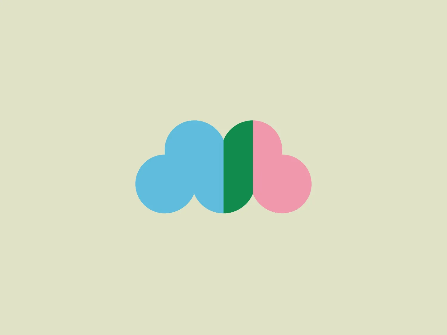
The Mosaert logo includes two overlapping cloud shapes with soft, rounded edges. The left cloud is a pastel blue, while the right is a gentle pink. Between them, a flat green vertical line appears where the clouds overlap, visually joining the two clouds and adding a splash of contrasting color. The design is minimalist with a playful, modern vibe, evoking a calm and positive feeling.

About Mosaert

Mosaert was established in 2009 by Stromae and his brother as a label for Stromae's debut album "Cheese," managing all aspects of his work. The company later transitioned to creating limited-edition, sustainable clothing following the addition of stylist Coralie Barbier in 2012. In addition to its clothing line, Mosaert engages in music collaborations and directs music videos for global artists.

Similar logos

The Lazada logo features a stylized three-dimensional shape reminiscent of a cube with a portion of its structure removed or invisible, creating an open corner perspective. It consists of two visible faces, with the left face in a vibrant orange and the right face in a hot pink, employing a gradient that combines the two colors seamlessly at the edge where they meet. The use of color and shading gives the logo a luminous, dynamic look, evoking a sense of innovation and modernity. There are subtle highlights and shadows on the faces that suggest depth and dimensionality. The overall design aesthetic is minimalist, bold, and contemporary, with a playful twist on geometric representation.
The Matsuura logo features a stylized depiction of three overlapping, rounded shapes in a vibrant green color. The design exudes a modern and minimalist aesthetic with a nod to nature or growth themes, implying movement and connectivity. The shapes suggest leaves, pebbles, or abstract representations of increasing value/momentum.
The image depicts the Akku Vertrieb logo with a bold, geometric design primarily using a bright blue color. The logo resembles an abstract depiction of an uppercase 'A' without the crossbar. It consists of three parallelogram shapes that form a stylized 'A' with white lines creating separation between them, adding a dynamic and layered effect. The design is sharp, modern, and conveys a sense of stability and professionalism. The simplicity and use of negative space give it a clean and versatile look, suitable for various applications.
The Mobileye logo features a stylized letter 'n' with a distinct geometric design. It is comprised of bold, straight lines with sharp angles, creating a modern and minimalist aesthetic. The main component of the logo is a deep blue color, giving it a professional and trustworthy feel. The design is simple yet striking, with the use of negative space on the left side that could be interpreted as an abstract arrow or a partial square bracket, which adds an element of dynamism and forward-thinking to the overall design.
The Commodore logo features a large, bold, blue letter "C" that encircles a smaller red shape resembling a right-pointing arrow or a play button symbol. The stark contrast between the blue and red hues creates a striking and modern aesthetic. The absence of additional elements or embellishments underscores a commitment to clarity and efficiency in the design, striking a balance between visual impact and straightforward symbolism.
The Unilever logo appears to consist of intricate and stylized illustrations forming a shield-like shape. The design features a collection of floral and organic patterns, ranging from leaves and flowers to abstract swirls, all densely packed to create a cohesive emblem. It is monochromatic, using a deep blue color which gives it a classic and professional appearance. The contrast between the negative space and the blue areas creates an engaging and dynamic visual effect, suggesting detail and craftsmanship. The logo has a symmetrical layout that adds to its balanced and harmonious look.
The Banreservas logo showcases a capitalized letter "R" in a dark grey tone using a modern, bold sans-serif typeface. Below the "R," three curved swooshes flow to the left, colored in gradients of light blue, blue, and orange, creating a dynamic contrast. The design presents a clean, contemporary look that suggests energy, speed, or growth.
The Valvoline logo features a stylized letter 'V' composed of two diagonally opposite chevrons. The left chevron is filled with a vibrant red color, while the right chevron sports a deep blue hue. Both chevrons are set against a plain white background, which makes the contrasting colors pop and adds to the visual impact of the design. The logo boasts a modern and minimalist aesthetic, employing sharp lines and a bold color scheme to convey dynamism and innovation.
The Ferrellgas logo is a minimalist, abstract design that features a single, fluid shape suggesting movement and dynamism. Resembling a stylized letter "F," the design has an elongated top arm sweeping forward and a shorter bottom arm curving underneath. Its bold, solid blue color exudes a strong, modern, and professional appearance, while the curvaceous lines convey a sense of flexibility and innovation. The simplicity and solid blue color make it adaptable for various applications without losing its visual impact.
The logo presented for Eredivisie is a modern and minimalist design, comprising two interlocking shapes - a circle and a stylized letter "e." Crafted with smooth, clean lines, the logo suggests continuity and connection, with a deep, elegant navy blue as the primary color, providing a professional and trustworthy feel to the design. The negative space within the "e" creates a dynamic effect, making the letter stand out distinctly against the circular outline. Overall, the aesthetic mixes a corporate sensibility with a fresh, contemporary look.