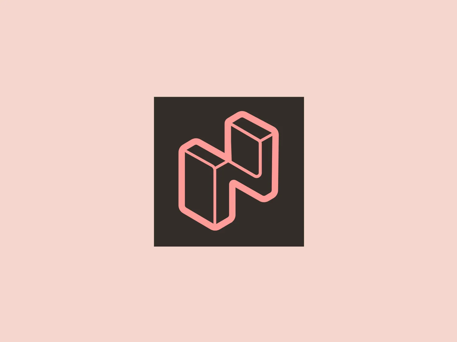
Netigate

15
What catches our eye is the sleek, modern, and three-dimensional design of the Netigate logo, with its clean lines and clever use of contrast.

Netigate Logo

The image displays a stylized, geometric logo consisting of interconnected shapes that resemble a three-dimensional letter or symbol for Netigate. It has a minimalistic design with clean, angled lines highlighting the figure's depth and structure. The logo has a modern and abstract appearance with a monochromatic color scheme, using shades of pink and brown to create a contrast that emphasizes the three-dimensional aspect. It's set against a plain, dark background that makes the logo pop. This logo exudes a sleek, contemporary vibe with an architectural feel, likely designed to convey innovation or sophistication.

About Netigate

Netigate is a rapidly growing SaaS company that aims to promote the customer, employee, and consumer voice in everyday business decisions. The company helps its customers focus on the right activities by providing solutions for gathering and analyzing feedback.

Similar logos

The logo in the image displays a symmetrical design resembling an abstract butterfly or a pair of wings. It consists of multiple leaf-like shapes radiating from the center, creating a harmonious pattern. Vibrant colors such as pink, orange, yellow, green, light blue, and teal are used, outlined with a thin black border that enhances their individuality. The overall design aesthetic is lively and organic, suggesting a sense of growth or transformation. The black background makes the colors pop, giving the logo a bold and energetic appearance.
The Qmedics logo showcases a stylized letter Q in a 3D ribbon-like form with smooth, flowing curves. It incorporates warm red and pink tones transitioning to cooler purples and blues on the interior, creating a vibrant and energetic look. The modern, playful design uses gradients to convey depth and movement, evoking an aesthetic of creativity and dynamism.
The Monday logo boasts a minimalist design with three simple geometric shapes, exuding a modern and playful aesthetic. It showcases two oblong shapes, one vibrant pink and the other bright yellow, slightly slanted and positioned in parallel, hinting at forward motion or connectivity. A small, solid green circle sits below them to the right, providing a visual anchor and adding a touch of contrast. The clean lines and bold, primary colors infuse the logo with a sense of approachability and energy.
The Banijay Group logo consists of a stylized letter "B" formed by two solid pink shapes. The upper half is a rectangular block with a flat top and a curved bottom, while the lower half is a mirror image of the upper, with a curved top and a flat bottom. The two halves are perfectly centered, creating a symmetrical design. The use of rich and vibrant pink color gives the logo a modern and energetic feel. It relies on bold simplicity and dynamic use of negative space and would complement a subtle and light background well.
The Matterport logo presents a stylized letter 'M' with a three-dimensional effect, consisting of various shades of pink and red. It features sharp angles and clean lines that give it a modern and geometric appearance. The clever use of gradient and shadowing creates an illusion of depth, making the 'M' appear to stand upright. The overall design aesthetic is contemporary and sleek, suitable for a brand aiming to convey innovation and sophistication.
The Bandist logo depicts a modern and abstract interpretation of a lowercase letter 'b'. It features a bold and flowing red shape resembling a 'b', alongside a smaller, soft pink element that adds depth and contrast to the design. The angular cut in the red form instills a sense of precision and forward-thinking aesthetic. The vibrant color palette exudes energy and attention-grabbing qualities.
The Key Retirement logo features a stylized, abstract representation of a cross or plus sign, crafted from two elements. The left element is a warm, vivid orange, while the right element is a slightly cooler, deep pink shade. The design has a modern and dynamic look with a slight curvature, creating the impression of motion or fluidity. The overall aesthetic is minimalist yet bold, and the contrast between the two colors adds to its striking appearance. The image is clean, with no additional embellishment, adding to its contemporary vibe.
The Nozbe logo showcases an abstract, geometric design with two intertwined shapes resembling stylized letter 'N's or arrows pointing in opposite directions. It incorporates a vibrant gradient transitioning from a purplish-pink hue to a lighter, soft pink, imparting a modern and dynamic feel. The design employs minimalist techniques, incorporating clean lines and flat surfaces to convey a sense of movement and interconnectivity. The overall aesthetic is sleek and contemporary, making it ideal for diverse branding and tech-oriented applications.
The Biodiversify logo is a circular composition filled with a variety of organic shapes and symbols, including several animals such as a giraffe in the center, surrounded by stylized representations of a sea wave, a leaf, and possibly a bird or a fish. The overall design carries an artistic, fluid style with a balanced and harmonious aesthetic, focusing on natural beauty and diversity. The color palette used is earthy and aquatic with hues of green, blue, orange, and brown, suggesting an environmental or nature-based theme.
The Wiserr Travel logo is a contemporary, fluid design that incorporates a stylized, continuous line forming a lowercase "w". It showcases a gradient that seamlessly transitions from a deep violet to a magenta-pink, culminating in a vibrant golden-yellow, evoking dynamism and innovation. The consistent thickness of the line and its rounded ends lend a friendly and approachable feel to the logo. Additionally, the line's curvature forms a loop at the top center, adding a unique element to the design.