Automation Alley


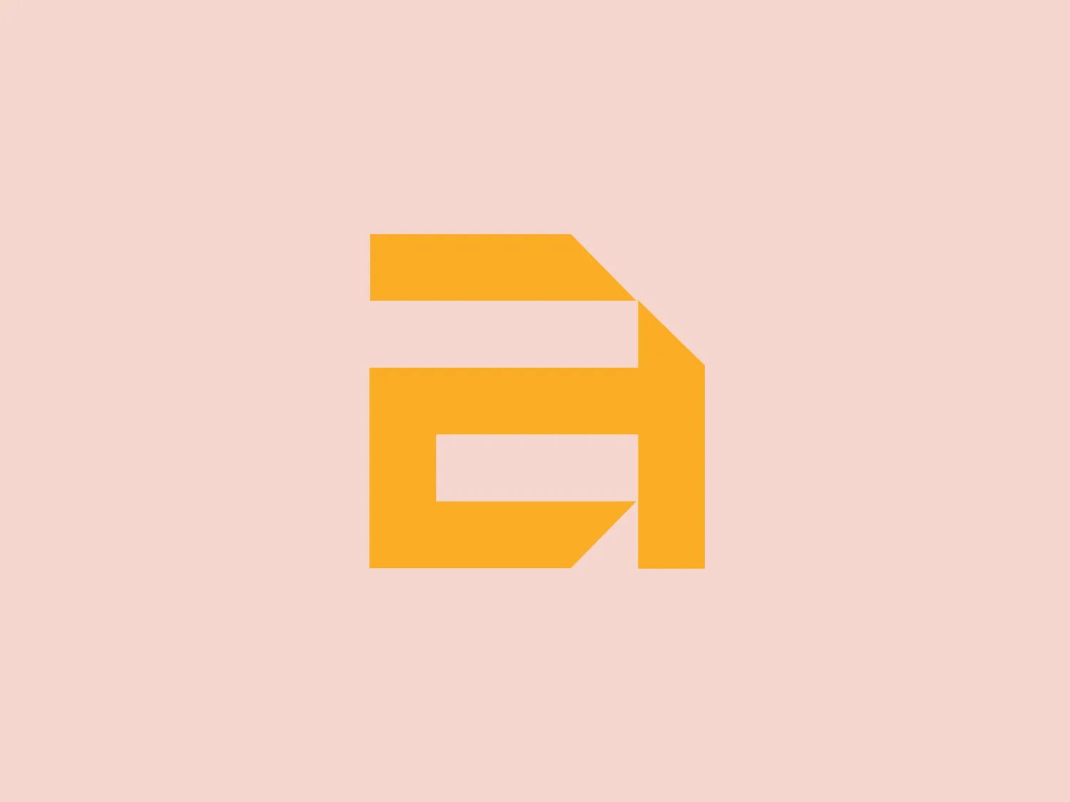
What catches our eye is the geometric and abstract design of the Automation Alley logo, with two interacting shapes forming a stylized letter "A" and creating a modern and dynamic appearance.
Letter
Type
Color
Style
The Automation Alley logo is a geometric and abstract design featuring two interacting shapes that form a stylized letter "A". The bold orangish-yellow parallelogram creates a sense of direction and movement, with a smaller white parallelogram cut out to create negative space. The use of negative space and contrast gives the logo a modern and dynamic appearance.
Automation Alley is a non-profit organization that serves as a business association for manufacturing and technology companies in Michigan. It is recognized as Michigan's Industry 4.0 knowledge center and operates with both global perspectives and a regional focus.
Similar logos
NEW

The Lazada logo features a stylized three-dimensional shape reminiscent of a cube with a portion of its structure removed or invisible, creating an open corner perspective. It consists of two visible faces, with the left face in a vibrant orange and the right face in a hot pink, employing a gradient that combines the two colors seamlessly at the edge where they meet. The use of color and shading gives the logo a luminous, dynamic look, evoking a sense of innovation and modernity. There are subtle highlights and shadows on the faces that suggest depth and dimensionality. The overall design aesthetic is minimalist, bold, and contemporary, with a playful twist on geometric representation.
NEW

The Browze logo features a continuous line that forms a sleek fusion of the letters 'V' and 'B'. The design exudes elegance and modernity with its fluid and organic structure. Presented in monochrome, the black against white creates a timeless and classic feel. Its minimalist aesthetic draws attention to the beauty of the line's curve and the use of negative space. The design's seamless flow may suggest connectivity or unity, and its simplicity allows for versatility and scalability.
NEW

The Rossignol logo showcases a stylized white letter 'R' in the center of a bright red circular background. The 'R' includes a clean design with a striking slash through its stem, adding a modern flair. Smooth curves create a sleek look, and the red and white color scheme offers a bold and attention-grabbing contrast. The overall design aesthetic is minimalist and contemporary, making it versatile for various applications.
NEW

The Delivery Hero logo features a dynamic red comet shape with a stylized white star centered on its body. The comet tail metaphorically conveys speed, progress, or possibly a shooting star suggesting dreams and aspirations. The sharp edges of the star contrast with the smooth, curved form of the comet, giving the design a sense of forward motion. Its design is simple yet effective, easily scalable, and memorable. Considering the vibrancy of the red, a muted background that complements without competing would be ideal.
NEW

The Cornerstone logo features a simplistic and modern design, consisting of a stylized, abstract shape that somewhat resembles a flower or starburst within a circle. The primary element is a brilliant, solid red-orange color that gives the logo a vibrant and energetic feel. The inner white shape has softened edges which contrast smoothly with the circular boundary. Its symmetry and clean lines convey a sense of balance and professionalism. Considering the color palette of the logo, a soft, neutral background color would complement it well without competing for attention.
NEW

The image showcases a bold and abstract Neufquatre Éditions logo, consisting of a stylized letter "N" with a dynamic, fluid shape. The design is minimalist and modern, using negative space effectively to create the impression of motion within the letter form. The logo is monochromatic, featuring a stark black against a clean white background. The simplicity of the design lends itself to versatility, while the curvature of the lines suggests creativity and innovation.
NEW

The BETA Technologies logo features a bold, solid black letter "B" with a white lightning bolt cutting through its center, creating a modern and minimalist design. The stark contrast between the black and white elements emphasizes the strong visual impact of the logo. The lightning bolt infuses a sense of power and energy, suggesting dynamism and force. The classic, rounded attributes of the "B" combined with the edgy, contemporary feel of the lightning bolt create a striking visual identity for the business.
NEW

The Prodigy logo showcases a contemporary, fluid lowercase 'p' in a striking orange color. The design features soft curves and a dynamic loop, along with a sharp cut in the descender, creating a modern and slightly abstract appearance. This clean and minimalistic logo exudes energy and approachability while the vibrant orange color conveys creativity and enthusiasm.
NEW

The BOSS logo features a blue square with rounded corners, enclosing a modern and minimalist white letter 'b'. The 'b' has a sleek, open design created from a single line with a smooth curve, and the vibrant blue contrasts sharply against the white, offering a bold and clean appearance. The simplicity of the logo makes it versatile for various applications and suggests a brand identity associated with innovation or technology.
NEW

The Meralco logo features a stylized, angular lightning bolt in white, cutting dynamically across a vibrant, solid orange circle. The bolt itself has sharp edges and points, conveying a sense of energy and power. The simplicity of the design gives it a modern and impactful aesthetic, as the high-contrast color scheme makes the logo stand out boldly. The circular shape envelops the bolt, suggesting completeness and a global or universal aspect to the brand identity.