School Incarnation


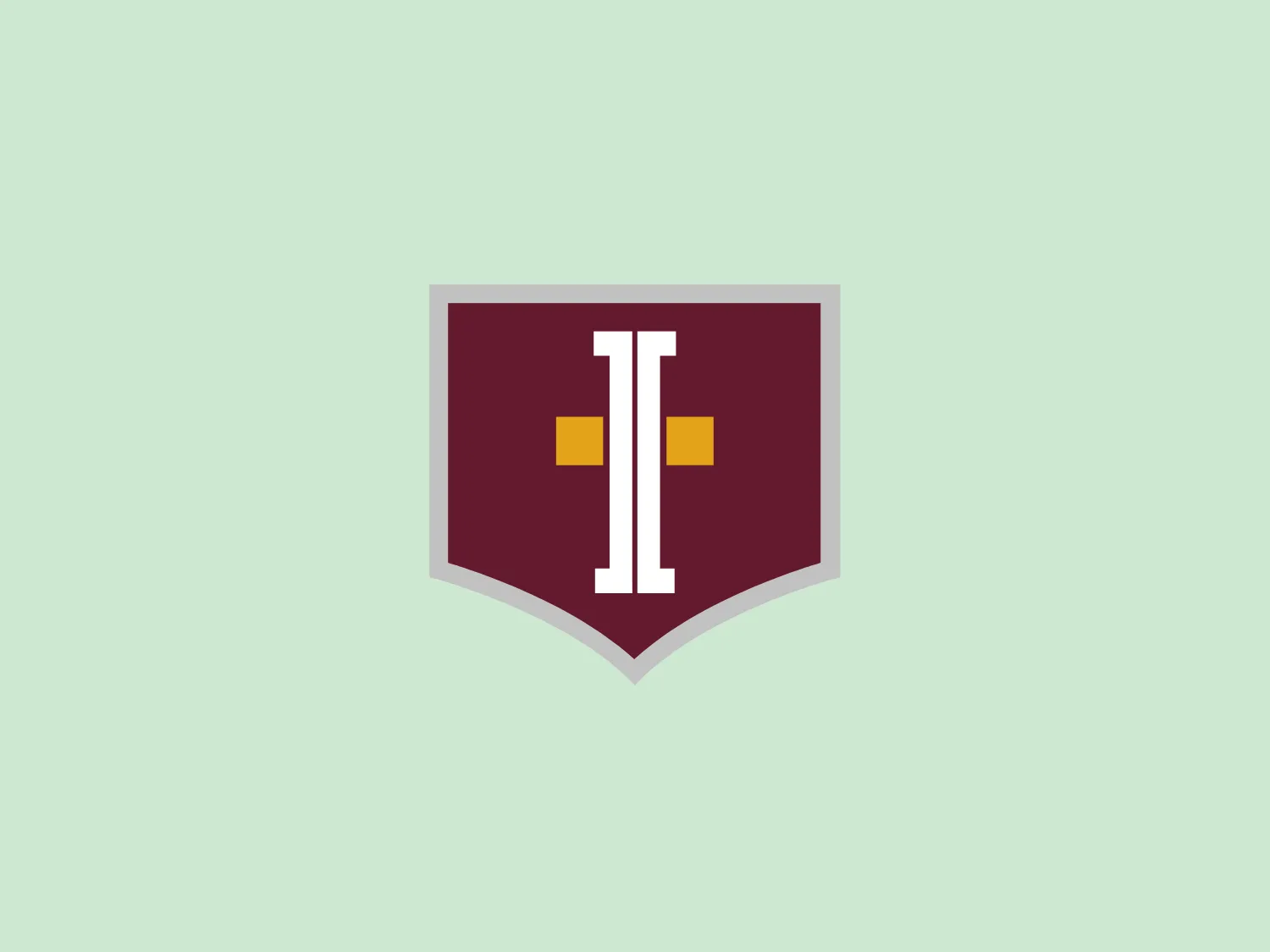
We like the modern and minimalistic design of the School Incarnation logo, featuring a bold "I" in a shield-like shape with a striking color contrast.
Letter
Type
Color
Style
The School Incarnation logo showcases a shield-like shape with a deep maroon background. Positioned at the center is a stylized, modern letter "I" in a lighter shade, featuring a bold and blocky appearance. Small square accents in a rich yellow color flank the "I" on each side, providing contrast and drawing attention to the central letter. The overall design aesthetic is minimalistic and contemporary, with a limited color palette that conveys a sense of sophistication and strength.
Incarnation School is an accredited Catholic educational institution committed to fostering academic excellence within a framework of Gospel values.
Similar logos
NEW

The Breitling logo depicts a stylized, fluid letter "B" with elongated, curved strokes, giving it an elegant and dynamic appearance. The design is minimalist, using a bold golden yellow color that suggests luxury, quality, and sophistication. The overall aesthetic is modern and sleek, with a sense of movement and possibly creativity, hinted by the smooth lines that evoke a sense of continuity. Given the vibrancy of the golden hue, a subtle and light background would complement it well without competing for attention.
NEW

The Subway logo features two bold, interlocking arrows forming an 'S' shape, with the top arrow colored in a striking green and the bottom in a vibrant yellow. The design is clean and modern, with a dynamic sense of movement implied by the arrows pointing in opposite directions. This creates a sense of exchange, circulation, or progression, which might suggest a company involved in logistics, technology, or finance. The flat color treatment and lack of additional embellishments give it a contemporary and straightforward aesthetic.
NEW

The Washington Commanders logo features three interconnected diamond shapes forming a stylized letter "W." The primary color is a deep maroon with a thick golden yellow border, creating a sharp contrast and a dynamic feel. The use of geometric shapes and bold colors conveys strength and modernity.
NEW

The Nationale Nederlanden logo exhibits a modern and dynamic design, featuring a stylized letter "N" enclosed within a circular shape. The minimalist "N" showcases sharp angles and a bold presence, with a gradient color scheme transitioning from vibrant orange to deep yellow, evoking energy and innovation. The circular background lends a sense of inclusivity or a global perspective, while the clean lines and digital feel make it suitable for a brand associated with technology, creativity, or communication.
NEW

The Windesheim logo features a bold, modern design of a stylized letter "W" with sharp angles and a two-dimensional appearance. It is a vibrant, solid yellow color, creating a strong visual presence that is immediately eye-catching. The minimalist aesthetic and contemporary feel are accentuated by the use of a single bright color. The logo's angles convey a sense of movement and dynamism, resonating well with brands seeking to convey innovation or energy.
NEW

The Shangri-La Group logo features a stylized, abstract design consisting of smooth, curvilinear shapes. It is composed of golden yellow lines that form a central symbol reminiscent of a bird in flight or a leaf, enclosed within a perfect circle. The lines are bold and flowing, creating a sense of movement and harmony. The overall aesthetic is modern, minimalistic, and organic, suggesting elegance, freedom, or growth. The simplicity of the design allows for versatile use across various media.
NEW

The logo for Can Metal is a stylized, geometric design made up of interconnected diamond or rhombus shapes that combine to form a larger hexagon-like figure. The deep maroon color exudes professionalism and sophistication. The interconnected shapes create a sense of cohesion and connectivity, while the minimalist design conveys stability and innovation.
NEW

The logo presents a dynamic swirl with a gradient transition from a deep orange to a bright yellow, representing movement or energy. The design resembles a stylized sun or a spinning object with rounded triangular shapes emanating outward, simulating rays or rotation. The overall design aesthetic is modern and vibrant, invoking feelings of creativity, warmth, and motion. The smooth transition of colors gives it a sleek, gradient look that could imply heat, speed, or innovation. The Logo for Grafana Labs.
NEW

The MSGCU logo features a bold, geometric design enclosed within a diamond shape. Within the diamond, there is a dark navy blue 'M' that appears three-dimensional, with shaded sides to give the impression of depth. Above the 'M', a maroon or wine-colored pentagon acts as a highlight or the top of the letter, enhancing the three-dimensional effect. The entire logo is outlined by a thin, light border, adding a crisp finish to the edges. The design conveys a sense of stability and professionalism, with its sharp angles and clean lines.
NEW

The Webster Bank logo features a stylized letter "W" composed of two overlapping chevron shapes in a bold yellow color, set against a white background enclosed within a thick blue circular border. The design aesthetic is modern and minimalistic, with the use of sharp angles and clean lines conveying a sense of dynamism and forward movement. The simplicity and contrast between the yellow and blue make the logo stand out and easily recognizable. The design effectively balances negative space within the "W" to create a sense of depth and layering.