Dallas Independent School District

15
What we like: The dynamic and powerful contrast of the bold maroon "D" with the stylized yellow silhouette gives a striking and modern impression for the Dallas Independent School District.

Letter

Type

Color

Dallas Independent School District Logo

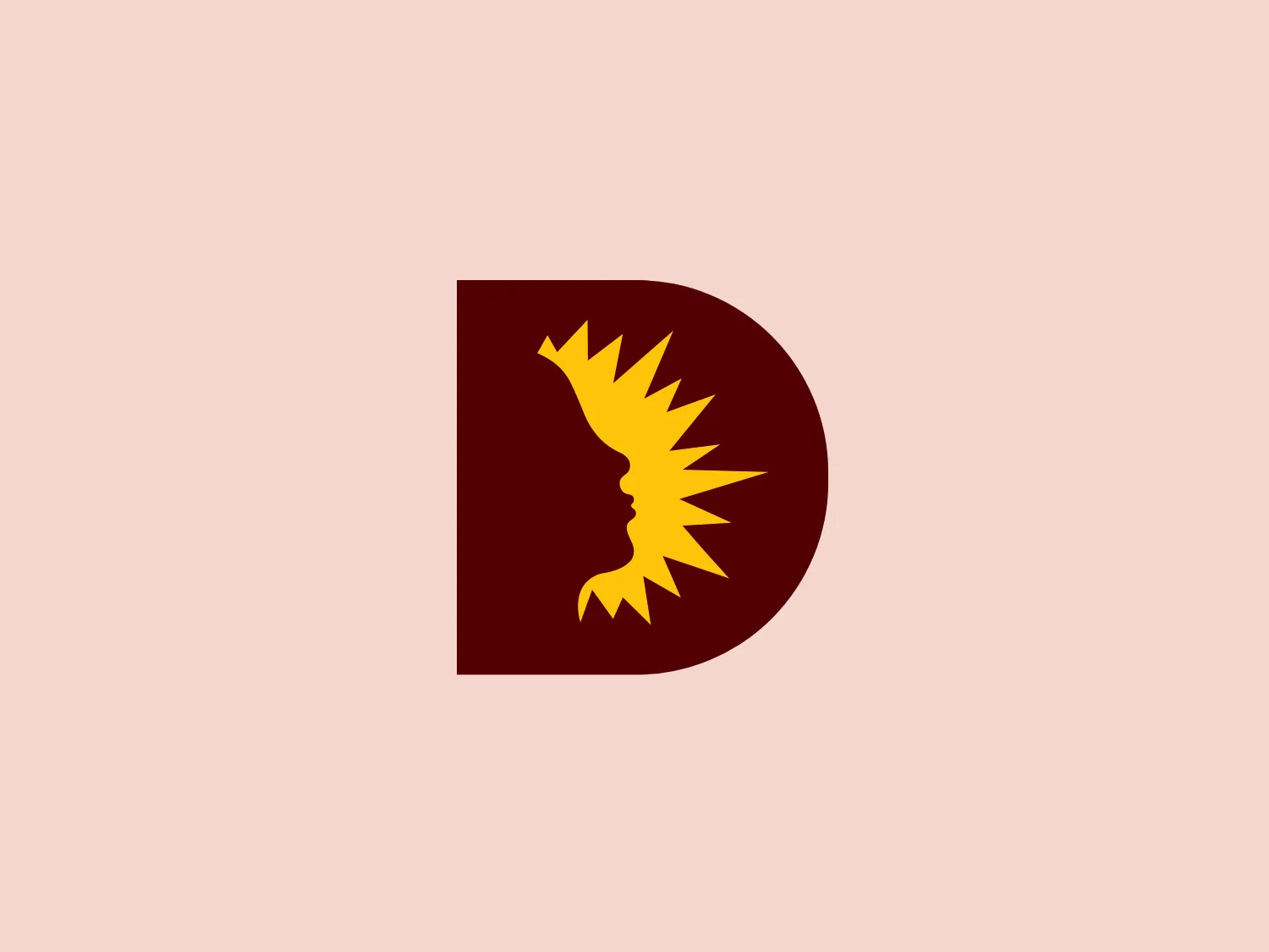
The Dallas Independent School District logo consists of a bold, modernistic capital letter "D" in a deep maroon color. Against this backdrop, a stylized yellow silhouette resembling a flame or sunburst pattern is superimposed, creating a stark contrast. The silhouette appears to form a profile of a face, with the flame or sunburst representing hair or emanation from the mind. The overall effect is dynamic and powerful, suggesting energy, creativity, or thought leadership. The shapes are simple yet evocative, and the two-color palette is striking and easy to reproduce across various media.

About Dallas Independent School District

Dallas Independent School District (Dallas ISD) is recognized as one of the most rapidly advancing urban school districts in the nation. Situated in a vibrant and diverse region, it serves as a cornerstone of the community, offering educational opportunities to a large and dynamic population.

No items found.

Similar logos

The Breitling logo depicts a stylized, fluid letter "B" with elongated, curved strokes, giving it an elegant and dynamic appearance. The design is minimalist, using a bold golden yellow color that suggests luxury, quality, and sophistication. The overall aesthetic is modern and sleek, with a sense of movement and possibly creativity, hinted by the smooth lines that evoke a sense of continuity. Given the vibrancy of the golden hue, a subtle and light background would complement it well without competing for attention.
The Washington Commanders logo features three interconnected diamond shapes forming a stylized letter "W." The primary color is a deep maroon with a thick golden yellow border, creating a sharp contrast and a dynamic feel. The use of geometric shapes and bold colors conveys strength and modernity.
The Nationale Nederlanden logo exhibits a modern and dynamic design, featuring a stylized letter "N" enclosed within a circular shape. The minimalist "N" showcases sharp angles and a bold presence, with a gradient color scheme transitioning from vibrant orange to deep yellow, evoking energy and innovation. The circular background lends a sense of inclusivity or a global perspective, while the clean lines and digital feel make it suitable for a brand associated with technology, creativity, or communication.
The Subway logo features two bold, interlocking arrows forming an 'S' shape, with the top arrow colored in a striking green and the bottom in a vibrant yellow. The design is clean and modern, with a dynamic sense of movement implied by the arrows pointing in opposite directions. This creates a sense of exchange, circulation, or progression, which might suggest a company involved in logistics, technology, or finance. The flat color treatment and lack of additional embellishments give it a contemporary and straightforward aesthetic.
The MSGCU logo features a bold, geometric design enclosed within a diamond shape. Within the diamond, there is a dark navy blue 'M' that appears three-dimensional, with shaded sides to give the impression of depth. Above the 'M', a maroon or wine-colored pentagon acts as a highlight or the top of the letter, enhancing the three-dimensional effect. The entire logo is outlined by a thin, light border, adding a crisp finish to the edges. The design conveys a sense of stability and professionalism, with its sharp angles and clean lines.
The Gearbest logo features a bold, black, stylized smile at its center, with the ends of the smile tapering to points. This simplistic and cheerful smile is prominently positioned against a vibrant yellow square background with rounded corners. The overall design aesthetic is modern and minimalistic, suggesting friendliness and positivity. The design's high contrast and simplicity would stand out well against a variety of backgrounds but would be particularly striking on a light, muted color to maintain its vibrancy without overwhelming its simplicity.
The eTactica logo showcases a simple and geometric design composed of four differently colored quarter-circle sectors arranged in a circular pattern, resembling a spinning wheel or pie chart. The transition from vibrant red to yellow, green, and blue creates a smooth and balanced look. The use of primary and secondary colors gives the logo an energetic and optimistic feel. The white negative space in the center subtly forms a 'C' shape, possibly representing the initial of the company or brand.
The image is a minimalist logo that consists of geometric shapes: a large square with a smaller square situated at its upper right-hand corner. The shape arrangement creates a sense of depth, suggesting a three-dimensional cube slightly offset to the bottom left. The color of the logo is a solid, vivid yellow, giving it a bright and bold appearance. The design is simple yet effective, likely representing structure, stability, and innovation. The aesthetic is modern and would suit a technology company or a creative agency well.
The Varta logo is a stylized representation of an envelope formed by simple geometric shapes. It features a large blue rectangle as the base of the envelope and an inverted yellow triangle as the flap. The design is minimalist with bold color contrast, using flat colors without gradient or shadow for a modern and clean aesthetic. The rectangular shape conveys stability and reliability, while the bright yellow triangle adds a dynamic element, suggesting movement or opening, in a universally recognized motif associated with mail and communication.
The 9mobile logo presents a stylized letter "P" in a bold green color with a gradient ranging from a darker to a lighter shade, signifying depth and dynamism. Within the upper curve of the "P," there's a yellow circle, surrounded by three lighter green semicircular arcs, which could represent motion, connectivity, or sound waves. The design is modern and appears to be related to technology or digital services, with its use of gradients and contemporary color choices offering a sense of innovation. The overall aesthetic is clean and scalable, making it suitable for various applications.