Gridly


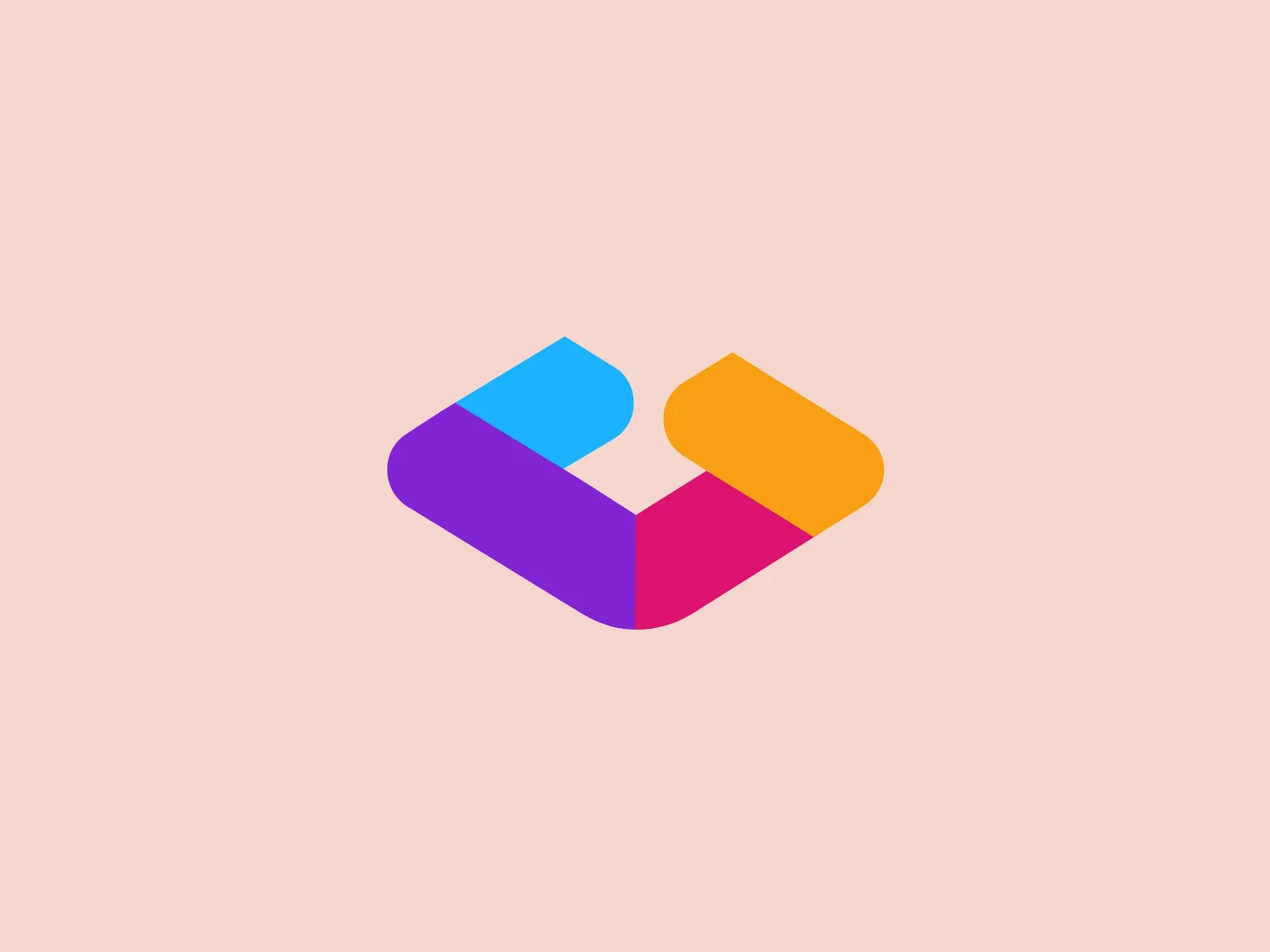
We like the modern, vibrant, and dynamic design of the Gridly logo, featuring geometric shapes and a striking color scheme that symbolizes connectivity and innovation.
Letter
Type
Color
Style
The logo for Gridly depicts a modern and stylized design with vibrant geometric shapes. A square and a rhombus are juxtaposed to create an abstract letter "U" or a dynamic arrow pointing to the right. The color scheme includes bright cyan blue (#40C4FF), vivid magenta (#FF4081), and warm yellow (#FFC107), blending seamlessly where the shapes overlap to suggest connectivity. This playful and energetic aesthetic is suitable for a brand that emphasizes innovation and forward-thinking.
Gridly is a cloud-based platform offering a flexible solution for managing and localizing digital content, catering to businesses' needs for multilingual content across various platforms and devices.
Similar logos
NEW

The Breitling logo depicts a stylized, fluid letter "B" with elongated, curved strokes, giving it an elegant and dynamic appearance. The design is minimalist, using a bold golden yellow color that suggests luxury, quality, and sophistication. The overall aesthetic is modern and sleek, with a sense of movement and possibly creativity, hinted by the smooth lines that evoke a sense of continuity. Given the vibrancy of the golden hue, a subtle and light background would complement it well without competing for attention.
NEW

The Subway logo features two bold, interlocking arrows forming an 'S' shape, with the top arrow colored in a striking green and the bottom in a vibrant yellow. The design is clean and modern, with a dynamic sense of movement implied by the arrows pointing in opposite directions. This creates a sense of exchange, circulation, or progression, which might suggest a company involved in logistics, technology, or finance. The flat color treatment and lack of additional embellishments give it a contemporary and straightforward aesthetic.
NEW

The Nationale Nederlanden logo exhibits a modern and dynamic design, featuring a stylized letter "N" enclosed within a circular shape. The minimalist "N" showcases sharp angles and a bold presence, with a gradient color scheme transitioning from vibrant orange to deep yellow, evoking energy and innovation. The circular background lends a sense of inclusivity or a global perspective, while the clean lines and digital feel make it suitable for a brand associated with technology, creativity, or communication.
NEW

The Windesheim logo features a bold, modern design of a stylized letter "W" with sharp angles and a two-dimensional appearance. It is a vibrant, solid yellow color, creating a strong visual presence that is immediately eye-catching. The minimalist aesthetic and contemporary feel are accentuated by the use of a single bright color. The logo's angles convey a sense of movement and dynamism, resonating well with brands seeking to convey innovation or energy.
NEW

The Shangri-La Group logo features a stylized, abstract design consisting of smooth, curvilinear shapes. It is composed of golden yellow lines that form a central symbol reminiscent of a bird in flight or a leaf, enclosed within a perfect circle. The lines are bold and flowing, creating a sense of movement and harmony. The overall aesthetic is modern, minimalistic, and organic, suggesting elegance, freedom, or growth. The simplicity of the design allows for versatile use across various media.
NEW

The logo for Luma AI showcases a stylized, geometric design with two overlapping planes. The primary shape resembles a three-dimensional rhombus or skewed cube, creating depth and perspective. A vibrant cyan transitions smoothly to a rich, deep blue, suggesting movement and energy. The overall aesthetic is modern and dynamic, with clean lines and a minimalist approach, conveying a sleek, professional image.
NEW

The Boonli logo features a stylized, continuous loop resembling an abstract figure-eight or infinity symbol. It consists of two intertwined segments with a gradient color transition, starting from a rich magenta on one end, blending into a deep violet, and finishing with a vibrant orange on the other extremity. The colors give it a dynamic and modern feel, while the smooth curves suggest fluidity and connection. This design is sleek and minimalistic, with no additional embellishments, making it versatile and easily recognizable.
NEW

The logo presents a dynamic swirl with a gradient transition from a deep orange to a bright yellow, representing movement or energy. The design resembles a stylized sun or a spinning object with rounded triangular shapes emanating outward, simulating rays or rotation. The overall design aesthetic is modern and vibrant, invoking feelings of creativity, warmth, and motion. The smooth transition of colors gives it a sleek, gradient look that could imply heat, speed, or innovation. The Logo for Grafana Labs.
NEW

The Webster Bank logo features a stylized letter "W" composed of two overlapping chevron shapes in a bold yellow color, set against a white background enclosed within a thick blue circular border. The design aesthetic is modern and minimalistic, with the use of sharp angles and clean lines conveying a sense of dynamism and forward movement. The simplicity and contrast between the yellow and blue make the logo stand out and easily recognizable. The design effectively balances negative space within the "W" to create a sense of depth and layering.
NEW

The eTactica logo showcases a simple and geometric design composed of four differently colored quarter-circle sectors arranged in a circular pattern, resembling a spinning wheel or pie chart. The transition from vibrant red to yellow, green, and blue creates a smooth and balanced look. The use of primary and secondary colors gives the logo an energetic and optimistic feel. The white negative space in the center subtly forms a 'C' shape, possibly representing the initial of the company or brand.